Optimising the Parliamentary digital experience
.png)
The challenge
The Scottish Parliament needed to redesign their website and wanted to put users at the heart of the new website even though it caters for a vast user base from the general public and journalists to MSP’s and their staff. They were keen to refresh their understanding of:
- Who uses the website.
- Why they come to the website.
- What they use the website for.
- How the current site measures up, compared to what the users want.
- What are the most important content / features of the website and make the new website more focused on these.
Our approach
As a large website, with a broad range of users, and the need to prioritise the focus of the site, we employed the Top Tasks Management Approach along with experience evaluation and service design activities.
- Within the Experience evaluation phase, we started by building a picture of the current situation within the parliament, including learning more about what they thought of the website.
- Socialising the project internally, assisting in identifying key stakeholders and facilitating discussions on how digital content is managed in the Parliament.
- We went onto gather quantitative insights about the current website and interviewed visitors to understand what research they did online beforehand.
The Top Tasks Management Approach involved identifying the most important tasks, using the stakeholder and user-centred approach, followed by creation and validation of a user-centred IA (this will open in a new window)and navigation, and finally measuring the current website against the prioritised tasks to obtain a benchmark to monitor improvements.
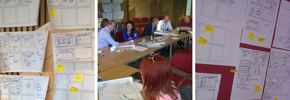
Finally, we created low fidelity prototypes (this will open in a new window)of the home page and the three most important tasks. This enabled us showcase how the user research, top tasks insights and the new IA could come together as a website for users.

The result
We gathered a huge amount of customer insights throughout the process. These included:
- Understanding how often and why users visit the website.
- A breakdown of task importance.
- An insight into users perceptions of the current website and how it could be improved.
- A user-centric and validated IA and navigation, based on their top tasks.
- Prototypes of the most important journeys.
- A clear benchmark of how the website is currently performing and where attention needs to be focused to improve task importance.
All of this meant that the project team had an excellent start to be able to take the project forward with Scottish Parliament users being at the heart of the new website.