Renewing my visa, or how a poor user experience cost me £500
17 December 2015 - Jessica Cameron

Having now been in the UK for two years and nine months, I recently found myself needing to renew my visa in order to continue living and working here.
Getting started
Armed with a nice cup of tea, I began the process in August. I knew that I wanted to make a premium service appointment, which would cost a bit more but let me avoid having to send away my passport, and that I wanted the appointment to fall just before my visa expiry date in December.
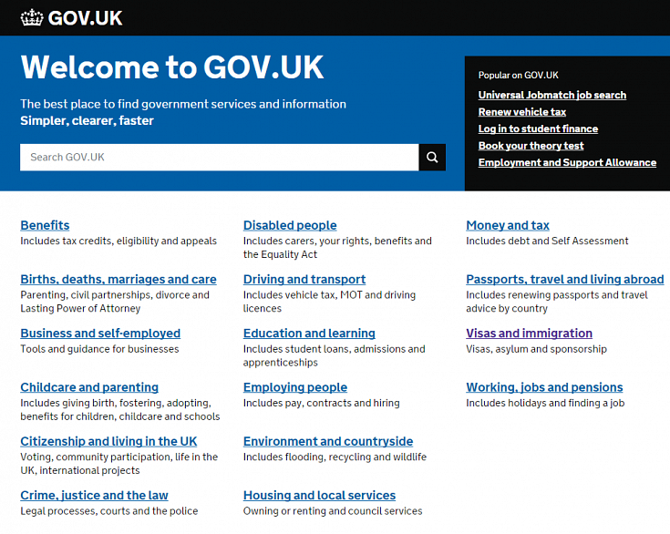
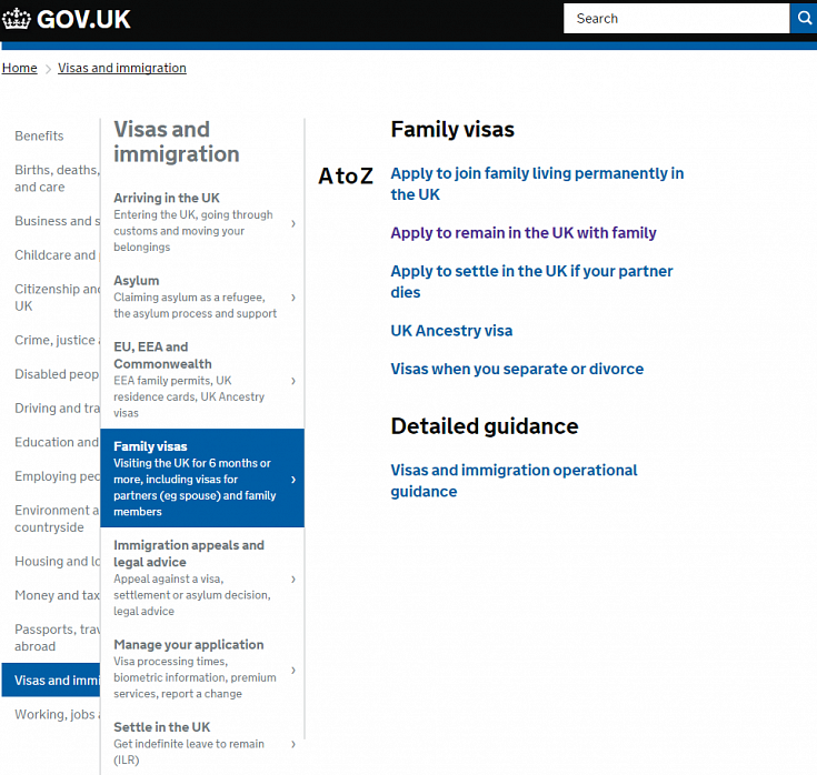
My first port of call was GOV.UK(this will open in a new window), the website for all things UK government related. The navigation of the site was beautifully straightforward; clicking the ‘visas and immigration’ link on the homepage took me into an A-Z list of relevant topics, where ‘family visas’ was clearly the one that applied to my situation as the spouse of a UK citizen.

From there, ‘apply to remain in the UK with family’ sounded like exactly what I was looking for. While there were potentially other avenues to explore, I was pleased that this happy path was so easy to find.

The instructions
Once I reached the application instructions, I had to do a bit of extra research to figure out if I was a partner on 2-year or a 5-year route, but good descriptive linking made it easy to find the information I was looking for.
I also read about the immigration health surcharge(this will open in a new window)(IHS), which would add an additional £500 onto a not inconsiderable set of fees. It was unclear if I would have to pay it to book an appointment, but I figured the application would clarify that.
I clicked through to book an appointment.
Making an appointment
I ended up on the UK Visas & Immigration Page. Not as user friendly as the GOV.UK site, and a big red insecure logo in the browser bar gave me pause, but I soldiered bravely on.

I had to create an account, and then choose the type of visa I was applying for. The menu of options contained a dizzying list of acronyms, and I had to do a bit of hunting to figure out which specific application I needed. Unfortunately, the friendly ‘apply to remain in the UK with family’ language used on GOV.UK is not repeated anywhere on the application portal, but a short set of questions provided as guidance helped me confirm that what I needed was an FLR(M) application.
I eventually reached a page directing me back to GOV.UK to pay the IHS, separately from the rest of the application fees. After I paid my £500, I was taken back to the application portal, where I saw that appointments were available… but only six weeks ahead. So I signed out, noted down my IHS reference number, and set a calendar reminder to come back and make an appointment in October.
In mid-October I went through the process again, and reached the point where I had to pay my IHS. I found that there was no way to continue my application without paying it again.
NOT twice as nice
That’s right. I had to pay a £500 surcharge TWICE, just so I could submit an application for an appointment.
Huge usability fail. I phoned up to make sure I wasn’t missing something, and learned that no, there really was no way for me to input my reference number or otherwise indicate that I had already paid this surcharge. All I could do was email my details and wait for a refund.
Applying for a visa is a stressful process. (Remember, all this was just to book an appointment – I still had a 74 page application form to fill out.) GOV.UK do a brilliant job of making sure that the right information is easy to find, but the process falls apart when users are directed to the application portal. Poor integration between the two systems makes the process even more stressful (and expensive) than it needs to be.
However, this process could be greatly improved if GOV.UK simply offered more information at the correct points in the user journey. At a minimum, the following details should be explained before users start the appointment booking process:
- Appointments can only be made up to six weeks in advance.
- After paying the IHS, applicants must book their premium service appointments in the same session.
As a bonus, GOV.UK could inform users of what terminology they will need to know (e.g., visa names) to book an appointment.
Update
Happily, I have now received both my visa and my refund. The former took four days from the date of my appointment; the latter took more than two months from the date I requested it.
You might also be interested in...
Applying the Three Lenses Model: How to Integrate MR, CX and UX Research
21 April 2026Knowing the three lenses is one thing — here's how to actually use them together without restructuring your entire research function.
Read the article: Applying the Three Lenses Model: How to Integrate MR, CX and UX ResearchThe Three Lenses Model: How MR, CX and UX Work Better Together
16 April 2026Most organisations run market research, track CX, and test with users — but they rarely connect the dots. Here's a model that does.
Read the article: The Three Lenses Model: How MR, CX and UX Work Better TogetherSynthetic Users and Digital Clones: A UX Researcher’s Honest Take
2 April 2026AI research tools promise speed – but at what cost to human insight? Are synthetic users and digital clones really the same, and do they truly work for UX research? We cut through the hype to share a clear, practical view: where synthetic methods add genuine value, where human insight remains essential, and how to tell the difference between synthetic users and digital clones in real‑world research. A must‑read for UX professionals, product teams, and researchers navigating AI‑driven testing.
Read the article: Synthetic Users and Digital Clones: A UX Researcher’s Honest Take