New Look – User Experience review
11 December 2014 - Nicola Dunlop

This article was published in December 2014 issue of Internet retailing(this will open in a new window)
Homepage
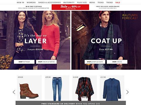
The New Look homepage effectively communicates a young, on-trend and affordable brand image. The use of stylised images successfully pushes desirable fashion trends for the autumn/winter 2014 season.
The product price is highlighted next to each garment bringing back an element of affordability within these photo-shoots, (Image 1).
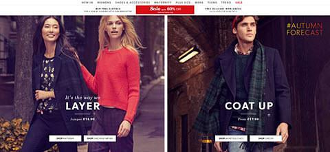
When viewed on a 1920 x 1080 desktop, the Homepage images dominate the full screen meaning the additional content is pushed down out of sight, (Image 2).
This is not an issue for tablet or smaller 1280 x 1024 screens yet the real-estate of these images could be reduced to display other promotional sections on the homepage.
The homepage calls to actions and mega menu offer a broad range of discovery avenues for the user to begin their journey, either through browsing or direct search behaviour.
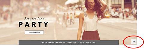
An effective feature on the homepage is the ‘recently viewed’ items section which is currently hidden at the bottom of the page.
This panel facilitates quick sourcing of products for repeat visitors and therefore may be more effective if presented at the top. Another nice feature on the homepage is the ‘scroll up’ tab within the footer, (Image 3).
This removes the need for users to manually scroll back through page content facilitating seamless flow of interaction.
In terms of accessibility for tabbed viewing the keyboard the site does not provide any visual clues as to where the cursor lies, making the page hard to manage without a mouse.
For screen readers some of the headers are not nested correctly and skip to link are missing from the site preventing these users to jump navigation.
Mega Menu
The content within the mega menu may at first appear overwhelming; however categories have been grouped into logical sections, making it easier for the user to find what they want quickly (Image 4).
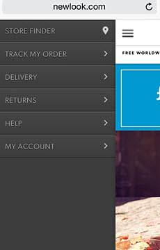
On mobile an accordion format has been used for the menu which successfully deals with limited screen space yet prevents the user from gaining a clear overview of search options.
I would rather see what you mean in mobile than see mega menu.
Category Page
The category page makes good use of whitespace to display garments. The roll-over interaction is a playful addition, automatically presenting how the item would look when worn (Image 5).
A ‘preview option’ is also available for items that are not yet available to buy.
This feature is great for product promotion as the user is shown a ‘teaser’ and can chose to be notified by email when the garment is in stock.
This feature could be pushed in its function to assess product demand before production.
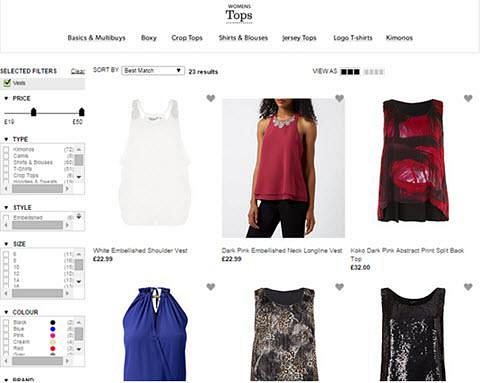
There is a good choice of products filters ensuring users are returned with accurate results quickly. Users search in a variety of ways and so the site successfully optimises on search behaviour.
Filtering is much more limited on mobile as the user is only able to search by style ranges and price brackets. Navigation between product pages is also limited on mobile as the site relies solely on the breadcrumb trail to toggle between pages.
This navigation should be supported within the burger menu to meet a range of search expectations.
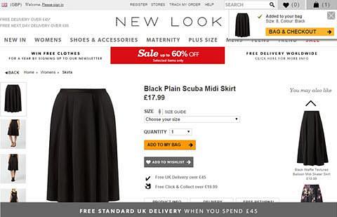
Product Page
The range of product images works well allowing users to realistically visualize what they are buying.
At this stage within the journey the site includes product recommendation panels such as, ‘you may also like’ and ‘recently viewed items’ which encourages the user to explore other product options.
Low stock is also highlighted within the size section, a good persuasion technique in triggering an instant purchase.
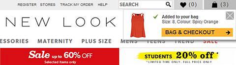
In the Bag
When adding items to the shopping a drop down panel is triggered within the header area. This top section is already loaded with content making the panel easy to miss.
Feedback on this interaction must be clear for the user to trust that the site is successfully responding to their demands, therefore white space may be needed to relax the eye and draw attention to the panel.
Checkout
The progress bar works well at checkout clearly communicating the user’s stage within the process. Alignment within the ‘my basket’ page could be clearer to aid scanning behaviours and readability.
Summary
On a whole New Look is an effective e-commerce site. The site successfully encourages exploring behaviours by adding in tailored suggestions and preview features throughout the buying journey.
The homepage communicates a strong brand image yet the screen real-estate on mobile could be used more effectively to promote varying sections on the website.
The mobile experience could do with some refinement in terms of general navigation and product filters yet overall works well in the product pages and merchandising. Accessibility is well considered on the site; however some accessibility issues were identified.
You might also be interested in...
Designing for Cognitive Load: Why Accessibility Must Account for Mental Effort
15 May 2026Accessibility is not just about whether someone can technically use a product - it's about how much effort that use requires. This article explores why cognitive load is a fundamental accessibility issue, how it affects users, and what organisations can do to create clearer, calmer, more inclusive digital experiences.
Read the article: Designing for Cognitive Load: Why Accessibility Must Account for Mental EffortThe Three Lenses Model: How MR, CX and UX Work Better Together
16 April 2026Most organisations run market research, track CX, and test with users — but they rarely connect the dots. Here's a model that does.
Read the article: The Three Lenses Model: How MR, CX and UX Work Better TogetherAre You Heading to the Right Moon?
3 April 2026If your digital transformation north star wasn't defined by evidence, your agile ceremonies and KPI dashboards will simply deliver you efficiently to the wrong destination.
Read the article: Are You Heading to the Right Moon?