Information Architecture and the ‘First Click’
1 March 2016 - Mark Crowley
Customers can be confused if website menus don’t offer a single clear choice about where to click first. Why is this important? Well, research has shown that the chances of customers completing their tasks and finding what they need can be between two and six times higher when the first click is correct (Measuringu.com, December 2013(this will open in a new window)).
So, how do you ensure that your customers’ first clicks have a high chance of being correct? Let’s look first at how a deficient information architecture (IA) can reduce the chances of that critical first click leading customers down the wrong track.
The bad examples
One of the main issues that can hinder customers is that the labels in navigation menus seem to offer more than one correct choice. In other words, more than one choice appears to lead to the destination they are looking for.
Over the years we have frequently witnessed this effect while running user testing sessions. Typically, when people are presented with menu items that overlap in meaning, their indecision shows in how they move the cursor and how they are verbalising their difficulties.
In the example below, consider what happens when the customer wants to find technical details on a product. The cursor moves around the menu, indicating that they are not sure which path to take. Knowledgebase, FAQ, Customers, Support, and even Products all seem reasonable choices. In this case, the first click has a low chance of being correct:
There is a view that offering multiple paths to the same content is a good idea. In my experience, this is not the case. When more than one path exists, there can be a doubt about whether the destinations are the same. Often customers will engage in trial and error which wastes time and reduces confidence in the likelihood of success. Too much choice makes for a bad navigation, and this is especially true for mobile devices where physical restrictions make trial and error more frustrating.
When navigation is business led
One of the causes of ambiguity in menus is an organisation-centric approach. In this scenario, the information architecture is built around organizational structures that don’t correspond with customers’ mental models of how the information might be categorised.
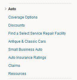
For example in the menu shown below from an insurance website, forcing a menu based on an internal company structure on customers will undoubtedly lead to confusion. What if a Small Business customer wants to check coverage options for a classic car? Three choices will seem correct. As a result, this menu will cause hesitation, delay, and ultimately could lead to abandonment:
In the example below, someone looking for a research publication has two clear and conflicting choices —’Research’ and ‘Publications’. If they have a specific subject in mind, ‘Topics’ is another possibility, while ‘Learning’ is a label that, although it gives no information about the destination, may prove tempting. They are therefore presented with four choices, none of them clearly better than the others. Which option would be best for a research report on poverty in China?

How to create a good IA
For a good customer experience, the goal is to make the menu choices mutually exclusive — only one choice in a menu should seem logical. Getting to this stage involves detailed research and testing with customers, but an information architecture with a high first-click success rate will vastly improve success rates and, as a result, conversion rates and customer satisfaction.
Techniques and methodologies that can help to improve the information architecture to improve the ‘first click’ success rate include:
- Top task identification – a foundation for having the correct content linked from the main navigation menu.
- Card sorting – to find out how your customers view your content and how to categorise it.
- Tree testing – get quantitative data on first-click choices in a navigation structure.
User Vision offers these services as part of our IA analysis.
Get in touch to find out how we can help.
You might also be interested in...
Creating Space for Surprise in User Research
1 June 2026Good user research creates space for surprise - exposing blind spots, challenging assumptions and helping teams make better decisions.
Read the article: Creating Space for Surprise in User ResearchApplying the Three Lenses Model: How to Integrate MR, CX and UX Research
21 April 2026Knowing the three lenses is one thing — here's how to actually use them together without restructuring your entire research function.
Read the article: Applying the Three Lenses Model: How to Integrate MR, CX and UX ResearchThe Three Lenses Model: How MR, CX and UX Work Better Together
16 April 2026Most organisations run market research, track CX, and test with users — but they rarely connect the dots. Here's a model that does.
Read the article: The Three Lenses Model: How MR, CX and UX Work Better Together