Travel and the passenger experience – Ryanair
6 November 2015 - Abi Reynolds
Travel through the ages
Back in the 60’s it took my mother at least a month of her wages as a secretary to get a flight to London for the weekend. 20 years ago when I first worked in London, a flight back to Dublin was approx. £200, about a week’s salary. Fast forward to today and a flight from Edinburgh to Dublin usually costs me about £40, which could be an hour’s salary. A change for the positive.

The travel industry has been revolutionised over the last 30 years, thanks to the likes of Ryanair (and perhaps Easyjet to some extent). Frequent flights and low costs have not only changed how people can travel but also how people can work and live. It’s made it possible for me to live in Edinburgh but travel back to Dublin regularly while not breaking the bank. And flights are pretty well organised too.
As a UX consultant, I am interested in process and how technology can improve and enrich our lives. I have always found the airline industry a fascinating one. An airport is a busy place with its own unique challenges; scheduling of flights, security issues, managing the ebb and flow of people on the ground and dealing with customers from all over the world, all contained in one, often stressful, environment. Efficiencies in process save time and money and improve the customer experience. New and better technologies such as mobile apps and improved booking and check in processes save time and effort.

I can’t talk about changes to the travel industry without mentioning Ryanair, who have grown from a small Irish Airline founded 30 years ago to one of the biggest, if not the biggest, airline in Europe. Set to carry 100 million passengers this year they have been the biggest disruptors of the airline industry in Europe. And they have forced others to follow their lead.
So why didn’t I like them?
Up until about 2 years ago I, and almost everyone else I knew, didn’t particularly like flying Ryanair. Of course I liked their prices but not the stress that came with flying with them. They were cut throat, and would pounce on every opportunity to make a buck out of their customers; late check-in, extra bags/weight, on board selling etc. I was in a panic even before I reached the airport. And it was well known that they were notoriously mean and penny-pinching with their own staff too. Not a brand you wanted to engage with.

The tipping point
Ryanair’s aggressive policies finally came to a head about 4 years ago. According to newspaper reports, it involved a particularly insensitive and bad PR incident where Ryanair charged a man to change his flights back to the UK. A man who had just learned his family had burned to death in a house fire. CEO Michael O’Leary vowed to change Ryanair policies. A noble gesture perhaps but no doubt falling profits at the airline at the time helped him make this decision.
I too had noticed this tipping point but in other ways; friends and colleagues said they would rather pay up to £50 extra to fly with someone else. Not even low costs or on-time flights could combat our dislike of Ryanair.
Change was in the air
Ryanair stepped up their investment in technology and people and a new raft of policies followed. Changes included small things like being able to take a handbag on board, shortening the on-line checking to 2 hours. Even cutting out some of those annoying tannoy adverts on late flights really does make a difference. And they got rid of the trumpet on landing. Thank God.
YouTube video of trumpet(this will open in a new window)
These changes have had a positive impact for me personally and the lifestyle I lead.
Getting here from there
So how did Ryanair achieve this miraculous transformation? To me, as an external but obviously interested observer, it appears that they chose to examine the experience as a whole, explore where the pain points were in the user journey and make them go away.
Addressing these pain points or ‘moments of truth’ can really make or break people’s engagement with a brand.
Of course Ryanair’s investment in technology has helped hugely. Investment not only in new planes but also in the new Ryanair Innovation labs in Dublin and with this a shift of focus onto the user experience.
The introduction of their mobile App about 2 years ago was a good start, although I still prefer Easyjet’s and British Airways’ Apps in terms of a seamless experience. Hopefully we will see a new improved mobile App from Ryanair soon.
And they have just launched a redesigned site, more good news for the customer. Although I haven’t booked a flight on the new site yet, I have had a quick look and my first impressions, in terms of design and new features, are positive.
Some thoughts from my preliminary foray onto the new Ryanair site…
Improved Homepage and Navigation
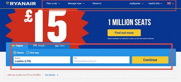
- The top menu is simple and straightforward with, it seems, sensible labels. This acts as a useful signpost and makes it easy to find stuff.
- Easy to see and interact with the flights section (the old site drove me mad when I had selected Dublin as a destination from the drop down and it didn’t pick it up).
- But I’m not sure about the huge £15 red banner. Eye tracking research and Fitt’s law tell us that a huge image like this really dominates the user’s attention when first looking at this page. Okay, so it is a MASSIVE sale (I get it!) and the first time you see it might be okay, but it would really annoy me after a while.
Yay! I can create an account and save myself time and fuss in booking my flights
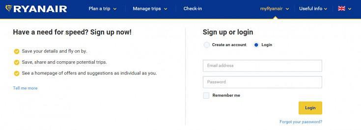
- I’m not 100% sure I couldn’t log-in in the old site. I don’t think so – it certainly was not obvious or easy to do. I was therefore very happy to easily spot the myRyanair section of the new site where I assumed I could create an account
- In the myRyanair section, I also like the list of benefits on the left. A sensible place to have these benefits and they are easily scannable.
- The ‘Create an account’ functionality appears really straightforward too. And I can choose to ‘Show’ password; a good design convention and especially important on mobile. But then I ran into some issues…
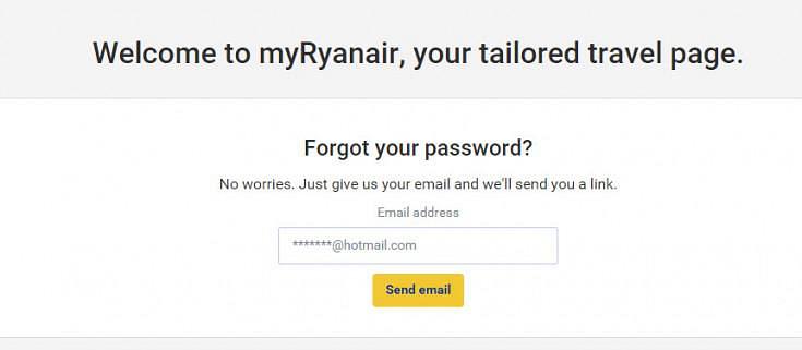
- The system already recognised me, so I requested a new password, which was easy. So easy in fact that I ended up requesting it three times. This was because I hadn’t realised that it had been requested already. Once I pressed the ‘Send Email’ button nothing happened. The system failed to tell me I had completed the action so I kept repeating it.
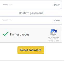
- I was also interested to see how Ryanair handled the Captcha, a notoriously difficult element to get right. It’s hard to strike a balance between preventing spamming and annoying the customer. I was not sure how Captcha works here, but I pressed the tick button anyway thinking ‘this is easy’. Not so.
- Because I then got booted out of the site and was told ‘code already in use’. What? Not a great start after all. Mind you, when I tried to log in again, the system recognised my email and my new password so something must have worked.
In summary, I would say, bar a couple of quirks in the login process, my first impressions of the new site are good. I look forward to investigating more. And hopefully, a new mobile App is in the not to distance future too. Improvements in technology along with Ryanair’s change in attitude and a focus on customer service have no doubt been a large contributor to a change in their fortunes. Recent reports show that the airline’s share price has more than doubled since January 2014. No wonder Ryanair are flying high these days. Of course cheap flights and efficient on-time services are important too.
Keep going Michael, sure it’s all going grand now…
You might also be interested in...
Applying the Three Lenses Model: How to Integrate MR, CX and UX Research
21 April 2026Knowing the three lenses is one thing — here's how to actually use them together without restructuring your entire research function.
Read the article: Applying the Three Lenses Model: How to Integrate MR, CX and UX ResearchThe Three Lenses Model: How MR, CX and UX Work Better Together
16 April 2026Most organisations run market research, track CX, and test with users — but they rarely connect the dots. Here's a model that does.
Read the article: The Three Lenses Model: How MR, CX and UX Work Better TogetherUser Vision Joins the New DOS 7 Framework - Making Public Sector UX Procurement Simpler
1 April 2026User Vision has secured a place on the Government Commercial Agency (previously CCS) new Digital Outcomes and Specialists 7 (DOS 7) framework - making it faster and simpler than ever for public sector organisations to access specialist user research, accessibility, and user-centred design services.
Read the article: User Vision Joins the New DOS 7 Framework - Making Public Sector UX Procurement Simpler