Top 10 accessibility issues in public sector websites
23 September 2020 - Keith Allan
.png)
User Vision works with a wide range of clients in the public sector, helping them increase their awareness of accessibility and produce more accessible digital products and services.
When the Public Sector Bodies (Websites and Mobile Applications) (No. 2) Accessibility Regulations 2018 came into force on the 23 September 2018, public sector organisations were required to make their website or mobile app more accessible by implementing ‘reasonable adjustments’ for disabled people.
In order to comply with the new regulations, public sector bodies must meet a set of international requirements and coding standards called the Web Content Accessibility Guidelines (WCAG) 2.1(this will open in a new window) to Level AA. WCAG compliance ensures that websites are accessible by everyone, irrespective of disabilities and age.
New public sector websites must adhere to these standards and publish an up-to-date accessibility statement must be published on the site.
All public sector websites, regardless of when they were published need to comply with the new regulations by 23 September 2020.
We have assessed in detail many public sector sites and seen many different accessibility barriers, but some crop up much than others. We’ve reviewed our recent accessibility audits and created the top 10 accessibility issues that we commonly find when performing accessibility audits on public sector websites. We have also listed the corresponding WCAG criteria for each of the issues. and provided recommendations on how you resolve these. Don't hesitate to contact us if you need more information on any of these findings.
1. Colour contrast (WCAG 1.4.3) and non-text colour contrast (WCAG 1.4.11)
WCAG 2.1 states that the colour of the text and the background must have a contrast ratio of 4.5:1 for small text, and 3:1 for large text (18px or 14px bold).
Similarly, for non-text contrast, user interface components and interactive elements must have a colour contrast ratio of 3:1. This includes button elements, clickable social media icons and visible focus indicator. This can be problematic to low vision users and colour-blind users.
Recommendation
At the design stage, use a colour contrast analyser to ensure that the text and background colours and interactive elements meets the appropriate colour contrast ratio.
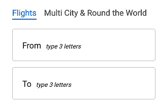
2. Image alt text (WCAG 1.1.1 and WCAG 1.4.5)
Another common accessibility issue for public sector websites is images with missing or insufficient alternative text. Alternative text or ALT Text is a fundamental accessibility requirement since it effectively enables blind and visually impaired users to ‘see’ an image when it is read out by their screen reader. Images that convey meaningful information visually should also be announced to screen reader users.
Images containing text, like company logos, should also have alternative text announced via screen readers.
Recommendation
Develop a strategy – at the design stage – for deciding when images do and do not require meaningful alt text. For decorative images, icons and svgs, use null alt text (alt=“”). Do not omit the alt text entirely, as screen readers will then announce the full image path which is typically meaningless and not nice to listen to.
3. Information and relationships (WCAG 1.3.1)
The information and relationships criteria encompass a variety of issues and is another common fail for public sector websites. This includes:
- Page titles not being adequate
- Landmarks not identified
- Text not being programmatically associated to links
- Form fields not associated to labels
- Links opening in new tab windows without informing users visually or programmatically
- Headings and HTML not being used to specification
Recommendation
The best way to address these failures is to use HTML to specification and provide additional context for screen reader users. Many of these issues are not easy to determine through automatic accessibility tools and require a deeper investigation using assistive technologies and examination of the code itself.
4. Visible Focus (WCAG 2.4.7)
Visible focus is required for keyboard users to navigate through the site, allowing them to know which form field or element they are interacting with.
By default, web browsers indicate focus visually (thin blue outline on Chrome, dotted outline on Firefox), but custom programming, styling, and scripting can disrupt it. Without a visible focus indicator, sighted keyboard users will become disorientated on a page as they will not know which element they are interacting with.
Recommendation
Best practice is to include a:focus and a:active in the CSS file as well as a:hover to make focus highlight effects work when tabbing to links as well and when using a mouse.
5. Error identification (WCAG 3.3.1) and error suggestion (WCAG 3.3.3)
Error messages that are not announced by screen readers and error messages that do not provide helpful instruction on how to fix errors are common accessibility issues.
Screen reader users will not be aware of errors when completing forms resulting in the user abandoning the form thinking it isn't functional.
Recommendation
Inline errors can be indicated by setting aria-live=‘assertive’ so that dynamic elements on the page are announced when user input produces changes.
The position of the error messages should appear above the field with the error. Upon submitting the form, the error should be announced by the screen reader and focus should move to the field with the error to make it easier for the user to identify which fields have the input error, with a helpful and informative error message.
6. Status Messages- Dynamic content (4.1.3)
Like error messages, status message including loading messages, confirmation messages and warning messages that appear dynamically on screen which are not announced via screen reader will cause issues especially for blind and visually impaired screen reader users. These users need to be informed of changes happening on screen as they have no visual frame of reference and require up-to-date information in order to make informed decisions.
Recommendation
Depending on the context and importance of the dynamic content on screen, the information can be indicated by using aria live regions setting aria-live=‘assertive’, aria-live="polite" or role=“alert”.
The purpose of this ARIA content is to notify assistive technologies that a change has occurred and to avoid users assuming that the form is not functioning correctly.
These incidence and impact of these errors depends on the technology being used. Therefore to discover these issues we need to test the site in multiple browsers, devices and technologies and ensure that any automatic focus that is set does not interfere with the announcement of newly opened modal windows, popups or loading screen.
7. Keyboard barriers (2.1.1)
For users who navigate by keyboard, it is important that all interactive elements can be accessed by or triggered by using the keyboard alone. This is especially important in navigation menus, content hidden in tabs, tooltips and modal windows.
If these elements cannot be accessed by keyboard alone, this will cause a significant barrier to these users.
.png)
Recommendations
All content that is operable using a mouse needs to be operable by keyboard users as well. Ensure that all interactive elements can be triggered via onfocus and touch events as well as the mouse.
8. Link Purpose (2.4.4)
Link text should be meaningful and identify the purpose without visual cues. Links like “read more ‘’ or “click here” are not descriptive enough to help users understand their destinations and should be avoided. Screen reader users who navigate between interactive elements only hear the text of each link.
Recommendation
If links like ‘read more’ are unavoidable, place descriptive information at the beginning of the link by adding the text and displaying it off screen with CSS to remove content from visible display, but keep it available to screen readers.
Another option is to use the aria-label attribute to add a descriptive text label to the link. E.g. <span aria-label="tax refunds">read more</span>
9. Focus order of interactive elements not in a logical sequence (2.4.3)
For users who navigate using the keyboard alone, not only is it important that they know which element they are focussing on, but also the sequence in which the element receives focus. If the focus order is not in a logical sequential order, users can become confused and disorientated on the page.
This can be particularly frustrating for low vision users or users with motor disabilities, navigating with a joystick.
Recommendation
Ensure that when users navigate sequentially through content, they encounter information in an order that is consistent with the meaning of the content and can be operated from the keyboard. Depending on the operating system (e.g. iOS/iPadOS), focus may need to be set using JavaScript after a full-page load.
If dynamic content is triggered like a modal window, ensure the focus moves into the modal window so that users can access the information within it, and dismiss the window with ease.
10.Browser and device compatibility (4.1.1)
All content should support compatibility with current and future ‘user agents’ such as browsers. This is especially important for assistive technologies where incompatibilities between the different technologies being used can effectively be a barrier to use.
Users of assistive technology JAWS, a screen reader, use Internet Explorer as a default browser. When sites are developed to be viewed on one assistive technology or browser, there are often compatibility issues when it is viewed on another browser, including content being obscured or certain components not functioning as expected.
Recommendation
Again the combination of technologies being used is an important factor. Test the app on various browsers and platforms to ensure that even when scaled that all content will reflow appropriately without the need to scroll horizontally and vertically.
Summary – ensuring your site provides a good, accessible user experience
The best way to avoid accessibility barriers is by making your design, development and test teams aware of the barriers and the users it affects. They may need to learn more about the specifics of the accessibility guidelines and how to design solutions for these. User Vision provides a range of in-house and public training courses on accessibility and inclusive design, with accessibility courses for developers, managers, designers and content providers.
It is also important to test your site/app on multiple platforms and browsers to make sure that everything works as it should. The ideal technology stack used for creating the site may not be what your audience of users with disabilities use.
Consider the recommended changes to resolve the accessibility barriers in priority order. Some will have a much greater impact on the user experience and affect a larger audience.
Once it is launched, you are not necessarily done. Content is regularly changing on most sites and these can introduce new accessibility issues. Perform spot checks once changes have been made to confirm those pages are accessible
Get empirical evidence that the site works for people with disabilities. Test the site with disabled users to gather further insight into the usability of your application.
User Vision has been helping clients deliver inclusive, accessible websites, intranets and applications for 20 years and we can help resolve accessibility issues in existing sites to ensure you are set for the future. Our digital accessibility services include accessibility audits, usability testing with people with disabilities, technical and management training on accessibility and consultancy on long-term governance of accessibility so that inclusive design becomes part of your everyday business.
Why not book time with our team(this will open in a new window) to discuss your accessibility requirements in more detail? We'd love to hear from you!
You might also be interested in...
Nothing About Us Without Us: What CRPD at 20 Means for UX
16 June 2026As the Convention on the Rights of Persons with Disabilities turns 20, this article asks what “Nothing About Us Without Us” should mean for UX in practice. It argues that accessibility is not just about testing whether something works for disabled people, but involving disabled people earlier in shaping what gets built.
Read the article: Nothing About Us Without Us: What CRPD at 20 Means for UXThe Third Key: Why Social Access Is the Missing Piece in Inclusive Service Design
8 June 2026Social access is the missing piece in inclusive service design. Read Chris Rourke’s latest thinking on creating services that work better for more people.
Read the article: The Third Key: Why Social Access Is the Missing Piece in Inclusive Service DesignDesigning for Cognitive Load: Why Accessibility Must Account for Mental Effort
15 May 2026Accessibility is not just about whether someone can technically use a product - it's about how much effort that use requires. This article explores why cognitive load is a fundamental accessibility issue, how it affects users, and what organisations can do to create clearer, calmer, more inclusive digital experiences.
Read the article: Designing for Cognitive Load: Why Accessibility Must Account for Mental Effort