Ticked off about opting out
20 August 2015 - Jessica Cameron

Gambling in the UK is a multi-billion pound industry, with a huge share of those profits generated by the most profligate of punters. It is noteworthy that this summer, Glasgow bookmakers have shown a great deal of social responsibility and made it easier for problem gamblers to opt out of service at their local betting shops.
If bookies can make it easier to opt out, can your favourite websites?
Do you want marketing with that?
You will no doubt be familiar with the little tick boxes at the end of a checkout or related form asking you to set your marketing preferences. Companies in the UK are required to get their customers’ permission before adding them to email or other marketing lists.
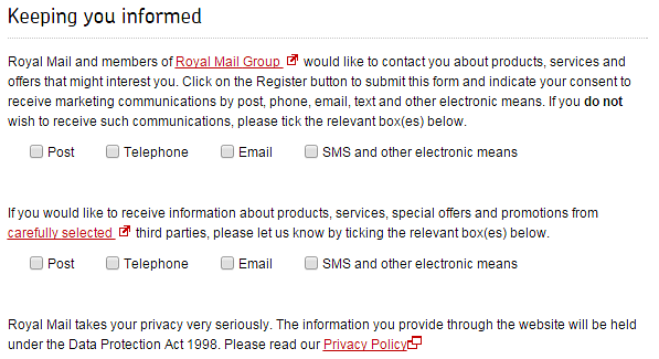
Once upon a time, customers generally opted in, or explicitly gave their permission. But today, many online retailers (perfectly legally) add customers to their lists by default and ask them to opt out. So subtle was this change I can imagine many missed it:
“If you do not want to receive such communications, please tick the relevant box(es) below”

Why have they done this?
Wouldn’t you rather opt in than opt out? Usability professionals agree that opting in is preferable. Opting out requires an extra step from customers, which imposes a burden, and can also be annoying. When we know that the key to increasing conversion rates is to make the checkout process as smooth as possible, why would anyone throw a spanner in the works?
The reason, of course, why opt out options are so common is that they work – if your definition of ‘working’ is compiling the biggest marketing list possible. Whether users don’t notice that they need to tick a box or simply can’t muster up the energy to say no, opt out options are effective, and companies end up with longer marketing lists.
And truly, as UX offenses go, requiring people to opt out is a misdemeanour rather than a felony, an irritation rather than an obstacle.
Playing with psychology
The real problem comes when opting out is confusing… or even deceptive. We call these dark patterns.
At best, requiring customers to opt out imposes a small burden. At worst, it is a dirty trick.
Some websites try to trick customers into not realising that they are failing to decline the option to opt out.
Was that last sentence confusing? That’s just what these sites are banking on.

Dirty tricks include:
- Using double negatives in opt out instructions (‘if you do not wish to receive such information by post, please untick the box’);
- Burying whether a tick represents a decision to opt in or opt out at the end of lengthy instructions (see Ryanair example);
- Switching between opt in and opt out requirements (see Royal Mail example).

These retailers seem to hope that customers will ‘accidentally’ end up on their mailing lists. Oops! Is that any way to start a relationship?
Opt out procedures do not need to be evil. If bookies can make it easier, surely retailers can as well.
Betting that easier opt out policies will have a benefit
Yes, bookies. In partnership with Glasgow Council, local bookmakers recently launched a pilot betting shop exclusion scheme. Gamblers looking to quit can now make just one phone call to request they be denied service at up to 36 betting shops in the city centre.
Two details about this scheme intrigue me:
- There are 36 betting shops in Glasgow city centre.
- Punters have long been able to exclude themselves from betting shops, but they had to do so:
- in person
- by filling in a paper form
- in every single shop they wished to be excluded from.
Not surprisingly, none of the betting shops lost much business under that programme(this will open in a new window). And compared to that, having to untick a box doesn’t seem so bad, does it?
By dramatically simplifying the opt-out process, both bookmakers and government officials expect that the new scheme will be much more effective in reducing problem gambling than the old system. Also, the sun will rise tomorrow morning, and the earth will continue to revolve around it.
Final thoughts
Opting out is more difficult than opting in. Does it need to be enormously more difficult? It does not. Respect your users, don’t trick them into receiving your marketing, and keep it simple.
You might also be interested in...
Applying the Three Lenses Model: How to Integrate MR, CX and UX Research
21 April 2026Knowing the three lenses is one thing — here's how to actually use them together without restructuring your entire research function.
Read the article: Applying the Three Lenses Model: How to Integrate MR, CX and UX ResearchThe Three Lenses Model: How MR, CX and UX Work Better Together
16 April 2026Most organisations run market research, track CX, and test with users — but they rarely connect the dots. Here's a model that does.
Read the article: The Three Lenses Model: How MR, CX and UX Work Better TogetherSynthetic Users and Digital Clones: A UX Researcher’s Honest Take
2 April 2026AI research tools promise speed – but at what cost to human insight? Are synthetic users and digital clones really the same, and do they truly work for UX research? We cut through the hype to share a clear, practical view: where synthetic methods add genuine value, where human insight remains essential, and how to tell the difference between synthetic users and digital clones in real‑world research. A must‑read for UX professionals, product teams, and researchers navigating AI‑driven testing.
Read the article: Synthetic Users and Digital Clones: A UX Researcher’s Honest Take