The UX of elections and voting
6 May 2015 - Chris Rourke

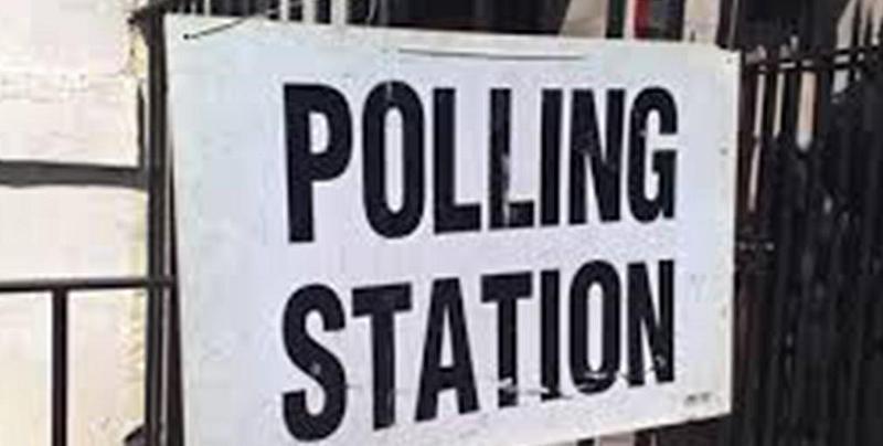
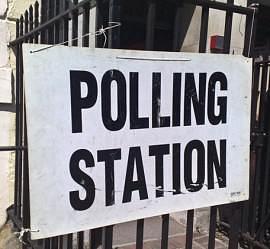
This Thursday after you close the curtain and carefully point your pencil to pick your preferred politician, pause for moment and consider the experience that you are having. How are you feeling? Anxious? Excited? Proud? Grateful? Undecided (still? You’re not alone).

Do you have any doubts about how you vote, especially if it’s your first time?
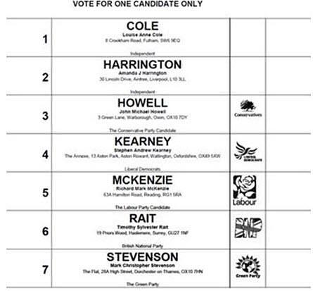
Hopefully the ballot paper is clear and the instructions are easy to follow. But if not then let your election monitors know because a lot of work has gone into making the process and materials as clear and easy a process as possible.
User Vision is fortunate to have been part of the process of improving the voting experience through our involvement in a project to review the voting experience and the design of ballots and instructions back in 2009.
As outlined in our case study describing the Electoral Commission project we conducted exploratory usability testing with dozens of participants in all parts of the country and with different designs of ballot paper and voting methods.
Our research found that everything from the layout of the ballot, the logos for the parties, party descriptions, slogans and the use of second languages (Welsh) could all impact the success or perceived ease of casting a vote.

The electoral system itself was sometimes an issue, with most people expecting a ‘first past the post’ style of voting although in some elections a proportional representation is required when rank ordering the options.
Perhaps you have already done your democratic duty through the post. Postal voting is increasingly popular but presented the greatest challenges in our research. A certain degree of origami is needed to fold, tear and put envelopes inside of other envelopes. Depending on where you live you may need to get a witness to your postal vote. And after all that you hopefully remember to sign your name or else that vote ends on the large pile of spoilt ballots that occurs every election.
At the risk of displeasing Russell Brand(this will open in a new window), I hope that you exercise your right to vote. It’s a case where the “Wisdom of the Crowd” will hopefully prevail somehow through the prism of our electoral system. And if you are interested in learning more about the user experience of voting the summary report from our project has been published and is publicly available from the Electoral Commission website.(this will open in a new window)
Happy voting!
You might also be interested in...
Applying the Three Lenses Model: How to Integrate MR, CX and UX Research
21 April 2026Knowing the three lenses is one thing — here's how to actually use them together without restructuring your entire research function.
Read the article: Applying the Three Lenses Model: How to Integrate MR, CX and UX ResearchThe Three Lenses Model: How MR, CX and UX Work Better Together
16 April 2026Most organisations run market research, track CX, and test with users — but they rarely connect the dots. Here's a model that does.
Read the article: The Three Lenses Model: How MR, CX and UX Work Better TogetherAre You Heading to the Right Moon?
3 April 2026If your digital transformation north star wasn't defined by evidence, your agile ceremonies and KPI dashboards will simply deliver you efficiently to the wrong destination.
Read the article: Are You Heading to the Right Moon?