Site down time killing your user experience?
25 September 2015 - Amy McInnes
At some point or another all websites have to perform maintenance of some kind. Maybe there’s a problem on the site needing fixed or improvements to the user experience to be made, and in many cases, maintenance unavoidably requires taking your site offline temporarily. But how does down time affect the user?
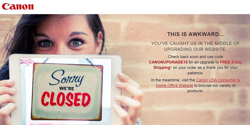
Such was the situation this week when I was looking for a specific photo printer from Canon’s website and I was faced with the inevitable holding page of doom.
In the case of Canon, I was initially frustrated. Frustrated I couldn’t quickly browse for the printer in question in my spare 5 minutes. However, kudos to Canon on this occasion for their approach to addressing the issue and keeping the user engaged:
My initial frustration was dulled by the friendly copy tone, openly admitting the issue and cause (always keep the user informed). Then I was pleasantly surprised at the hook to come back, using the principle of reciprocity to incentivise the user: ‘free two day shipping as a thank you for your patience’. This now not-as-frustrated user has a reason to come back to them over the competition.
Canon have managed to somewhat alleviate a potentially frustrating situation. We often stumble across many other holding pages that risk ruining the customer experience and driving even loyal custom elsewhere.
So what should you do if your site has to be down for maintenance? Important points to take from Canon’s example are:
- Build a custom maintenance page – avoid the use of generic 404 pages.
- Be descriptive – these pages are only temporary so let the user know that. Tell them this is a temporary page and indicate how long the site will be down for.
- Keep it simple – short and to the point. Don’t make users work too hard to figure out what’s going on.
- Address the issue, that this is inconvenient to your users – make users see that you understand this is a pain and you are doing all you can to speed things up.
- Keep things light hearted – humour in such situations goes a long way to improving a user’s perception of the site.
- Stay on brand – reassure users this is an official action by ensuring that the look and feel of the maintenance page is still the same as the rest of the site, e.g., provide the company logo and use the same colour scheme.
- Provide alternative content or reasons to return – money-off codes or links to related content will keep your users happy and away from the competition.
- Provide a contact – where possible provide a contact address or phone number and address any issues of concern.
Take the time to think about holding pages and always think about the user.
You might also be interested in...
AI Has a UX Problem: What the ISO RIA Systems framework Means for Trustworthy AI
6 July 2026AI is not just a technical challenge. It is a UX challenge, and the way people understand, trust and act on AI outputs matters more than ever.
Read the article: AI Has a UX Problem: What the ISO RIA Systems framework Means for Trustworthy AICreating Space for Surprise in User Research
1 June 2026Good user research creates space for surprise - exposing blind spots, challenging assumptions and helping teams make better decisions.
Read the article: Creating Space for Surprise in User ResearchDesigning for Cognitive Load: Why Accessibility Must Account for Mental Effort
15 May 2026Accessibility is not just about whether someone can technically use a product - it's about how much effort that use requires. This article explores why cognitive load is a fundamental accessibility issue, how it affects users, and what organisations can do to create clearer, calmer, more inclusive digital experiences.
Read the article: Designing for Cognitive Load: Why Accessibility Must Account for Mental Effort