Selfridges – User Experience Review
16 January 2015 - Ed Chandler

This article is published in January 2015 (this will open in a new window)Internet Retailing
Selfridges is aiming to stay ahead of the competition in the luxury shopping space by investing heavily in its multichannel business and focusing on responsive, touch first experiences.
First impressions
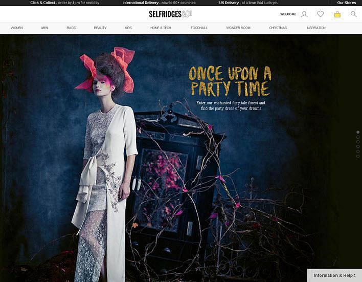
The homepage “touch first” ethos pays dividends when moving through content on a tablet or phone.
Whilst the imagery dominates the page, it is to the site’s advantage as vertical movement lends itself perfectly to touchscreen experiences moving through the different images with ease.
Such a layout focuses the customer to navigate through the primary navigation.

Key messages highlighting delivery and click & collect services are all clearly visible to promote confidence and trust.
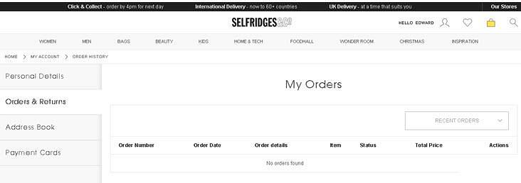
Selfridges have decided not to implement a simple “sign on and carry on functionality” as signing in means being transported to the account page.
As such this makes the journey more cumbersome if you sign in when you get to the site rather than at the point of sale.
The account management side and sign up welcome email is a lot less visually appealing.
It can be described as functional at best, especially as the left hand tabs force a new page load rather than just refreshing the main part of the screen – making this area rather slow and uninspiring.

In terms of accessibility of the site, it would currently fail a web accessibility audit from an initial check. Issues with alt tags and form labels were present.
On touchscreens, VoiceOver (from Apple) finds lots of hidden content on the homepage making it very difficult to navigate and use the site on a touchscreen device.
Navigation
The primary navigation is well thought through and clear. After selecting one of the menu options, the customer is presented with a range of options broken down into sections. This takes a few moments to scan though, but the use of headings make it easy to navigate.
Product pages and checkout
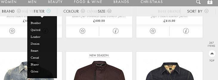
Product pages are fairly standard with the usual filtering options (styles, brand colours and size) down the left hand side, sorting options and the option to view the number of products on the page (across the top).
However, these options are lost as the customer scrolls down the page.
In comparison, Harvey Nichols have provided a filter and sort across the top, which drops down on click (or press) and follows the user as they scroll down the page.
This works much better as it is less intrusive and means it is available no matter how far down the page the customer goes.

The lack of a “view all” products is missed, especially for touchscreens which excel at the vertical movement to reduce page reloads (you can only see 60 or 180 products on one page).

The option to have a “quick look” at the product is available but the magnifying glass icon with a plus sign used to do this lends itself to “zoom” rather than a quick look.
On the desktop, hovering over a product with the mouse shows another view of the item but this is not available on touchscreen devices which makes for a less compelling experience and drops that touch first ethos.
Moving to an individual product page, everything looks as it should be although the size guide is a little disjointed from the size selections.
When looking at the additional information under the main product images, the “Selfridge says” and “Delivery & Returns” sections have an additional scroll bar.
This has the feeling of being unfinished and not-so-luxury.
The checkout process needs to be streamlined as there are multiple pages to go through in order to complete the transaction.
This is nowhere more evident than on the delivery pages as the second page has 90% repeated content on it. The additional page load just to get to this information slows down the customer and realistically this information should be incorporated into a single page view on delivery.

Adding a gift option is only seen if the customer specifically selects that call to action from the delivery options page, which means Selfridges miss an opportunity to up sell and add that luxury feel to their service.
On the final payment page, all the usual information is there to highlight trust in terms of payment security and the option of paying by PayPal to speed up the payment is welcomed.
Summary
The touch first design ethos pays dividends on the homepage when viewing on a touchscreens.
However as the customer moves through the site, the experience is less compelling, with ambiguous “quick look icons” and a lack of a “view all” (product category pages) followed by additional scroll bars and disjointed information (such as the size guide) on the individual product pages.
The account management and checkout need to be streamlined as multiple page loads slow the interaction down.
You might also be interested in...
The Three Lenses Model: How MR, CX and UX Work Better Together
16 April 2026Most organisations run market research, track CX, and test with users — but they rarely connect the dots. Here's a model that does.
Read the article: The Three Lenses Model: How MR, CX and UX Work Better TogetherAre You Heading to the Right Moon?
3 April 2026If your digital transformation north star wasn't defined by evidence, your agile ceremonies and KPI dashboards will simply deliver you efficiently to the wrong destination.
Read the article: Are You Heading to the Right Moon?Understanding Accessibility Drift - And How to Prevent It
12 February 2026Why accessibility standards erode after audits, and what continuous monitoring can do about it.
Read the article: Understanding Accessibility Drift - And How to Prevent It