‘Mobilegeddon’ – is your site mobile friendly?
23 April 2015 - Amy McInnes

From the 21st of April, a site’s ‘mobile friendliness’ will now play a key role in the way it is ranked on Google’s mobile search results. Key factors Google will be checking are load times, responsive design elements, and mobile best practise…basically all the elements that affect the user’s experience of a site viewed on a small screen.
Do the test
The algorithm change acknowledges the importance of having a site designed for mobile, such as through a responsive or adaptive design.
There are still sites that are not considering the mobile user experience, and as such, are failing to provide their users with the right content, in the right format, for the right journey. This in turn leads to high bounce rates, frustrated users, and low conversion rates.
Google therefore want to reward websites that do provide content that is ‘relevant and timely, but also easy to read and interact with on smaller mobile screens.(this will open in a new window)’
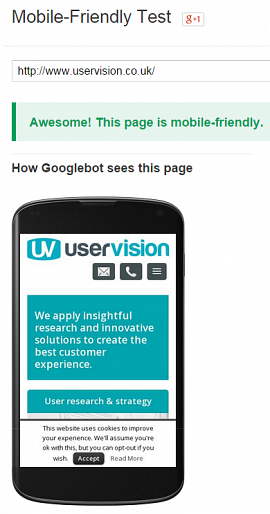
Do a quick check of your site with Google’s mobile-friendly test(this will open in a new window).
For example here’s the User Vision site:
Consider your mobile UX
To ensure that your website stays in the top search results, you need to make sure your site is user-friendly and relevant, across devices. Areas you should address that Google will favour:
- Reduce page load times
- Provide readable text sizes
- Remove the need to pinch and zoom
- Supply content that fits into the screen removing unnecessary scrolling
- Increase spacing around links/elements is implemented to ease tapping of required content
- Remove the requirement for Flash
What this means
No longer is it OK for the mobile experience to be as good as the desktop, it should be better. To do this, it’s key that you understand your users and offer up the right content/experience to them on their mobile.
This update will certainly hurt the rankings of those companies who have ignored mobile so far. However from a UX perspective, these users were already getting a poor experience so hopefully this will encourage businesses to change…to consider the user!
You might also be interested in...
AI Has a UX Problem: What the ISO RIA Systems framework Means for Trustworthy AI
6 July 2026AI is not just a technical challenge. It is a UX challenge, and the way people understand, trust and act on AI outputs matters more than ever.
Read the article: AI Has a UX Problem: What the ISO RIA Systems framework Means for Trustworthy AINothing About Us Without Us: What CRPD at 20 Means for UX
16 June 2026As the Convention on the Rights of Persons with Disabilities turns 20, this article asks what “Nothing About Us Without Us” should mean for UX in practice. It argues that accessibility is not just about testing whether something works for disabled people, but involving disabled people earlier in shaping what gets built.
Read the article: Nothing About Us Without Us: What CRPD at 20 Means for UXKano as a Lens for Innovation and Competition
4 June 2026How Kano explains innovation, disruption and competitive advantage.
Read the article: Kano as a Lens for Innovation and Competition