Google play store – User Experience Review
3 December 2014 - Alan Blackwood

This article was published in September 2014 edition of Internet Retailing(this will open in a new window)
Although not the only App Store option available to Android users, the Google Play store is the main digital distribution channel for the platform and the main rival in terms of revenue to Apple’s iTunes store.
According to recent analysis(this will open in a new window) Google Play’s mobile app revenue will outstrip iTunes’ by 2018. Average revenue per user(this will open in a new window) on the Android platform is around 25% of that on Apple’s iOS but Android’s 80%+ handset market share means that sheer volume of users will push its total app revenue above Apple’s.
Unlike Apple’s ‘mobile and desktop application only’ approach, there is a fully functional web version of Google’s store. So how does the online shopping experience stack up? And what can Google do here to better sell the proposition to Android users of extending handset functionality by spending more time and money in its app store?
First impressions
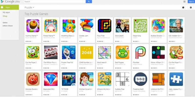
The homepage presents clear routes to further item detail. Under appropriate category titles, each app, movie or other item is given its own ‘card’ with the expected detail of a small graphic, the item’s and developer’s/author’s/artist’s names and the price.
How much?
However, Google has recently taken the decision, motivated by a request from the European Commission(this will open in a new window), to stop labelling apps that feature in-app purchases (IAPs) as ‘Free’. Confusingly, free apps on Google Play that do not include IAPs are now no longer labelled as ‘Free’ either.
The upshot is that the majority of apps are listed with no price information at all, meaning that there is still no quick means for a time-pressured parent, for example, to quickly distinguish between ‘Free’ and ‘Includes IAPs’ without clicking into each items’ product page.

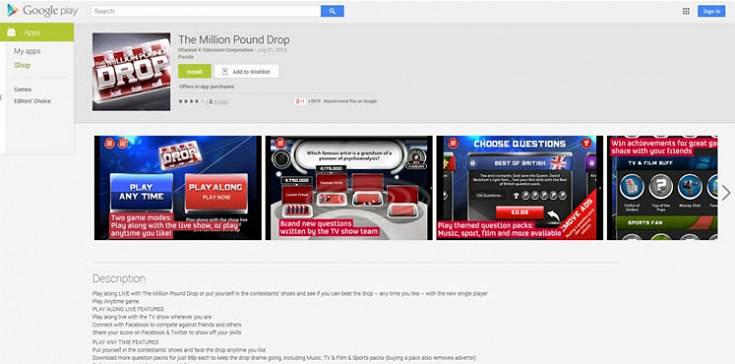
Only when you get to the product page is an explicit text description included: ‘Offers in-app purchases.’ underneath the ‘Install’ and ‘Add to Wishlist’ calls to action. This is not accompanied by bold formatting or a recognisable icon though, limiting the likelihood of it being noticed by someone quickly scanning the page.
Search
Search works well if you already have a good idea of what you are looking for with predictive auto-complete making useful suggestions as you type.
However, the only options for filtering results are by Store section (Music, Books, etc.) and by Price. Again the Price filter options are interesting in light of the EU intervention as the two choices presented are: ‘Free’ and ‘Paid’. Including an ‘In-app purchases’ option here would go further to aid transparency in this regard.

Browsing the site
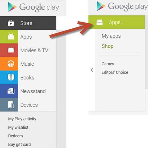
The navigation panel on the left of the homepage neatly delineates the main sections in the Store. Bold colours, clear text labelling and easily recognised icons capture your attention and provide obvious starting points to navigate to the main sections of the site.
Once you make a selection, Google employs a somewhat unconventional approach as all primary options are replaced by an often very short list of secondary options specific to the current section of the site.

This is a somewhat puzzling design decision as ample vertical and horizontal space appears to be available to accommodate a more familiar expanding navigation system. This would also offer the twin benefits of a persistent reminder of the other sections contained in the site and more direct access to them.
This approach also introduces an extra hurdle for screen reader users who will be forced to tab to the page body via all of the secondary navigation options each time they move to a new page.
Other navigation-related accessibility issues are present when moving through category index pages.
Not only do the descriptions used for some item links give insufficient indication of context (for example, the ‘See more’ action buttons) but the image for each app store ‘card’ is set to be hidden from screen readers meaning that these users will be operating with a reduced set of information when browsing these pages.
Completing a purchase
Unless you are logged in and have activated Google Wallet, there is no way of completing the purchase process.
This is slightly more restrictive than the iTunes Store which allows you to associate a credit card with an account but may in fact be a preferable approach to those at the more paranoid end of the security consciousness spectrum.
Conclusion
Browsing the Google Play store can be a frustrating experience. You are quickly given the impression of a large amount of content across many categories.
However, unless you already have a good idea of what you are looking for, tracking down something interesting can involve a surprising amount of effort.
Serendipity can be a powerful selling tool as Amazon’s cross-selling efforts demonstrate – maybe Google should be putting temptation more firmly in the path of its potential customers by making it easier to stumble across hidden gems within its store.
Summary
It may not be the main revenue stream for search and advertising giant Google, but a little attention to navigation and search operation could reap greater dividends from its Play store.
If you know roughly what you’re looking for, there will almost certainly be something here to interest you.
However, some eccentric navigation design decisions mean that the happy accident of stumbling across a hidden gem while browsing the site is surprisingly unlikely.
Addressing these issues could help Google raise the rate of app purchases among Android users, an aspect of its business that currently lags some way behind rival Apple.
You might also be interested in...
Applying the Three Lenses Model: How to Integrate MR, CX and UX Research
21 April 2026Knowing the three lenses is one thing — here's how to actually use them together without restructuring your entire research function.
Read the article: Applying the Three Lenses Model: How to Integrate MR, CX and UX ResearchThe Three Lenses Model: How MR, CX and UX Work Better Together
16 April 2026Most organisations run market research, track CX, and test with users — but they rarely connect the dots. Here's a model that does.
Read the article: The Three Lenses Model: How MR, CX and UX Work Better TogetherAre You Heading to the Right Moon?
3 April 2026If your digital transformation north star wasn't defined by evidence, your agile ceremonies and KPI dashboards will simply deliver you efficiently to the wrong destination.
Read the article: Are You Heading to the Right Moon?