Faceted navigation for policies & parties
7 May 2015 - Chris Rourke

When it comes to navigation and information architecture, we often find a good solution is a “faceted navigation” built around the way people naturally choose to find information and providing a flexible and intuitive user journey.
Many people feel confused about understanding where the parties stand on various issues.There are many issues and (this time especially) so many parties. So how can I understand it all?
A good faceted navigation lets people find information by the way that best suits them, providing a sense of control while foraging for information. It can also let the user ‘pivot’ from one facet to another and see the content from another perspective.
The BBC provides an admirable example of faceted navigation to help readers navigate this potentially confusing area.
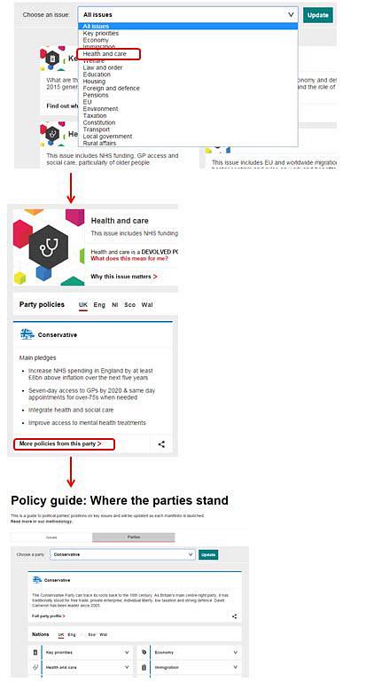
The BBC Manifesto Guide(this will open in a new window) provides a simple example of faceted navigation, with two main facets to let the user find policy information by party or party information by policy and pivot between the two.
In the context of understanding the issues in the election and what each party stands for, a voter might want to understand the policies or pledges of a given political party across all of the issues – i.e what are their policies from their manifesto. For example they may wish to know “What are the Liberal Democrats’ policies” and then drill down into specific policies for that party or even compare those to other parties.
The information hierarchy or path in that case would be : Party (Liberal Democrat) > Policy Topic (e.g. Environment).
Equally they may want to focus their comparison around a specific issue – “What are the policies of the different parties for the NHS and healthcare?” and then drill down from there into the individual parties.
There the information hierarchy would be : Policy Topic (e.g. Healthcare) > Party (The Conservatives).
Either way the user is able to navigate through the information the way they want, regardless of if they start by the Policy facet or Party facet.
This type of navigation, which lets the user play by their own rules to find information is a feature of many usable sites that provide a reassuring intuitive user experience.

You might also be interested in...
Applying the Three Lenses Model: How to Integrate MR, CX and UX Research
21 April 2026Knowing the three lenses is one thing — here's how to actually use them together without restructuring your entire research function.
Read the article: Applying the Three Lenses Model: How to Integrate MR, CX and UX ResearchThe Three Lenses Model: How MR, CX and UX Work Better Together
16 April 2026Most organisations run market research, track CX, and test with users — but they rarely connect the dots. Here's a model that does.
Read the article: The Three Lenses Model: How MR, CX and UX Work Better TogetherAre You Heading to the Right Moon?
3 April 2026If your digital transformation north star wasn't defined by evidence, your agile ceremonies and KPI dashboards will simply deliver you efficiently to the wrong destination.
Read the article: Are You Heading to the Right Moon?