Creating Valuable Personas
27 January 2021 - Mark Haley
.png)
Personas, what are they?
Interaction-design.org defines them as:
Fictional characters which you create based upon your research in order to represent the different user types that might use your service, product, site, or brand in a similar way.
Why would they be useful to you and your team? Once again, interaction-design.org states this excellently:
Creating personas will help you in understanding your users’ needs, experiences, behaviours and goals. Creating personas can help you step out of yourself. It can help you recognise that different people have different needs and expectations, and it can also help you to identify with the users you’re designing for.
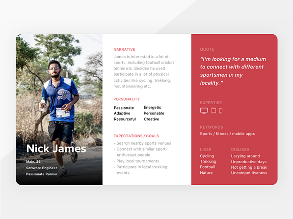
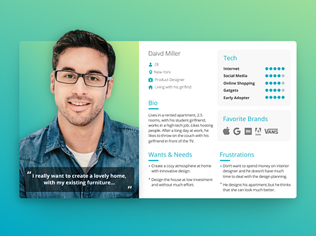
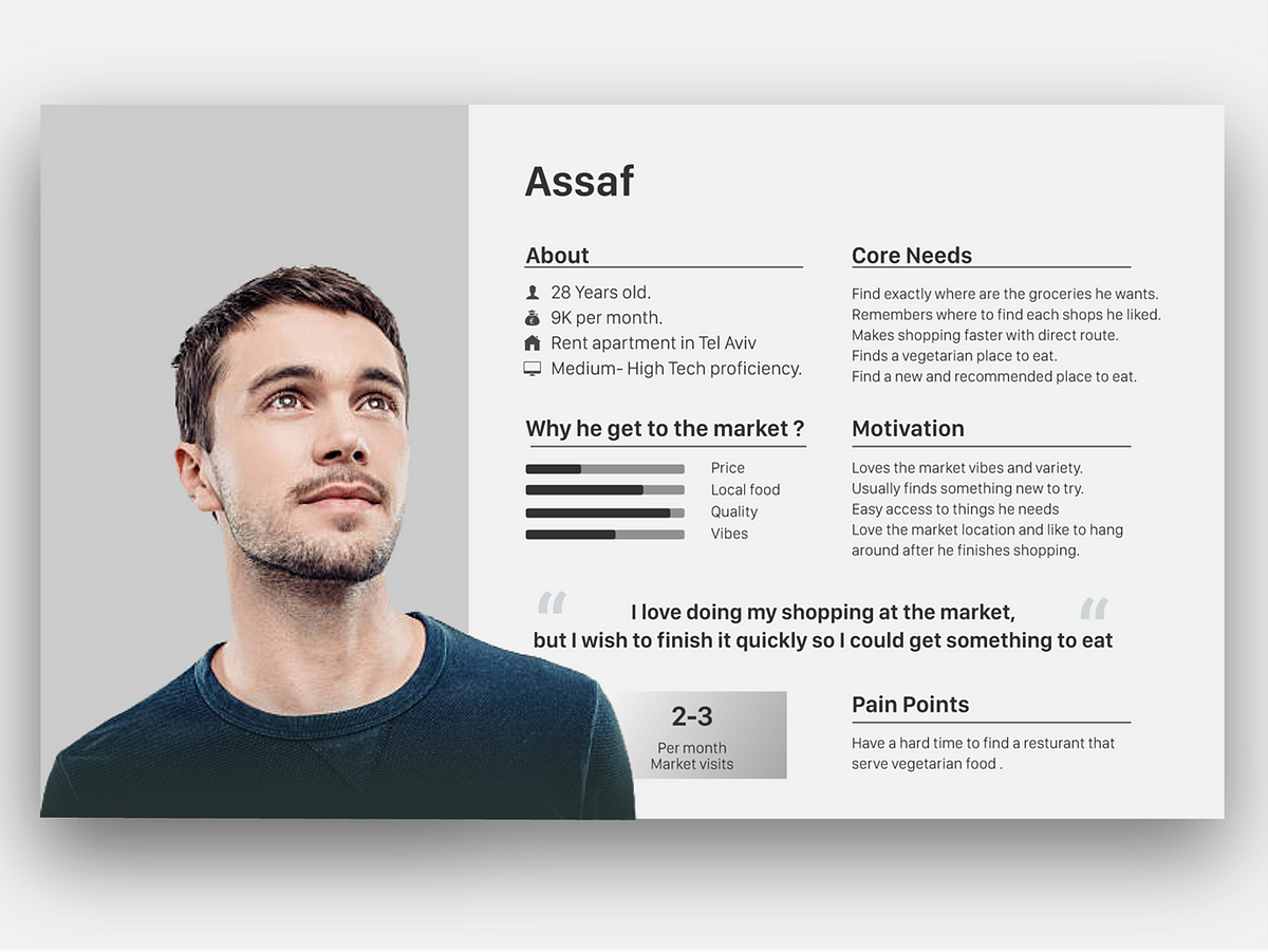
The following are a few examples of how a persona might take shape:
Personas often find themselves following certain templates, with key sections that most should include. Regardless of the data and metrics that are only relevant to each individual project, I have highlighted three key sections that are valuable to include in a persona in order to help build that relatable character we’re aiming to understand and learn about.
Those three sections are:
1. Personal Information
This includes any information about the user is relevant, perhaps age, gender, occupation, or where they live? This section can vary massively, but general information allows your user to come to life and build those human qualities we can build empathy with.
2. Wants and needs
Another way of phrasing this section could be ‘user goals’. In the context of the product or service, what is this user trying to achieve? What are their goals? What does success look like for this person? This content should be clearly defined and displayed quite prominently within the persona. The wants and needs should be kept to as few words as possible, in order to cut away any fringe material and get straight to the point of what this user is trying to do.
3. Frustrations
A counter to the wants and needs of the previous section are the frustrations. What is stopping this person from being able to complete their goals? Perhaps this is related directly to your product, or it could be something totally different that still has an impact on this user and how they might interact with a product. An example of this could be childcare, a responsibility that a parent has that may not have anything to do with your service, but changes their situation and ability to interact with or use your service.
How do we make a persona more valuable?
Now we have the base template for our persona, including the key sections we know are important to include. How do we take that a little further and add more value to the final deliverable?
Tip 1: Make it personable
A good way of building empathy with the user is by representing them with a photo of a real person, which sparks that human connection between the client/stakeholder and the user groups. The goal here is to allow people to relate and connect directly to the persona, and including a photo helps bridge the gap in a more effective way than simply an illustration or a text description.
Tip 2: Make it consumable
Another way of adding value to a persona is to be intentional about the way you display your data and making sure that it’s done in an easily consumable format. Data visualisations play a large part in someone understanding and engaging with the content they are being shown. Designing the data to be displayed in a way that makes sense for those who are going to be reading it, and not just for you (the designer), is important.
Here are a few examples of data visualisation, and some comments about the way in which the data is displayed.
Choosing the right type of graph or chart for your data is also an important factor in allowing it to be easily read.
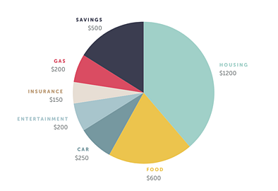
While a pie chart can definitely be an effective visualisation, it does have a drawback: different sections can often look quite similar in size, especially if they aren’t right next to each other, which can make it difficult to differentiate between segments. For example, referring to the above image, Savings at $500 and Food at $600 look like they are similar in size. Even though the data included could all be accurate, there is often too much to consume at a glance for the reader to be able to pick out a certain data set and fully comprehend what’s being shown. Although the exact figures being labelled is a good addition to the pie chart, there are other ways that may be more effective in displaying this kind of information on a persona, for example, a bar chart or a spider diagram, which are effective ways of showing relative differences in a glanceable format.
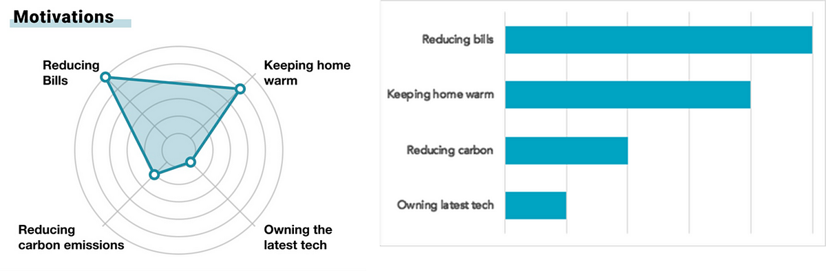
Tip 3: Make it creative
This is an example of how adding a creative twist into the way you show data can be both engaging and easy to understand.
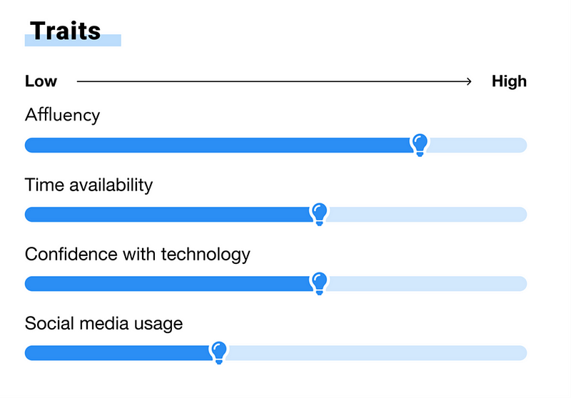
This example shows the traits of a persona who is a potential customer for an energy-saving company. This data includes an illustration relevant to the context of the persona (energy consumption) where the bar chart is topped off with an illustration of a lightbulb. This allows the figures to be presented in a way that is fun and relatable for stakeholders, but also in a format that is both clear and readable. If possible, try and include a creative visual to mould your data around the context of the persona. This could range from full illustrations, to relevant icons, or even just the colours chosen.
How do we make the personas process more valuable?
As well as making the personas themselves as useful, usable and engaging as possible, the journey of creating the personas is as useful as the final artefacts themselves. In order to keep persona development as a team sport, consider the following:
Involve the stakeholders
Personas aren’t a solo effort! It’s a great idea to involve the project team as often as possible. It doesn’t matter if you are an external party that’s creating the deliverables, or part of the product team internally, having extra minds involved helps keep the outcomes focused on the relevant content. It’s also important to remember throughout the project, but especially at this stage, that the data contained in the personas should ALWAYS be based upon real data from end users and not assumptions made by the project team.
Workshop them
Validate each draft of the persona content regularly by facilitating workshops with the rest of the stakeholders. At an early stage in the creation of the deliverables this can be text-based, with a rough outline of sections and topics that will be included. Once a rough structure for the personas has been agreed, a design can start to be drafted and iterated based on feedback. Getting everybody in a room with large print-outs of the personas and a stack of post-its and sharpies is a great way of sense-checking the personas and getting alignment within the team. In the days of remote working, where being in a room together isn’t as easy as we would like, online collaboration tools like Miro are a great way to facilitate this sort of workshop in a way that allows everyone to be involved and collaborate at the same time!
Personas are an excellent research output when used correctly and can play a big part in keeping the product and design teams grounded, in touch with their users and in sync with each other.
You might also be interested in...
Nothing About Us Without Us: What CRPD at 20 Means for UX
16 June 2026As the Convention on the Rights of Persons with Disabilities turns 20, this article asks what “Nothing About Us Without Us” should mean for UX in practice. It argues that accessibility is not just about testing whether something works for disabled people, but involving disabled people earlier in shaping what gets built.
Read the article: Nothing About Us Without Us: What CRPD at 20 Means for UXThe Third Key: Why Social Access Is the Missing Piece in Inclusive Service Design
8 June 2026Social access is the missing piece in inclusive service design. Read Chris Rourke’s latest thinking on creating services that work better for more people.
Read the article: The Third Key: Why Social Access Is the Missing Piece in Inclusive Service DesignKano as a Lens for Innovation and Competition
4 June 2026How Kano explains innovation, disruption and competitive advantage.
Read the article: Kano as a Lens for Innovation and Competition