ASOS visual search: A new way to look for clothes online?
20 September 2017 - Jessica Cameron

We at User Vision love ASOS – as the steady stream of packages we get delivered to the office will attest – but so much of that love is because they deliver a top-notch user experience. The search functionality is great. (Of course, with 85,000 items in their catalogue, it has to be.) The search tool delivers reasonable suggestions, tells users how many results they will see, and returns accurate results. So we were naturally intrigued when we learned that ASOS had started offering visual search in their iOS app.
ASOS are not the first retailer to use visual search(this will open in a new window), but they are one of the largest(this will open in a new window). ASOS say that 80% of their traffic and 70% of their sales in the UK happen on mobile, so they are certainly motivated to provide a best-in-class user experience. Does this new feature deliver?
First impressions
I downloaded and opened the app on my iPhone, and was drawn in by an engaging ambient video on the home screen. I went on to the landing page for women, where I expected to see a prominent banner advertising this new functionality – or at least some clear way of accessing it. But although there were promotions for sale items, and even a tooltip explaining one of the more mysterious icons in the bottom navigation, there was no clear route into the visual search tool – or into search at all, for that matter.
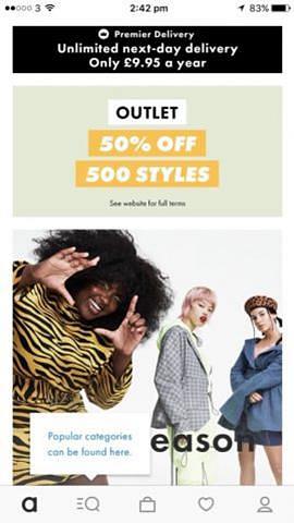
I went ahead and clicked that mysterious icon – a mildly horrifying combination of a magnifying glass and a hamburger menu – and, as suggested by the tooltip, it did take me to a page of product categories. With a search bar. And a very small camera icon. Which, when tapped, prompted me to pick an image source. Could this be it?
.jpg)
Testing the app
I started out tough, putting the app through its paces with a photo of my three-year-old in an Elsa dress. Bring it, ASOS.
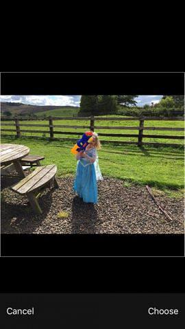
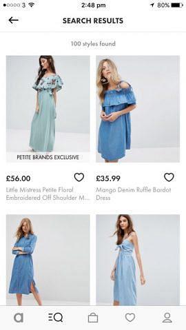
I must say, they met the challenge I set admirably.
I could have done without the petite selections, but there was no way to refine or filter the search results. Providing that degree of control would make it easier to shop, by reducing the burden on the user – because really, who wants to click into an appealing item only to find out it isn’t available in your size? A better user experience would let customers be sure that all of the options they see are items they can actually purchase – which would likely increase conversion rates, too.
Next, I chose a photo of a skirt that I had taken in advance of listing it on eBay. The picture wasn’t great, and neither were the results.
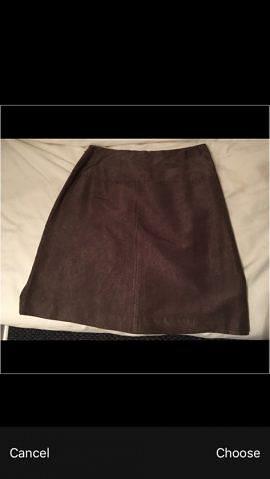

A total of 85,000 items, and no matches? Although to be fair, since all of ASOS’ photos are of items on models, I suppose it makes sense that the visual search would work better on clothes that are being worn rather than draped flat on a sofa.
Finally, I took a selfie of myself wearing a top that I had actually bought on ASOS a couple of months ago. That item isn’t still available, but a dress with the same print is. Would that dress come up, or would the app limit me to shirts?
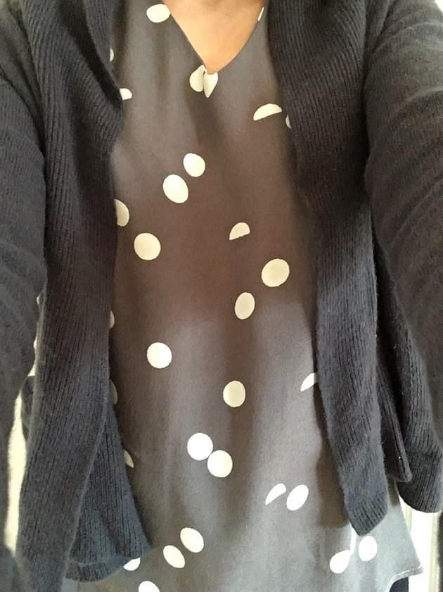
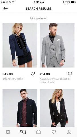
Interestingly, the app focused on the outermost article of clothing I was wearing – a cardigan – and gave me results that also incorporated the circle motif. Military style jackets were not at all what I had in mind, though, so I tried again with cardi removed.
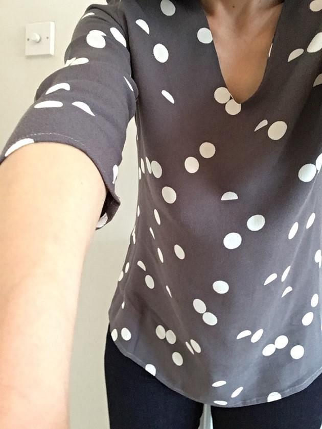
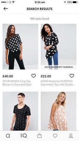
I saw some very nice spotty tops, but not the matching dress. While it would have been interesting to see that option pop up, in case I hadn’t been aware of it before, it ultimately would have been a distraction from my search for spotty tops. Limiting the search results to similar articles of clothing arguably makes for a much more consistent and predictable user experience.
How is the overall user experience?
Overall, the app is great fun to use, and even somewhat addictive – I’ve covered only a very small percentage of the total number of searches I’ve done here, and haven’t included any of the photos I took of strangers’ shoes.
However, there are a couple of key improvements to the user experience that would elevate the visual search in this app from a mere plaything to a powerful purchasing aid.
Right now, the visual search feature is like a cool secret – albeit one with extensive media coverage – that’s only available to users who know to look for it. While mystery UX hasn’t hurt Snapchat, it’s not necessarily reasonable for retailers to assume that devotees will persevere to figure out how to use the app. We often see in user testing that web conventions, from hamburger menus to asterisks on required fields, are far from universally understood. Making the functionality more transparent would open it up to a wider audience, which I would argue is a good thing.
The ability to filter results would also help. While it’s interesting to see the whole range of options in ASOS’ catalogue that match my photos, from men’s three piece suits to petite maternity swing tops, if I’m looking to make a purchase I really only want to see those options that are available in my size.
Visual search is still a very new technology, and it will be interesting to see how retailers harness it as it develops further. I’ll look forward to exploring future releases of the ASOS app – and perhaps ordering a few more black and white packages.
Have you tried ASOS’ new visual search? What do you think? Let us know in the comments.
You might also be interested in...
Applying the Three Lenses Model: How to Integrate MR, CX and UX Research
21 April 2026Knowing the three lenses is one thing — here's how to actually use them together without restructuring your entire research function.
Read the article: Applying the Three Lenses Model: How to Integrate MR, CX and UX ResearchThe Three Lenses Model: How MR, CX and UX Work Better Together
16 April 2026Most organisations run market research, track CX, and test with users — but they rarely connect the dots. Here's a model that does.
Read the article: The Three Lenses Model: How MR, CX and UX Work Better TogetherUser Vision Joins the New DOS 7 Framework - Making Public Sector UX Procurement Simpler
1 April 2026User Vision has secured a place on the Government Commercial Agency (previously CCS) new Digital Outcomes and Specialists 7 (DOS 7) framework - making it faster and simpler than ever for public sector organisations to access specialist user research, accessibility, and user-centred design services.
Read the article: User Vision Joins the New DOS 7 Framework - Making Public Sector UX Procurement Simpler