Airline web accessibility – Part 6: Qantas
13 July 2016 - Ed Chandler

Qantas

Today we travel down under to see how accessible Qantas’ website is. (Its winter in Sydney, so only a little bit warmer than summer in Edinburgh.)
Route searched: Los Angeles (LAX) to Sydney (SYD)
General Experience
Like Delta, Qantas provide a variety of “skip to” links on the homepage. We are still not convinced by this approach, but with the DOT mandating seven key functions we can see why they have been implemented that way.
The second thing we noticed about the Qantas site is the lack of visible focus. This gives us great cause for concern and suggests that they have not fully considered the range of people with disabilities that will likely be accessing their site. Given it is such a simple CSS fix and is clearly referenced in WCAG 2.0 Level AA (2.4.7 Visible Focus(this will open in a new window)), this makes us wonder what other barriers have not been addressed.
Tabbing through the main menu (avoiding the “skip to” links for now), it feels like there hasn’t been a lot of attention paid here as the site forces the user to tab through all the sub menu items by default. There is no obvious way to move through the top level navigation. This is where the way the DOT have implemented the roll out could allow some cracks to come through, as there is no directive message to say that the homepage or navigation menu need to be accessible.
Booking Flow
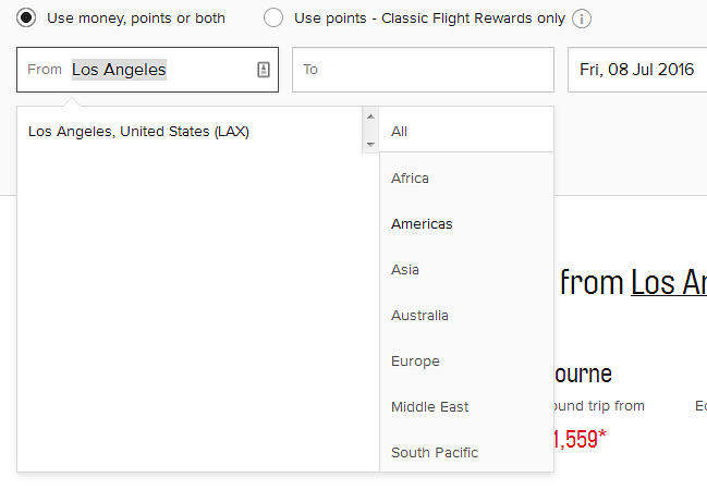
If skip to link “flight bookings” and head straight to the booking widget, we can tell that accessibility has been included as the various tabs are announced correctly by the screenreader. The method of payment radio buttons could use a fieldset and legend to help provide greater context. The airport form fields generally work well; however, mouse users have access to additional functionality to search by region/continent which is not available to keyboard users.

The date picker is not keyboard accessible, forcing users to type in the date. As we have observed previously, a lack of flexibility here causes errors. Keyboard users are prevented from progressing past this field without a correct entry, but the associated error message is not announced by screen readers. This means that blind users are trapped without understanding why. Many blind users would probably stop here if they encountered this issue, and we are still on the homepage!
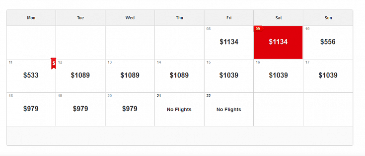
When “flexible dates” is chosen the site doesn’t help out keyboard users very much. Although the prices can be tabbed to, the user has to tab through all the options and cannot navigate the section quickly.

As there are two of these calendars (one for outbound and one for return), the site makes keyboard users work hard in order to get to the next stage. For screen reader users, the situation is worse as when tabbing through they only hear the price and not the date that the price is connected to. The date is only announced once the price is selected.
Moving on to the search results page, Qantas have added some good accessibility features as the flight number links provide descriptive information regarding the flight details (e.g., departure and arrival times, airports, number of stops, etc.). Unfortunately, this feature hasn’t been implemented in the most thoughtful way. For example, the arrival details (e.g., airport and time) are announced before the departure details. Currently it feels jumbled and incoherent, which is not how it is displayed visually, so we’d say this would fail under WCAG 1.3.1 information and relationships(this will open in a new window) because the visual relationships of times and locations is not communicated to screen readers.
Misleading instructions provided to screen reader users also add confusion. Specifically, the text “Press enter or space to open Saver fare family conditions. This will open a new tab or window in your browser” is inaccurate as spacebar or enter actually select that fare. More attention is definitely needed in this section.
Once a fare is selected the user still has to tab through lots of options, as we have seen before. Qantas may want to look at ways to remove these non-selected flights from the field of view like industry leaders do.
It is difficult if not impossible for keyboard users to change their fare once selected. This is because the options (prices) are actually radio buttons, and the keyboard focus does not go into these radio buttons once a fare has been selected.
Moving onto the to the passenger details, we felt the contact number form fields (mobile, daytime and evening) could have been better presented by using a fieldset and descriptive legend, as the country code drop downs do not have descriptive labels to indicate which number they are associated with. The car hire button only states “view options” and does not provide the wider context, so screen reader users will not be aware what options they can view. Finally, after selecting “continue” a modal window appears summarising the passenger information. As we have seen previously, modal windows can be a source of misery but this one has been implemented well, which is great.
On the payment page, the radio buttons regarding travel insurance costs do not have sufficiently meaningful labels so screen reader users may not understand what the amounts relate to. Wrapping these in a fieldset and legend would likely solve this problem. The rest of the payment page works as we would expect which is good.
Summary
It appears that Qantas have spent time trying to implement accessibility of the site but it is some way off the mark of where it needs to be. From our review, Qantas definitely need to seek further advice on the ordering of information for screen readers and making visually presented information accessible programmatically. Finally, the lack of consistent and custom visible focus means a definite fail which is really disappointing, given how easy a fix it is.
Final score: 3/5
See our previous reviews for:
You might also be interested in...
The Speed Camera Problem: Why Continuous Accessibility Monitoring Beats the Annual Audit
24 April 2026Most organisations treat digital accessibility like a fixed speed camera - everyone slows down for the audit, then immediately speeds up again.
Read the article: The Speed Camera Problem: Why Continuous Accessibility Monitoring Beats the Annual AuditUser Vision Joins the New DOS 7 Framework - Making Public Sector UX Procurement Simpler
1 April 2026User Vision has secured a place on the Government Commercial Agency (previously CCS) new Digital Outcomes and Specialists 7 (DOS 7) framework - making it faster and simpler than ever for public sector organisations to access specialist user research, accessibility, and user-centred design services.
Read the article: User Vision Joins the New DOS 7 Framework - Making Public Sector UX Procurement SimplerUnderstanding Accessibility Drift - And How to Prevent It
12 February 2026Why accessibility standards erode after audits, and what continuous monitoring can do about it.
Read the article: Understanding Accessibility Drift - And How to Prevent It