Airline Web Accessibility – Part 3: Norwegian Air.
8 July 2016 - Jessica Cameron
Norwegian Air
Next up is the entry on behalf of Europe: Norwegian Air.
Route searched: Oslo (OSL) to Fort Lauderdale (FLL)
General Experience
On the Norwegian site, visitors who press the tab key are offered a link to ‘enable accessibility mode’. Out of a sense of fair play, we limited our review to this version of their site.
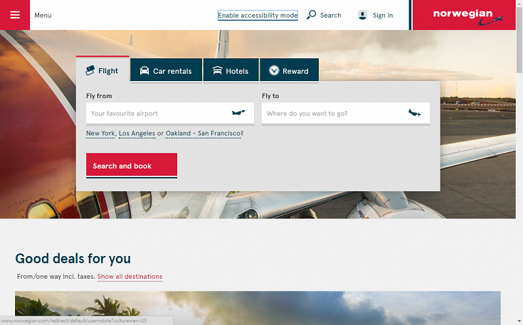
Accessibility mode
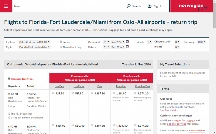
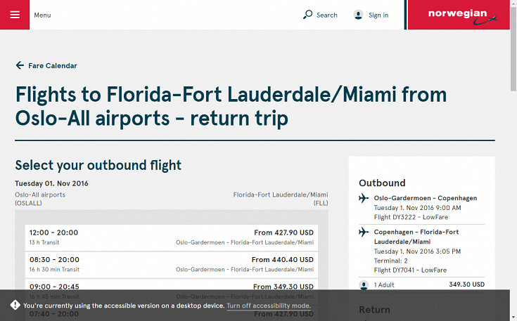
Although the first page of the site appears the same, later pages are presented differently – for example, flight search results are shown in accordion menus rather than in a table with radio buttons, mirroring the mobile version of the site. The risk in taking this ‘separate but equal’ approach is that the alternative version of the site may suffer: it may have less content, less frequently updated content, and/or less functionality thereby providing disabled users with a second class experience. For example, at a glance, it appears that flight options and prices are easier to compare when laid out in a grid than when presented in separately expandable menus.
Once this mode is enabled there is a continually present alert message at the bottom of the screen that users are in accessibility mode. Unfortunately, it can obscure content, form fields and calls to action for sighted keyboard users, making it more difficult for them to use the site.
Whether or not there is any loss of content will depend on the delivery method of this alternative version and we could not easily determine how the alternative interaction is being serviced. Whilst the DOT allowed for individual pages to have an alternative version they specifically ruled against alternative sites.
As the “enable accessibility mode” is the first link on the page, it can be missed. NVDA routinely causes these links to be skipped across sites, and focus may automatically go to the menu (which happened to us). As not all disabled users will have access to the accessibility mode link, some may be locked out further in the booking process.
For all of the above reasons we would advise against this method of delivery and encourage an accessible site that everyone can use.
Booking Flow
The flight booking widget on the homepage has good accessibility features, but NVDA kept on reading the page title when moving through options, which was quite frustrating. Although the return/one way radio buttons have a fieldset and legend, the legend of “direct / transit” is not very meaningful or clear. More care and attention is needed on labels, and this is a theme across the site.
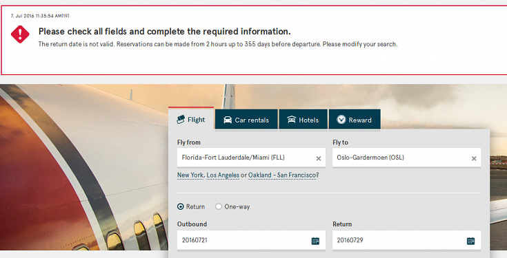
Users can type in dates directly rather than using a date picker; however, a lack of flexibility can make this task difficult as well. We found that the return entry field only accepted the date format if hyphenated. Missing the hyphens out or using a “/” as the separator caused errors for this form field, and the associated error message did not clarify the issue. This is exactly the type of issue that locks out disabled users. We recommend that Norwegian perform more stringent testing and provide greater flexibility with date entry.
Choosing to use the ‘low fare calendar’ presents additional accessibility issues and inconsistencies. The next month button on the outbound calendar has no label but it is labelled for the return leg. All keyboard users are forced to tab through the entire month of both departure and return to choose dates and reach the ‘show flight departures’ call to action. With up to 31 days in a month, that’s a lot of key presses to get to the next page. Going back or forward a month in the return flight options brings focus to the bottom of the page – a shift in focus that is not visible or predictable – and then requires the user to tab backwards through two months of options.
On a positive note, the date entries are programmatically associated with descriptive labels that communicate key information about each flight option. For example, after navigating to 2 December, NVDA announces ‘Mon column 2 December 5 selected fare is 202.6 USD button this is a direct flight’. Users hear the day, date and price of this flight, that it is direct, and that the field is a clickable button.
Moving onto the flight selection page, again we see inconsistencies with labelling as the link “1 stop (2h 20m) in Copenhagen” is spoken by the screenreader as “transit button”. On this page, it would be useful if each flight option was labelled as such, i.e., “flight option 1 22:00 to 15.30….” to give greater context to screenreader users. This labelling could then be tied to the fare options so users know which prices are related to what flights.
After choosing a specific fare option, sighted users see a tick mark appear next to that choice. Screen reader users do not have immediate access to the same information; screen readers announce previously selected details of the flight (e.g., the departure airport and the date) without confirming that a fare has been selected. Clear messaging that a fare class has been selected should be given focus at this point.
Passengers have the option of logging in to an existing account. However, these fields are labelled as aria-required=’true’, meaning that a screen reader announces these optional fields as required – which can mislead users of assistive technologies.
Although it is possible to complete the checkout process using a keyboard, form control labels and links in this section do not always provide the full context that screen reader users need to enter their details correctly. Additional information is often visually but not programmatically associated with related form fields, leaving screen reader users unaware of those relationships. Two examples are the ‘redress number’ field, which has supporting text placed underneath the field but not included in the descriptive label, and an informational link next to a checkbox that is simply announced as ‘read more’ to screen reader users.
Summary
Having a specific alternative version of Norwegian’s site may increase expectation that it delivers a more accessible experience. Unfortunately, it poses a fair few barriers to accessibility and does not provide a seamless experience for users with disabilities. Implementing more direct ways to allow keyboard users to navigate between options would streamline and enhance the experience. Norwegian should also consistently associate descriptive labels with form fields and links throughout the booking flow, to make sure that all users have access to the same information. Finally, with this implementation there is a risk that accessibility could be relegated to a ghetto; we hope that Norwegian Air will work towards fully integrating accessibility features within their primary site.
Final score: 3/5
Check out how the other airlines in our mini-series compare:
You might also be interested in...
Designing for Cognitive Load: Why Accessibility Must Account for Mental Effort
15 May 2026Accessibility is not just about whether someone can technically use a product - it's about how much effort that use requires. This article explores why cognitive load is a fundamental accessibility issue, how it affects users, and what organisations can do to create clearer, calmer, more inclusive digital experiences.
Read the article: Designing for Cognitive Load: Why Accessibility Must Account for Mental EffortUnderstanding Accessibility Drift - And How to Prevent It
12 February 2026Why accessibility standards erode after audits, and what continuous monitoring can do about it.
Read the article: Understanding Accessibility Drift - And How to Prevent ItAccessibility Toolkit - Access360 Managed Service
5 January 2026Continuous WCAG monitoring, expert audits, and capability building to maintain sustainable digital accessibility .
Read the article: Accessibility Toolkit - Access360 Managed Service