Airline web accessibility – Part 5: Latam Airlines
12 July 2016 - Ed Chandler

Latam Airlines

We return to the Western hemisphere with today’s review, turning to South America and Latam Airlines. This time we’re anticipating the upcoming Olympics, and looking for flights into Rio. Having seen mixed results from across the world so far, can this company do any better?
Route: Miami to Rio de Janeiro
General experience
Latam are a large airline operating in South America. The first thing we notice when we go on the site is that they have implemented a visible focus and a single “skip to main content” link. This could be a promising experience.
If keyboard users take advantage of the “skip to main content” link, they find themselves within the “Book a flight” widget. If they do not, they must bypass the carousel, which poses some accessibility obstacles. The tab order within the carousel is unpredictable, and tabbing through it causes the images – including some calls to action – to disappear from view.
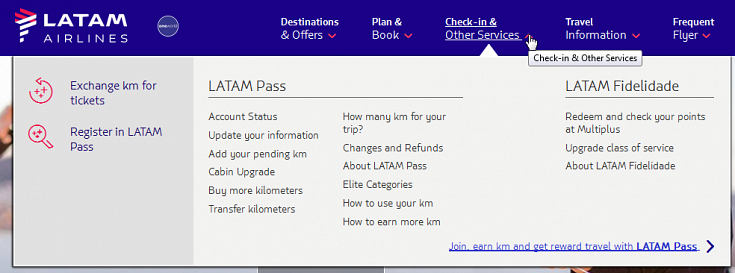
The main menu works with the keyboard in that the site allows the user to press the down arrow to access it. However the screen reader user is not told that the menu has opened and only hears “down arrow”. The links will then receive focus and the user can use the left and right arrows to move between menu options.
We found a slight issue with closing the menu. The last menu item (frequent flyer) stayed open after tabbing away from the last item (join). At this point it, if the user has not collapsed the menu it stays open. We tried using the escape key and up and down keys but couldn’t find a way to make it go away. Even going back and using the mouse, we couldn’t close it (or show any of the other menu options). Some more work could be done here.

Booking flow
Latam use a JQuery UI datepicker, which poses many of the same issues we highlighted in our Delta review. It is fully keyboard accessible only if users know the specific keys they need to use, and date changes are not announced. Like a hamburger menu, it may be dangerous to assume that this tool is universally usable – or even understood.
Moving through the homepage to the flight booking widget, we found that Latam have implemented ARIA to make it more accessible. The experience was pretty good although we came across role=”application” and role=”dialogue” and we are not convinced that these have been properly implemented as per the specification. That being said, points for effort here we feel.
The date vs. price grid is a really useful feature, however for keyboard users it may well prove an obstacle since they have to tab through the entire section in order to see flights for this date (up/down arrows do not work to make this interaction easier). On the plus side, this has been implemented with care from a screen reader perspective as both the departure date and return dates announce when the user is on a price (table cell). Unfortunately NVDA reads out the information twice and the previous and next week buttons do not state if they are related to return or departure. Both are a bit of a let down from an otherwise flawless implementation.

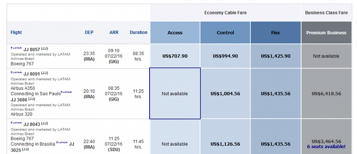
Moving onto the flight selection grid this has been implemented pretty well as the user can use the arrow keys to move through and select options more quickly.

When a screen reader user tabs to a new flight, the screen reader announces only the flight number and any connecting airports. The departure airport and arrival airports are not announced, so screen reader users do not have easy access to the information that they need to select a flight. Better descriptive labelling would resolve this issue.
When tabbing to the next fare for the same flight, the user just hears the flight cost and fare type – whilst this could be a little troublesome on first go, we see it as a positive that the appropriate amount of information is given at this step. However, after selecting a flight, the screen reader announces that the return prices are being updated but the user still has to move through the list of other flights – which for the route we searched for, meant going through a lot of flight options (if all fare types were available this would have been over 90 tabs). We definitely recommend improving the user experience of this page to reduce both keyboard presses and vertical scrolling.
Unfortunately the interaction for screen reader users does not get much better moving from outbound to inbound flight options as there is no tab-able content to tell them they have moved to a new section. The fare categories are repeated, but without being able to determine that these links are the start a new section of flights it is not clear that they are on the inbound flights.
On the “confirm your flight page”, we hit a snag as the “more information” link opens a modal window with a role=”dialog”. However, screen reader users only hear “dialog” section and need to know to force forms mode to hear the content. Modal windows are a bit of a nightmare and this one is no different.
Moving onto the passenger details, the majority of the form fields work as expected and again we see a good level of attention for the screen reader users. The travel voucher checkbox and the discount certificate radio buttons could both be better described using fieldset and legend but this is a small blip on an otherwise good page. Finally, the payment page is another well done page with little wrong from the screen reader or keyboard access perspective.
Summary
It is clear that Latam Airlines have put significant effort into their site to make it accessible in line with DOT requirements. There are a few areas were the level of accessibility has dropped meaning the interaction is not as good as it could be.
We feel that the site is getting very very close to WCAG compliance and with some assistance to improve the User Experience (especially related to the amount of tabbing required); it would be a good site for disabled people.
Score: 4/5
See how the others fare:
You might also be interested in...
The Speed Camera Problem: Why Continuous Accessibility Monitoring Beats the Annual Audit
24 April 2026Most organisations treat digital accessibility like a fixed speed camera - everyone slows down for the audit, then immediately speeds up again.
Read the article: The Speed Camera Problem: Why Continuous Accessibility Monitoring Beats the Annual AuditUser Vision Joins the New DOS 7 Framework - Making Public Sector UX Procurement Simpler
1 April 2026User Vision has secured a place on the Government Commercial Agency (previously CCS) new Digital Outcomes and Specialists 7 (DOS 7) framework - making it faster and simpler than ever for public sector organisations to access specialist user research, accessibility, and user-centred design services.
Read the article: User Vision Joins the New DOS 7 Framework - Making Public Sector UX Procurement SimplerUnderstanding Accessibility Drift - And How to Prevent It
12 February 2026Why accessibility standards erode after audits, and what continuous monitoring can do about it.
Read the article: Understanding Accessibility Drift - And How to Prevent It