Airline Web Accessibility – Part 2: Delta Airlines
7 July 2016 - Jessica Cameron

In this installment, we review our first airline: Delta. It’s been a chilly summer in Edinburgh, so we looked at flights bringing us into Fort Lauderdale International Airport (FLL).
Delta Airlines
Route searched: New York (JFK) to Fort Lauderdale (FLL)
Our expectations of the only US-based airline we reviewed were high, as there has certainly been no question that this airline is required to comply with the DOT legislation. Unfortunately, Delta’s site poses some serious accessibility issues.
General experience
On the home page, multiple ‘skip to’ links to key user journeys appear when the tab key is used – but they don’t bring the user to that content on the home page. The ‘skip to flight search’ link instead loads a separate ‘book a flight’ page – which, given that home pages are not counted among of the seven core functions required to be made accessible by the US DOT, enables Delta to continue to have inaccessible content on their home page for the time being.
Booking flow
Most form fields are programmatically associated with descriptive labels, allowing screen reader users to understand where they are and what type of information they need to enter. However, for drop down menus the first option in the list receives focus automatically but is not announced, forcing screen reader users to move through the entire list to find the most relevant option.
The calendar (JQuery) is keyboard accessible, but only using non-standard commands – and instructions are not provided here (you need to hold down CTRL while using the arrow keys to navigate between dates). Users who are not familiar with this type of date picker will likely struggle. Screen reader users will have particular difficulty as changes in date are not announced by the screen reader; each change is only announced as ‘2016’.
Users can type in dates directly; however a lack of flexibility can make this task difficult as well. For example, it is not possible to enter 11/2/16; this entry is recorded as 11/21/6. The site does highlight an error however it is quite generic and does not suggest to the user how to recover from it.

At the bottom of the “book a flight” page, users have the option of searching for flights by cabin (e.g., main, business) or specific fare class.

Interacting with this second drop down automatically switches the search to “fare class”. Sighted users can see that they have inadvertently chosen to search by fare class, but the change in context is never announced to screen reader users. As both search options have the same fieldset and legend (“search for a particular cabin or fare class”), screen reader users may be led to think that there has not been a change at all.
On the flight search results page, keyboard users need to tab through all of the focusable content on this page before being able to select a flight. This content includes top level navigation, links, and even icons indicating that the flight in question has Wi-Fi and Bluetooth capabilities.
These icons are given descriptive labels, but the primary calls to action on this page are not (e.g. select fare). Upon finally tabbing to a selectable flight option, screen reader users hear only the fare class, and not any other details associated with that flight (e.g., departure time or price).
Delta need to pay attention to button and link labels throughout the booking flow, as this problem comes up again on ‘upgrade’ and ‘open’ (trip extras) buttons later in the process. For WCAG compliance, this element should be programmatically associated with a label that provides all of the details users need to make an informed choice.
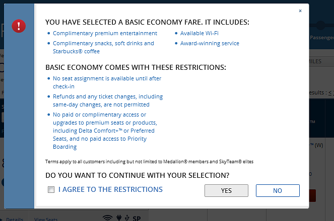
When a basic economy fare option (the cheapest option available) is selected a modal window warning users of the restrictions associated with the fare is displayed. Unfortunately, the lack of visible focus makes it very difficult to select the box indicating agreement to the restrictions using the keyboard alone. This means that disabled users may be blocked from choosing the least expensive flight options available.

It is worth noting that Delta’s seat map offers screenreader users access to all of the information that is conveyed visually. Tabbing to a seat announces the seat number, class, availability, and location in the row – so even without being able to see the map, people know whether they are choosing a window or an aisle.
The My Wallet payment option requires a log in, but this link is not programmatically associated with My Wallet, leaving screen reader users tabbing through the list of options in the dark as to what they are actually logging into.
Summary
Despite some solid efforts at incorporating accessible features, such as programmatic labels and accessible date pickers, Delta’s website would fail a WCAG audit in its current form. Delta need to address showstoppers including modal window accessibility, lack of programmatical association with links, calls to action and calendar dates. This key functionality (such as ‘select’ buttons) makes it significantly more difficult for screen reader users to navigate a complex process on their own.
Final score: 2.5/5
Read the following reviews and see how they all compare:
You might also be interested in...
The Speed Camera Problem: Why Continuous Accessibility Monitoring Beats the Annual Audit
24 April 2026Most organisations treat digital accessibility like a fixed speed camera - everyone slows down for the audit, then immediately speeds up again.
Read the article: The Speed Camera Problem: Why Continuous Accessibility Monitoring Beats the Annual AuditUser Vision Joins the New DOS 7 Framework - Making Public Sector UX Procurement Simpler
1 April 2026User Vision has secured a place on the Government Commercial Agency (previously CCS) new Digital Outcomes and Specialists 7 (DOS 7) framework - making it faster and simpler than ever for public sector organisations to access specialist user research, accessibility, and user-centred design services.
Read the article: User Vision Joins the New DOS 7 Framework - Making Public Sector UX Procurement SimplerUnderstanding Accessibility Drift - And How to Prevent It
12 February 2026Why accessibility standards erode after audits, and what continuous monitoring can do about it.
Read the article: Understanding Accessibility Drift - And How to Prevent It