5 Dark Patterns of Black Friday
13 December 2019 - Stephen Denning
So “Black Friday”, and its tech-savvy younger sibling “Cyber Monday”, have passed us for another year. It would have been almost impossible for anyone to have missed the growing impact of these US-imported shopping behemoths on UK consumers over recent years but, just in case, a little background.
Black Friday is, of course, an American invention. However, it has been around for much longer than most of us realise, having first been mentioned in its current form as far back as 1966. It grew out of the rise of post-Thanksgiving shopping. As Thanksgiving is always on a Thursday, people would use the Friday to call in sick to work and hit the stores for early Christmas shopping. After a while, most businesses just rolled the Friday into the Thanksgiving holiday, to avoid the paperwork of dealing with all the sick notes! The “Black” aspect of the Friday was born out of a reflection of the negativity associated with the over-crowding and less-than-holiday-spirited behaviour that could be readily witnessed in the local department store.
Half a century later and the tradition is not only alive-and-well – it has exploded, both in its scale, and in its national borders, crossing the Atlantic and establishing its UK presence around a decade ago (thanks Amazon!) Of course, in recent years much of the shopping has moved online (77% compared to 23% in-store(this will open in a new window)) with Black Friday and Cyber Monday now morphing into an unavoidable multi-day shopping binge, with an estimated £8.57bn(this will open in a new window) being spent by British consumers over the four days.

But has the negativity and “bad behaviour” that gave Black Friday its name dissipated as the sales have digitised? Or has online retail simply allowed retailers to use more subtle tactics to crowd the virtual department store lobbies and keep the shopping baskets ticking over? We examined a variety of retail sites during their Black Friday/Cyber Monday events and identified a number of “Dark Patterns” - Persuasion techniques or design slight-of-hand used to take advantage of our sub-conscious psychological biases against our will, employed to persuade people to part with their cash. I’ve unpacked five of them below, rating the impact of each from “Mildly Manipulative” through to “Downright Evil”.
1. Social Proof
Rating: Mildly Manipulative
The principle of “Social Proof” describes a psychological and social phenomenon in which people copy the actions of others in an attempt to undertake behaviour in a given situation. Simply put, as humans we are social beings and we like to engage in behaviour that groups us with other like-minded humans. In the eCommerce world, this usually looks like reviews, recommendations or indications that others are also looking/buying the item that you are interested in. This boosts our confidence in the decision-making process, because others have gone before us.
Social proof can also work in the opposite way and a few negative reviews, even among a largely positive base, can very quickly put us off buying. Social proof in of itself is not necessarily a dark pattern. However, when it utilises less-than-genuine data, and combines with the principle of Scarcity, social proof can be used by designers to manipulate behaviour.
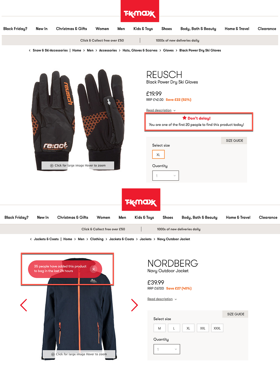
The examples below from TK Maxx show this in action. The callouts indicating the number of people looking at the items help build confidence and persuade us to also buy this item. This also incorporates an element of scarcity. Although stock levels are not explicitly mentioned, the idea that a number of people are looking at the same thing creates fear of missing out.
2. Scarcity
Rating: Slightly Manipulative
The principle of “Scarcity” describes the way in which we tend to put more value in items that are of limited availability. If something is scarce, we attribute high value to it, and if something is in abundance then we will tend to attribute lower value to it. Consequently, if something is perceived to be limited in availability, either through stock levels, or the time it is available for, then we are more inclined to desire it. This cognitive bias is something that is leveraged by many retailers, particularly around the time of sales such as Black Friday.
The concept of scarcity can be seen in a few examples. Amazon’s Lightning Deals (even the name suggests a time-limited opportunity):
· Only a certain amount of stock is available at the special deal-price, and only for a limited time.
· The progress-bar shows the percentage of stock that has been claimed and the time left to take advantage of the deal.
This ‘doubles-down’ on the scarcity principle, raising our anxiety of losing out while others take advantage of the deal (another example of the aforementioned Social Proof principle).
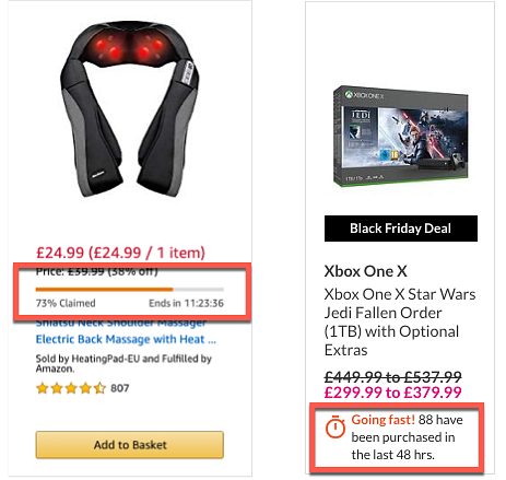
Very.co.uk leaves us guessing about how limited the stock of the item is. The message tells us that 88 have been purchased, but we don’t know if there are 90 on offer, or 900. This ambiguity again presses our anxiety buttons which increases our likelihood to purchase.
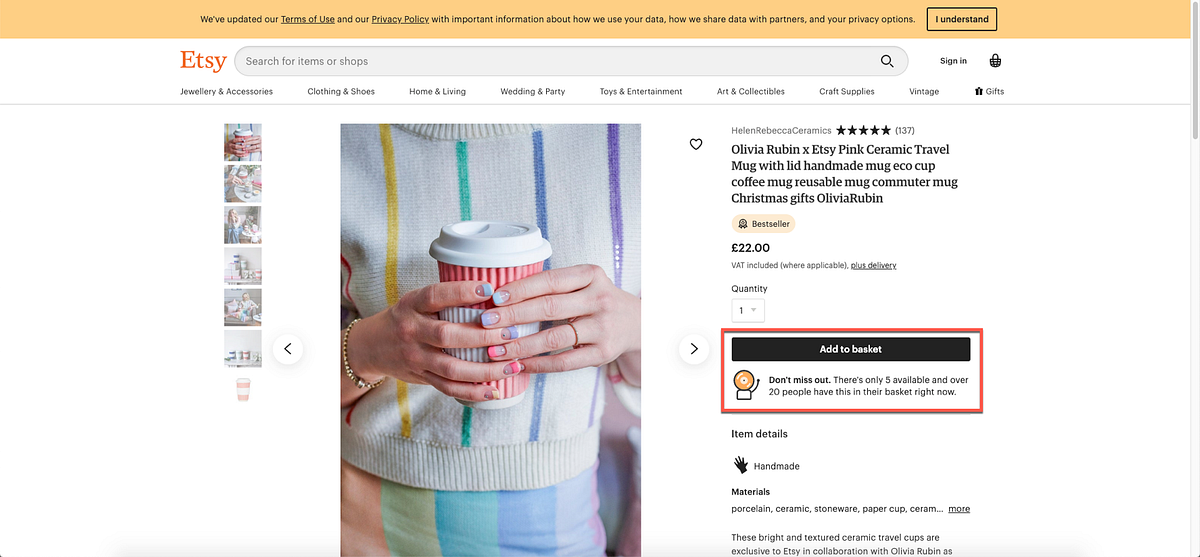
Etsy meanwhile, introduces the element of competition. The message tells us that there are only 5 mugs available and 20 people currently have it in their basket. We naturally assume from this that we are competing with 20 others for those final 5 mugs (in the spirit of Black Friday sales!) This will likely result in a more impulsive purchase decision. Again, this is a good example of where the principles of scarcity and social proof have been combined to great effect (if 20 other people want it, it must be good!)
Of course, nobody would argue that providing customers with an accurate view of stock levels is a negative thing and can help to avoid the disappointment and frustration that is associated with buying something that is out of stock. However, we can see from these examples how this information can be easily manipulated to tap into our sub-conscious anxieties and biases.
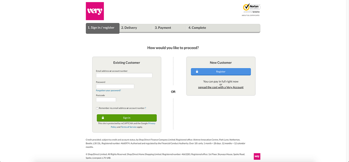
3. Forced Registration
Rating: Highly frustrating
Sometimes customers don’t want to enter into a relationship with a company. Many online retailers realise that this is a frustrating barrier-to-use for customers and have introduced the idea of guest registration. Very.co.uk appears not to have received that memo.
4. Basket Padding
Rating: Pretty Darn Evil
“Basket padding” is the dark art of filling a customer’s basket with items they haven’t requested, hoping that they don’t notice and the value of their shop increases. If they do notice, they are forced to take the time and effort to remove them (usually one at a time) from the basket.
It’s one thing to encounter the dreaded cross-sell or up-sell (anything from an extended warranty to Amazon’s infamous “customers who bought X also bought Y” approach), but it’s another level of evil UX to assume that your customers want these things without ever asking them.
Fortunately, this practice doesn’t happen too often anymore, which makes it even more shocking when it is encountered. This example from Laptop Outlet shows an anti-virus, a mouse and a case being added to the shopper’s basket when they add a laptop, adding £23 to the cost of their basket.
5. Forced Action (Salience)
Rating: Downright Evil
Salience is the principle of making important things highly visible and easily identifiable against the background noise of the rest of the page. When we use a website, we expect the most logical next step to be clearly pointed out to us, whether that be ‘Add to Basket’, ‘Buy Now’ or ‘Make Payment’; and designers use this principle of salience to highlight what that next step is.
However, sometimes designers will leverage salience in an (often successful) attempt to trick customers into clicking on what they want them to click on, rather than what the customer is expecting.
This dark UX pattern is exemplified by the now infamous “Amazon Prime” checkout trick.
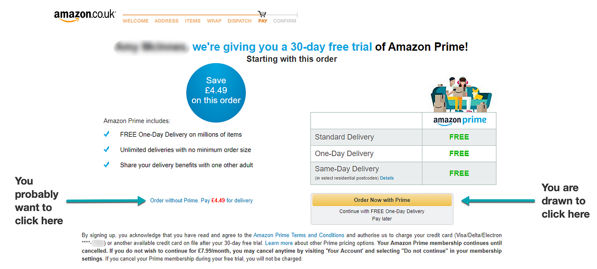
As can be seen in the screenshot, at the point when payment details have been provided, the customer is looking for a clear confirmation button. Amazon uses their styled yellow button (which by now the customer has come to associate with the next logical step and has been placed in the expected location in the bottom right) to confirm the order with an additional £79 Prime subscription added.
Confirming the order without the Prime subscription requires the customer to notice the small and understated blue link on the left-hand side (it’s not even a button!) Even an Advertising Standards Authority ruling this summer, stating that the design was misleading, hasn’t put Amazon off, and their contribution to Evil UX was recognised recently with the “2019 Dark UX Award” at the User Experience UK Awards.
So what should we take away from these examples?
There is little doubt that these examples utilise persuasive techniques, and we’ve seen how they will often leverage sub-conscious psychological biases. Ultimately however, it is down to the motive. The ‘psychology of design’ can be applied with either good or ill intent.
We can look to understand the way our mind processes information and use that knowledge to make things clearer, simpler and more intuitive, in a way that builds trust and confidence in a company. Or we can use it to pressurise, deceive and mislead in a way that may bring about increased revenue, but will ultimately erode trust.
So, as we move away from a product-based economy, to one based more on the experience that companies deliver, it is easy to see why the application “Dark UX” is a strategy with very short-term gains, but long-term implications.
You might also be interested in...
Nothing About Us Without Us: What CRPD at 20 Means for UX
16 June 2026As the Convention on the Rights of Persons with Disabilities turns 20, this article asks what “Nothing About Us Without Us” should mean for UX in practice. It argues that accessibility is not just about testing whether something works for disabled people, but involving disabled people earlier in shaping what gets built.
Read the article: Nothing About Us Without Us: What CRPD at 20 Means for UXKano as a Lens for Innovation and Competition
4 June 2026How Kano explains innovation, disruption and competitive advantage.
Read the article: Kano as a Lens for Innovation and CompetitionCreating Space for Surprise in User Research
1 June 2026Good user research creates space for surprise - exposing blind spots, challenging assumptions and helping teams make better decisions.
Read the article: Creating Space for Surprise in User Research