World Usability Day – What are you looking at?
21 January 2016 - Jessica Cameron
In keeping with the theme of innovation, Abi Reynolds and I decided to showcase some of the recent advances in eye tracking technology at our 2015 World Usability Day event.
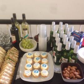
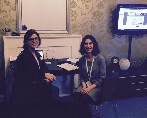
Our eye tracking demonstration
The technology we used
As with all computers, eye tracking devices have progressively shrunk in size and price over the years. Recently we upgraded our heavy beast for the slim lined Tobii Pro X2. The Tobii device is designed so that it can be attached under any computer screen, and after a short calibration exercise, any participant’s gaze is ready to be tracked.
So how does eye tracking work?
Most eye tracking hardware reflects infrared light into a user’s eyes while he or she is looking at a computer monitor. By capturing where that infrared light hits a user’s corneas, eye tracking devices let us ‘see’ where on the screen that person is looking. The accompanying software produces outputs such as gaze trails, which show the path that a user’s eyes follow around the screen, and heat maps, which illustrate the parts of an image that users spent the most time looking at.
Our approach was as scientific as circumstances allowed:
Our participants and observers
We had a total of 14 very willing participants:
Participants made themselves comfortable in our upstairs lounge, whilst their friends and colleagues watched from our observation room. We were able to broadcast the images that participants saw, along with their gaze trails, into the observation room so that observers could tell exactly what the participants were looking at. Some hilarity ensued:
The tasks we tested
In designing our study, we had two main goals: to highlight some of the interesting findings that have come out of recent research into eye tracking, and to keep the demonstration fun for our participants and observers.
We considered a few findings that intrigued us, and chose images that we thought would bring them to life. Here’s just a taste of what we explored.
Who are you looking at?
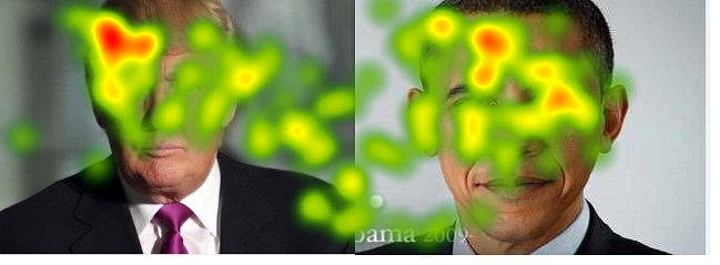
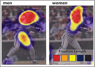
Previous research has shown that people do not necessarily look more, or differently, at images of people they like than of those they dislike. In other words, just because people look at something doesn’t mean they like it. We found two American politicians whom we thought would elicit pretty different reactions from our mostly British attendees:

Despite 13 of 14 participants’ telling us that they preferred the image of Obama to the one of Trump, they did not appear to spend considerably more time looking at the former. And further supporting the idea that people don’t necessarily look more at images that please them, the heat map of all our participants’ fixations revealed an intriguing amount of fixation on Trump’s hair:
And what exactly are you looking at?
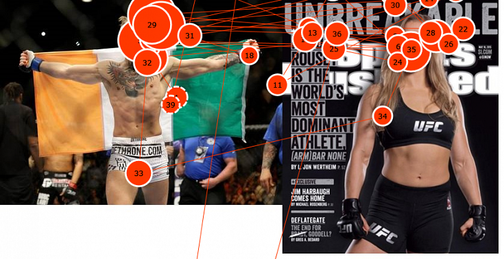
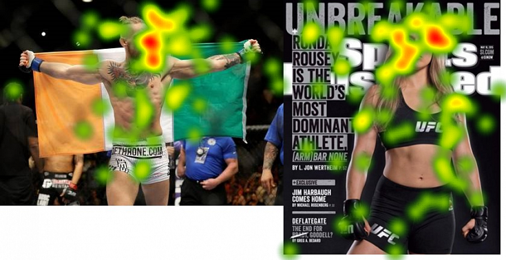
We used photos of Ronda Rousey and Conor McGregor to show that, as the image below suggests, men and women sometimes look at people in different ways:
However, experimental demand characteristics – specifically, participants’ awareness that they were being watched by bemused observers – may have perhaps had the tiniest effect on their fixations on Conor and Ronda:
Are you really looking at those icons?
Finally, in a little experiment of our own, we used Ryanair’s new website to test whether icons would help direct users’ eyes to the information we asked them to find – in this case, the number of daily flights between Edinburgh and Dublin (the timetable, or centre icon):
We found that of the seven participants who saw the regular version of Ryanair’s site, only one found the link to timetables – but of the seven who saw the version with the icons removed, four (more than half) were able to do the same. We did not observe big differences in where participants looked.
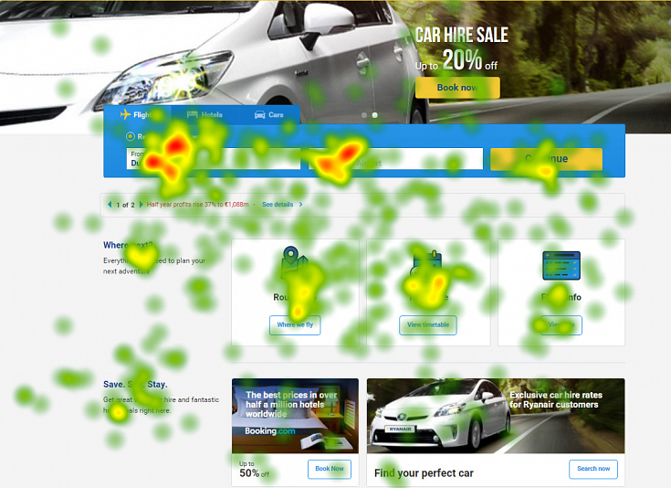
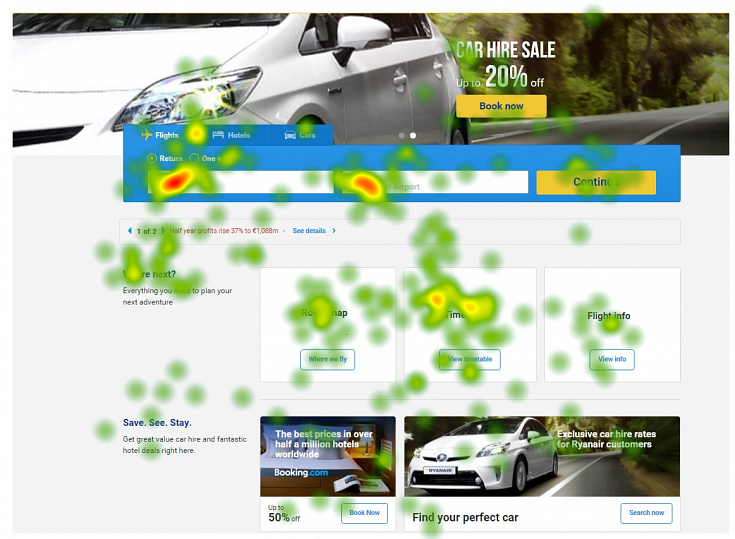
Although we cannot draw any quantitative conclusions from small numbers of participants, it looks to us like participants certainly saw the icon… they just may not have understood it. Perhaps Ryanair could make their icons a bit more user-friendly?
Eye tracking in user experience research
We fielded a lot of questions about how best to use eye tracking in UX research from our interested participants and observers. Watch this space for a follow-up entry on the best (and worst) uses of eye-tracking in UX research.
If you think our eye tracking expertise might be able to help you, get in touch.
You might also be interested in...
European Accessibility Act Now in Force: What Your Business Must Do
28 June 2025The European Accessibility Act is now in force, requiring organisations to ensure digital and physical products meet new accessibility standards across the EU. This major milestone will make physical and digital services more inclusive across the EU - find out your obligations.
Read the article: European Accessibility Act Now in Force: What Your Business Must DoConsumer Duty Compliance: Measuring Outcomes That Matter
4 March 2025Explore how financial services can move beyond traditional satisfaction metrics to master outcome measurement for Consumer Duty compliance. Learn about Key Experience Indicators (KEIs) and strategic approaches with User Vision's expertise.
Read the article: Consumer Duty Compliance: Measuring Outcomes That MatterWelcome to User Vision: Shaping Incredible Experiences
29 January 2025Discover User Vision: Your partner in human-centred design. We shape incredible digital experiences through expert UX research, accessibility consulting, and service design. Learn how our insight-driven approach can transform your digital offerings.
Read the article: Welcome to User Vision: Shaping Incredible Experiences