Accessibility Review of Online Retailers Part 5: Tesco
25 January 2017 - Natalie Simpson

Tesco is the UK’s largest supermarket retailer. Back in 1984, they recorded the world’s first ‘online’ shopping transaction(this will open in a new window) in Gateshead, England. So, it seems only right to include them in our series of short accessibility reviews.
A quick recap of Tesco’s accessibility background
Back in 2001, Tesco launched a more accessible alternative site for shoppers, ‘Tesco Access’. The site worked well, and with a simple design it attracted a much wider audience. On the back of its success, in 2005 tesco.com(this will open in a new window) was relaunched after working closely with RNIB(this will open in a new window) to marry the best aspects of both sites.
Looking at tesco.com today, there is a whole page dedicated to accessibility. This has tips for screen reader users and instructions to change the look of the page. Once logged in, there are further options to adjust the viewing profile based on a variety of custom requirements. Given Tesco’s past efforts, we have high hopes for this site.
Customer Journey Review
Today’s task: Buying a toaster through Tesco Direct(this will open in a new window).
Homepage
The Tesco homepage provides a clear and consistent visible focus which helps sighted keyboard users navigate around the site. The tab order moves through the page in a logical fashion and does not jump around. The positive experience continues with meaningful links, headings in the correct order and form fields being grouped together with appropriate labels. This is an impressive start:

However, there are a lack of ‘skip to’ links which help users avoid tabbing through lengthy navigation menus. This is a bit of a let down as they are a mandatory accessibility feature used to avoid going through repeated content. This unfortunately continues throughout the site.
On a more positive note, a good use of labels and a native button element mean that users can easily take advantage of the search function to locate the product they are looking for.
Browse
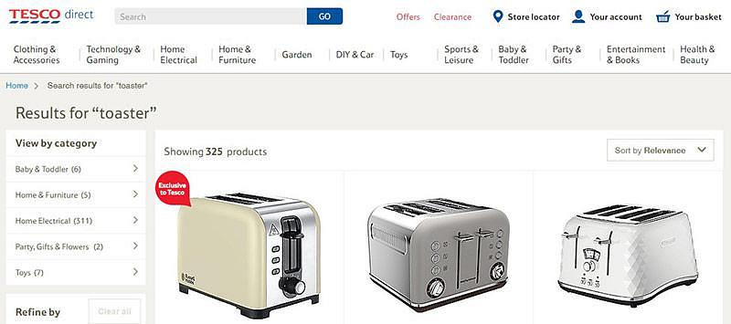
Tesco Direct Search results page
After the positive start, the first thing we notice on this page is the lack of clear visible focus which is disappointing. On some elements, only default browser focus is used, but elsewhere on the navigation menu it appears that this has been disabled completely. A sighted keyboard user would find it difficult to see where they are on the page:

Additionally, the ‘Your basket’ link at the top of the page does not receive focus making it only accessible to users who can use the mouse. This needs to be rectified as the basket is an essential feature that all customers need to have access to in order to complete their purchase.
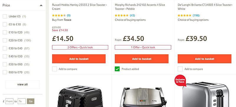
Further issues appear in the filter section of the page where non-sighted users need more context. Adding a fieldset and legend to each of the filter groupings would allow users who are tabbing through the filter controls to know what each section contains, so they can narrow their search further. Labels are also required in the ‘price section’ where users can enter a minimum and maximum budget. All that is currently read out is ‘edit from, from’ and ‘edit to, to’. Non-sighted users will not know what input is required here:

Moving onto the product details, the ‘star rating’ and ‘number of reviews’ are conveyed visually but not to screen reader users. All that is read out is ‘xxxxx rating’ and the number of reviews. We recommend adding alt tags and further text to the ‘number of reviews’ link to make this clearer. On a more positive note, descriptive alt tags on all product images mean non-sighted users are given the same access to this content.
Selection
Product page
Arriving at the product page, one of the first things we notice is the use of breadcrumbs. These are used as a secondary navigation aid and show users their current location as well as helping them understand where they are in relation to the rest of the site.
Moving through the product details to the ‘write a review’ link, a modal window is activated asking for a customer review. Modal windows can be a very handy and effective design pattern but are notoriously difficult to make accessible. In this case, we were very impressed, the user is given warning when the link receives focus that this action will open a modal dialogue window. The window then receives focus with keyboard access to all elements including the ‘close button’ to navigate back to the main site.
However, we did come across an issue with another pop up window on the page. Once an item is added to the basket, a window with the product information opens unannounced. The window doesn’t receive focus so keyboard users aren’t able to access any of the elements, close the window or proceed to the checkout:

Some work needs to be done here to rectify this using the existing customer review modal window as an example. Keyboard users are not able to access the basket at all and would most likely abandon their purchase at this stage or have to ask for help.
Payment
Progressing onto the ‘order’ page, there are a few significant issues that would hinder a screen reader user completing their purchase.
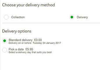
The ‘Choose your delivery method’ radio grouping does not receive focus. A screen reader user would be forced again to abandon the process or unknowingly go with the default option of ‘collection’.
Moving on, the ‘Delivery options’ radio grouping also has a focus issue and is bypassed when tabbing through. Again, this would likely force a screen reader user to abandon their purchase or ask for help as without it they would not be able to specify a delivery date.

There are further problems when proceeding to the ‘Payment card’ form fields. Currently, screen reader users only hear ‘edit blank’ as most form fields (except for security code) require associated labels. Again, a non-sighted user would struggle to complete the form without help or be completely stopped in their tracks. Unfortunately, there is no instruction as to what input is required here. In addition to this, error messages are visual, but not read out to the screen reader.
Summary
We had high hopes for Tesco and their homepage was a really positive starting point with some great accessibility features implemented. Unfortunately, when we moved away from this to Tesco Direct, some issues arose.
One significant problem was not being able to access the basket via the keyboard. This was not possible from the navigation bar or the modal window, only activated once an item has been added to the basket. This means that keyboard users are unable to proceed to the checkout without assistance.
The other main area for concern was the payment page where screen reader users would struggle to choose the method or date of delivery as well as enter card details due to lack of context.
We recommend that Tesco consult with accessibility experts to address areas of concern.
Score: 2.5/5
Up Next
Come back tomorrow to read our final review of the series – Not on The High Street.
Previous Posts:
Accessibility Review of Online Retailers Part 1: Boots
Accessibility Review of Online Retailers Part 2: Mothercare
Accessibility Review of Online Retailers Part 3: House of Fraser
You might also be interested in...
The Speed Camera Problem: Why Continuous Accessibility Monitoring Beats the Annual Audit
24 April 2026Most organisations treat digital accessibility like a fixed speed camera - everyone slows down for the audit, then immediately speeds up again.
Read the article: The Speed Camera Problem: Why Continuous Accessibility Monitoring Beats the Annual AuditThe Three Lenses Model: How MR, CX and UX Work Better Together
16 April 2026Most organisations run market research, track CX, and test with users — but they rarely connect the dots. Here's a model that does.
Read the article: The Three Lenses Model: How MR, CX and UX Work Better TogetherUser Vision Joins the New DOS 7 Framework - Making Public Sector UX Procurement Simpler
1 April 2026User Vision has secured a place on the Government Commercial Agency (previously CCS) new Digital Outcomes and Specialists 7 (DOS 7) framework - making it faster and simpler than ever for public sector organisations to access specialist user research, accessibility, and user-centred design services.
Read the article: User Vision Joins the New DOS 7 Framework - Making Public Sector UX Procurement Simpler