Accessibility Review of Online Retailers Part 3: House of Fraser
20 January 2017 - Natalie Simpson

House of Fraser (this will open in a new window)is a firm favourite on the UK High Street with over 60 stores nationwide. In 2014, they attributed record sales to the continued growth of their website, as online became the most profitable retail channel(this will open in a new window) for the first time.
Online sales and reaching a wide customer base is clearly important for House of Fraser. This is reflected on the site as they have a page dedicated to accessibility. Here, there is a short accessibility statement: ‘this site meets the requirements for single A compliance in accordance with accessibility guidelines’.
Although brief, this is an encouraging start and we are keen to see how the site as a whole will score in terms of accessibility.
Customer Journey Review
Homepage
The first thing we notice when we go onto the site is that they have implemented a clear visible focus and a single ‘skip to main content’ link.

It’s clear moving through the homepage that House of Fraser have taken the time to implement a number of accessible features. Links are meaningful and images have descriptive alternative text. Tab order is logical and despite the vast amount of content it is easy to navigate and look for specific products or browse for ideas. Our first impression of the site is promising.
We did come across a few labelling issues which could be easily fixed and would have a positive impact on interaction for non-sighted users. For example, the main search function is missing a corresponding label for the form field and search button. Placeholder text is announced to screen reader users but associated labels would make it clear as to what input is required here.
Additionally, there was an issue when users try to locate the basket. Visually, the number of items and total cost is conveyed clearly, but all that is read out to screen reader users is ‘3 £132.50 clickable link’. Non-sighted users are not provided any context as to what these numbers mean or where this link will take them. We recommend adding text to the link such as ‘basket’ and ‘items’ in order to provide context and give a clear indication to users as to where this link will take them.

Product search results
As soon as we arrive on this page a modal window appears asking for feedback. Although this was not announced, the window does receive focus allowing keyboard users to tab through all elements and close the window with clear instructions, navigating back to the product search results page.
This page also provides a breadcrumb trail enabling users to understand where they are and where they have come from.
Moving on, we arrive at the extensive product filter section which is accessible from the keyboard. Although, when a filter option is selected the browser refreshes without being announced to the screen reader and focus returns to the top of the page. This means, a disabled user must go through all filter options again from the beginning which is rather frustrating. Some work could be done here to ensure that after a browser refresh, focus returns to the product details and announces what has been done.
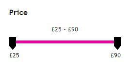
The filter option for price is presented as a slider which is not accessible from the keyboard alone. When focus arrives on the slider, ‘clickable’ and ‘blank’ only are read out to the screen reader, not providing any context as to what these controls might be. We recommend using ARIA to solve this to make the slider accessible.

Progressing onto the product details we come across an issue with the product image. This is read out three times to the screen reader due to there being a title, as well as an alt tag and image name. This could be looked at to make sure that the image is only read out once.
Selection
Product page
Arriving at the main content of the product page we are taken straight to the gallery of product images. Focus lands on the arrows but the screen reader just reads ‘clickable’. Sighted users can view the other images using these arrows and the keyboard, but for non-sighted users, there is no context provided here.
Moving on to the product information, one of the first links in the section is the option to add a review. Clicking on this link opens a new window in the browser, but no forewarning is given to the user which can be disorientating and makes it difficult for blind users to understand what has happened and where they are.
House of Fraser do need to pay some attention to the ‘selected size’ and ‘product availability’ areas of the page. When a user goes to select a size, availability is visually conveyed to the user with ‘crosses’ over the boxes if out of stock. Here, the product is only available in ‘XS’ and ‘Large’ but this is not clear to non-sighted customers as all sizes are announced whether sold out or not. (See below image).
There is further visual emphasis with a red ‘out of stock’ message that appears dynamically when an unavailable size is selected. A non-sighted user is unaware of this as it does not get read out to the screen reader. We recommend using ARIA to programmatically associate this with size links if unavailable.
Confusingly, the default value for the ‘select quantity’ dropdown is always set to ‘1’ even when the product is out of stock. To a screen reader user, as this gets read out it appears like there is one product available regardless of whether a size is out of stock or not.

My bag
Generally speaking, we felt that disabled users could interact well with this page as all elements receive focus and there are no clear issues. Here, users can proceed to the checkout with ease.
Payment
Moving on, we are also impressed with parts of the account register/sign in and checkout pages.
Sign in page
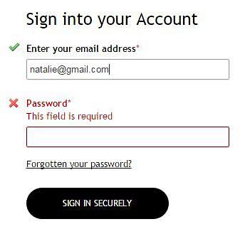
Both options for signing into your account or continuing as a guest have fieldset and legend groupings making it easy for screen reader users to know exactly what input is required of them. This is reflected throughout the payment process. However, when a user signs into their account the ‘enter your email address’ form field appears to be missing a label. A form label is present here but not correctly associated with the form controls meaning that a non-sighted user would have trouble knowing what input is required here.
In terms of error messages, there are good visual cues with green ticks and red crosses but these do not get read out by the screen reader, making it difficult for non-sighted users to rectify any mistakes made and proceed to the next stage. As form accessibility is a major obstacle to online inclusion this is an important area to spend time improving.

Delivery/payment page
Again, this page generally is good to navigate through using a screen reader and keyboard. Non-sighted users would be able go through the payment process, entering all their details without too many issues.
Summary
Despite the brief accessibility statement, we were impressed with our overall experience on the House of Fraser site.
It is clear that a big effort has been made to make this site accessible to a wider audience with a lot of good features implemented. However, there are a few key areas which let the site down. Most notably, the process of choosing a product size and being aware if this is available. Should a non-sighted user choose a size which is out of stock they would be completely unaware, causing them difficulty to move to the checkout.
The second big area for concern was error messages not being read out to the screen reader. Again, this could cause users to abandon their purchase if they were unable to proceed to the next stage.
Score: 3/5
Up Next
Come back tomorrow to read our next review – Joules
You might also be interested in...
The Speed Camera Problem: Why Continuous Accessibility Monitoring Beats the Annual Audit
24 April 2026Most organisations treat digital accessibility like a fixed speed camera - everyone slows down for the audit, then immediately speeds up again.
Read the article: The Speed Camera Problem: Why Continuous Accessibility Monitoring Beats the Annual AuditThe Three Lenses Model: How MR, CX and UX Work Better Together
16 April 2026Most organisations run market research, track CX, and test with users — but they rarely connect the dots. Here's a model that does.
Read the article: The Three Lenses Model: How MR, CX and UX Work Better TogetherUser Vision Joins the New DOS 7 Framework - Making Public Sector UX Procurement Simpler
1 April 2026User Vision has secured a place on the Government Commercial Agency (previously CCS) new Digital Outcomes and Specialists 7 (DOS 7) framework - making it faster and simpler than ever for public sector organisations to access specialist user research, accessibility, and user-centred design services.
Read the article: User Vision Joins the New DOS 7 Framework - Making Public Sector UX Procurement Simpler