Accessibility Review of Online Retailers Part 2: Mothercare
19 January 2017 - Marie Moyles

We were impressed by Mothercare’s approach(this will open in a new window)to how they do business in today’s market. For them an emphasis on community and people is key as they “believe that parenting and raising children is an essential foundation for the society we live in” and they strive to help parents by providing education and information.
Their vision and strategy includes being the leading global retailer for parents and young children as well as focusing on being a digitally led business as their online sales account for 30.2% of total UK sales.
Their intention is to invest further in digital by improving customer experience on their website. We have not come across an accessibility statement on the site which is a shame as having a fully accessible website can lead to a uniquely satisfying customer experience for all, help increase the loyalty to the brand and ideally introduce new customers to the Mothercare community. We were keen to experience the online Mothercare site and establish where they currently stand with regards to accessibility.
Customer Journey Review
Home Page
To comply with WCAG 2.0 at Level A there needs to be skip to links present to aid the user in navigating efficiently around the page. Unfortunately, we do not find these links when we tab with the keyboard. Moving on, issues appear such as there being little or no visible focus assigned to the elements when they receive keyboard focus. Unfortunately, this issue persists as we move through the site. Another early issue, which is a worry was the lack of programmatically associated labelling on the search functionality. This is concerning as without such features disabled users can become disorientated and confused when on a webpage. As the search option is not really that accessible a screen reader user would have to keep moving on to the main navigation menu and use this to be redirected to the toys category page.
Browse
Category Page
A positive trend establishes itself where page titles are well thought through and descriptive, this will help a user reliant on speech readers to know exactly where they are on the site. Landing on the toy category page a pop up window appears asking for feedback but unfortunately a keyboard user would not be able to interact with it and it does not get announced to the screen reader that it is present on the page. This violates WCAG 2.0 on Level A as the user needs to be made aware that there is a change to the page.
I notice that there are some buttons located under the main navigation bar regarding “free standard UK delivery”, “join My Mothercare”, “free click and collect” and “services & information”which contains hidden information. This information becomes visible when a user hovers over the buttons with a mouse but cannot be accessed in the same way for a keyboard user as the information is not unveiled when tabbed to. In the below example, a user can hover over the “free standard UK delivery” button and be made aware that this is applicable to “orders over £50”.


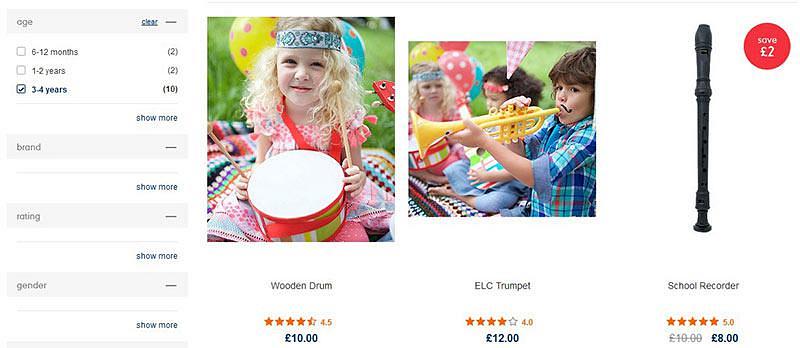
Elements which appear in the refine search section look like checkboxes but are actually links and therefore it does get not announced when something has been selected. There are several ambiguous links titled “show more” which can be easily understood to sighted users. However, these links need to be much more specific for screen reader users as they do not have the benefit of the added visual support of “brand”, “rating” and “gender” (as below) associated with the “show more” link.

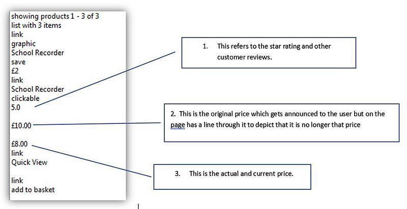
With regards to the school recorder specifically in the above image, there is confusion as to what the current price of the item is for visually impaired users as both the original price with a line through it and the current price are announced but there is no clarification as to how much the recorder actually costs. The star rating is not communicated effectively as only “5.0” is announced.

Selection
Product Page
The product page is quite problematic with poor visible focus and links titled without adequate meaning.

Controls such as the quantity selection (as above) are not labelled and do not get focus when using the keyboard. Navigating around the page by tabbing is via an illogical route jumping to different elements in an order which does not go in the familiar left to right pattern. A disabled user will be unable to interact effectively with the table containing “product information”, “specifications”, “delivery”, “reviews” and “ask an owner” so this vast amount of information will be of no help to them when purchasing an item.
Shopping Cart
The items in the shopping basket are displayed as if in a table layout but the headers such as “item”, “delivery options” etc. are not associated with the content in the table. Below, a sighted user will be able to identify that the subtotal is £45.00 from the way the table is visually laid out but without programmatically associating this information with each other a screen reader user will not be able to make the same association.

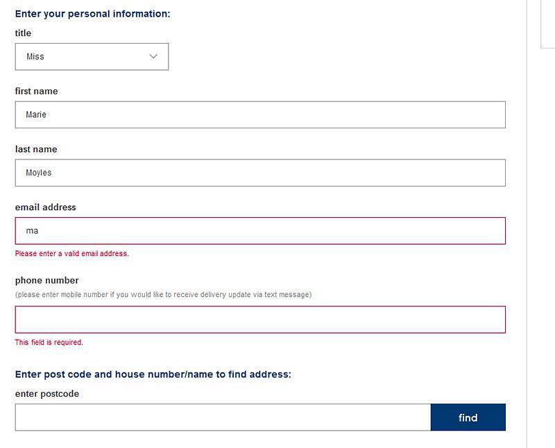
The ARIA attribute aria-required has been used on the delivery information form which is a great help for screen reader users to submit the form correctly, mandatory fields need to be also conveyed to keyboard users visually however. Errors made when filling out the form is announced to the screen reader as well as being displayed in red on the screen under the relevant field.

Selecting the “deliver to this address” button to complete the form causes a jump menu to appear but unfortunately this change to the page does not get announced to the screen reader. This is an area for concern as it fails to comply with WCAG 2.0 at a basic single A level.
Payment
The payment options are listed as radio buttons and grouped together with a fieldset but need a legend tag to effectively caption the section and to satisfy WCAG. There is an iframe used for the card details and the user can easily access it and fill out the form fields which are correctly labelled. Unfortunately, any errors made inputting card details are only highlighted visually and do not get announced to the screen reader. Opting to make the purchase with PayPal is not very clear as the button indicating this action gets called out as “proceed to” and omits “PayPal” from its label. Choosing this redirects the user to the PayPal site which needs to be announced to those users relying on screen readers.
Summary:
The mothercare.com site must take several steps to comply with WCAG 2.0 at a Level AA standard. The recurring issues which were present included a lack of ‘skip to’ links, little or no visible focus when navigating with the keyboard, links not adequately titled, illogical navigation and dynamically updated content not being announced to the screen reader. It was heartening to see the various webpages correctly titled and we were especially impressed with the delivery information form and how ARIA attributes were applied to this. Incorporating changes regarding the above issues in their digital strategy will help get the site much closer to Level AA WCAG 2.0 compliance.
Score: 2.5/5
Up Next
Come back tomorrow to read our next review – House of Fraser
Previous Posts:
You might also be interested in...
User Vision Joins the New DOS 7 Framework - Making Public Sector UX Procurement Simpler
1 April 2026User Vision has secured a place on the Government Commercial Agency (previously CCS) new Digital Outcomes and Specialists 7 (DOS 7) framework - making it faster and simpler than ever for public sector organisations to access specialist user research, accessibility, and user-centred design services.
Read the article: User Vision Joins the New DOS 7 Framework - Making Public Sector UX Procurement SimplerUnderstanding Accessibility Drift - And How to Prevent It
12 February 2026Why accessibility standards erode after audits, and what continuous monitoring can do about it.
Read the article: Understanding Accessibility Drift - And How to Prevent ItAccessibility Toolkit - Access360 Managed Service
5 January 2026Continuous WCAG monitoring, expert audits, and capability building to maintain sustainable digital accessibility .
Read the article: Accessibility Toolkit - Access360 Managed Service