What’s new with WCAG 2.2?
19 July 2021 - Harjit Dhanda

The next major iteration of the Web Content Accessibility Guidelines (WCAG) is on the way!
The Accessibility Guidelines Working Group have drafted WCAG 2.2(this will open in a new window), which builds on WCAG 2.1 by adding 9 new success criteria and an existing criterion has changed from Level AA to Level A. This extension of WCAG covers navigation, input modalities, input assistance and predictability to make the web more accessible for users. These changes aim to better reflect the experience of people with disabilities by improving accessibility guidance for people with low vision, cognitive and learning disabilities.
When does it change?
WCAG 2.2 was scheduled for release in June 2021, but is now expected to become the official standard by the end of 2021. Although, the working draft should be published this year, it is not final and there may be changes made before the final version is published. As recently as May 2021, changes were made with some of the new success criteria being renamed and restructured. We are keeping a watchful eye on the progress of WCAG 2.2 and are keen to keep you updated on the release date through our LinkedIn(this will open in a new window) and Twitter(this will open in a new window) channels.
How does it affect current UK accessibility Regulations?
In the UK, The Public Sector Bodies (Websites and Mobile Applications) (No. 2) legislation states that Public Sector websites must be accessible as defined in the WCAG 2.1 Level AA. Although WCAG 2.2 is likely to be a World Wide Web Consortium (W3C) recommendation this year, it is not yet clear when it will be incorporated into law and any updates to the regulations are likely to have a timeframe attached.
However, regardless of when the regulations are updated, conforming to WCAG 2.2 better meets the needs of users with disabilities than previous versions and is a great way to show your organization’s commitment to accessibility. It is especially important for public sector organizations who can begin by creating a strategy for moving to WCAG 2.2 in preparation for legislative changes. This could be achieved by setting a date by which all new projects meet WCAG 2.2 (rather than 2.1) so when legislative changes are made, organizations have already started that journey.
WCAG 2.2 Success Criteria
There are a total of 9 new success criteria broken down as follows:
- 5 at WCAG 2.2. Level A
- 4 at WCAG 2.2. Level AA
- 1 at WCAG 2.2. Level AAA
Here’s an overview of the new WCAG 2.2 success criteria broken down by conformance levels:
A) New Level A WCAG 2.2 Success Criteria
WCAG 2.4.7 Focus Visible(this will open in a new window)
This is an existing criterion that has been changed from level AA to A which elevates the essential need for visible focus indicators and aims to make the web more accessible for users with physical disabilities.
WCAG 2.4.13 Page Break Navigation(this will open in a new window)
The purpose of this success criterion is to allow people using assistive technology (such as screen reader or when using screen magnification) to find references to content based on the page break locators (page numbering). Each locator should maintain its place in the flow of content, even when the formatting or platform changes.
WCAG 3.2.6 Consistent help(this will open in a new window)
This ensures that users can find help for completing tasks on a website and this information is provided in the same relative order on each page. One of the key points is that when a site implements a help option, it should be available consistently, in the same relative place, so it can be easily located. Figure 1 below shows how the ‘Further support’ help option can be easily located as it is consistently positioned at the top of the page and for each stage of the form.

WCAG 3.3.7 Accessible Authentication(this will open in a new window)
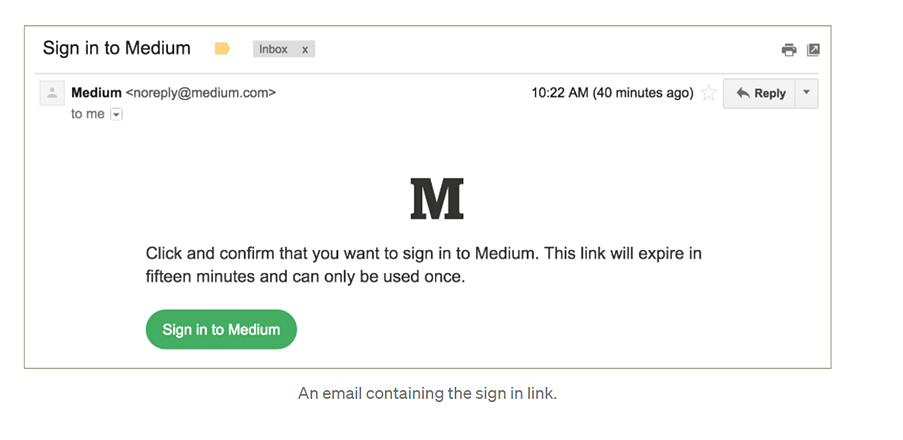
This criterion ensures that there is an accessible, easy-to-use, and secure method to log in and access the content. This aims to make authentication possible without being solely reliant on cognitive tests like captcha authentication and so that users don’t need to rely on memorising passwords or transcribing codes sent by text or email.
Figure 2 shows a technique that does not require a password. The user can enter their email address and is then sent an email with a link to activate. When the user activates the link in the email, they are directed back to the website and automatically logged in.

WCAG 3.3.8 Level A: Redundant Entry(this will open in a new window)
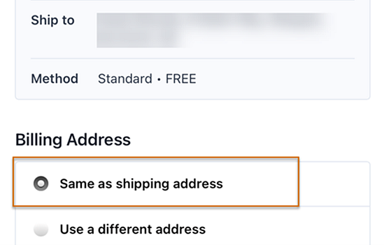
Users should be able to successfully navigate multi-step processes. This criterion aims to reduce cognitive effort by minimizing the re-entry of data that was previously provided within the same process or in the same session by auto-populating or providing an option to select. In the example (figure 3 below), the user can specify that the billing address is the same as the shipping address instead of re-entering it.
B) New Level AA WCAG 2.2 Success Criteria
WCAG 2.4.11 Focus Appearance (Minimum)(this will open in a new window)
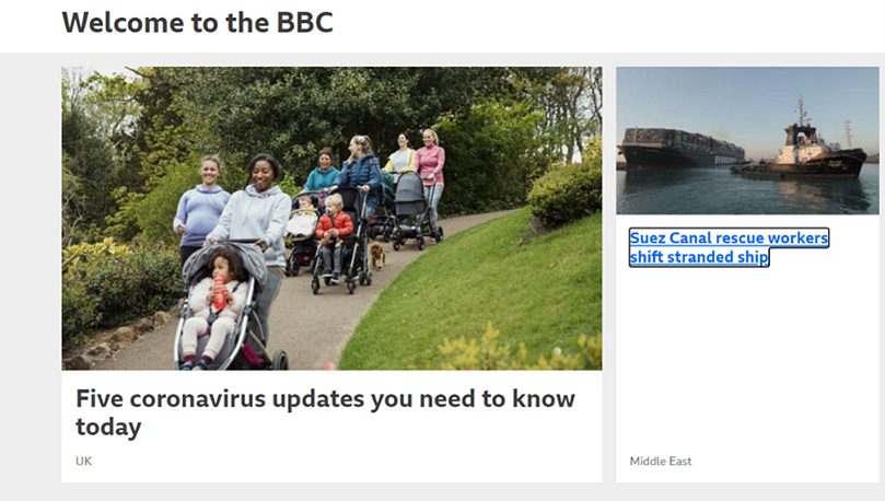
Focus Appearance (Minimum) defines a minimal level of visibility to ensure that the keyboard focus indicator is clearly visible and discernible.
It defines a minimum area for the indicator which should be greater than or 1 CSS pixel border or has a thickness of at least 4 CSS pixels along the shortest side of the element and no thinner than 2 CSS pixels. It also defines a minimum contrast of at least 3:1 between the focused and unfocused states of elements. The element in focus must also not be entirely hidden. Figure 4 shows an example of a visible focus indicator which stands out from the background and provides a strong indicator of focus.
WCAG 2.5.7 Level AA: Dragging(this will open in a new window)
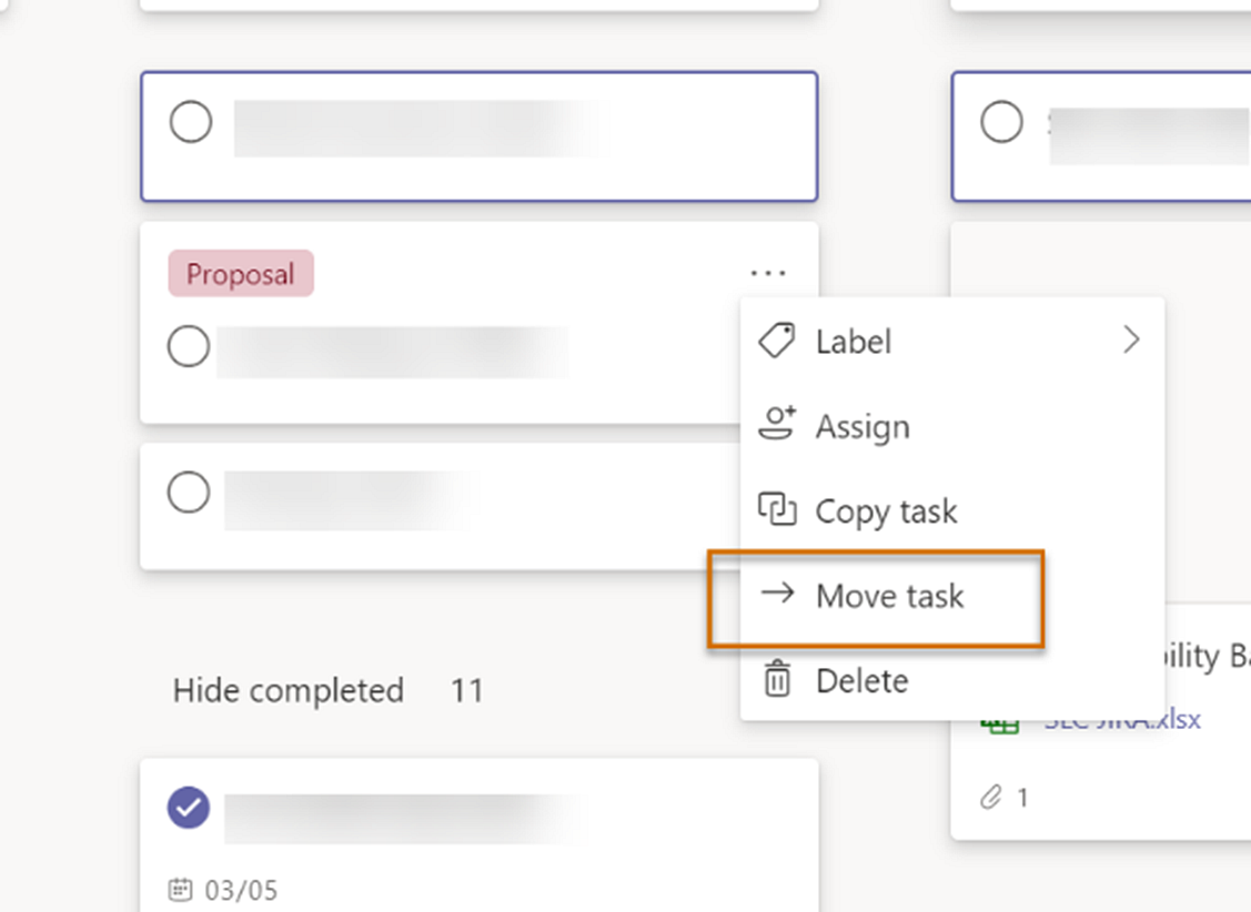
Functionality that uses a dragging movement (e.g. sliders, drag-and-drop interfaces) should have another single pointer mode of operation without the need for dragging the elements. This is important as users with mobility issues may experience particular difficulty or may be unable to perform a dragging motion. Figure 5 shows an alternative to a dragging movement as the user is able to move a task card by a single tap/ click or using standard keyboard gestures
WCAG 2.5.8 Target size (minimum)(this will open in a new window)
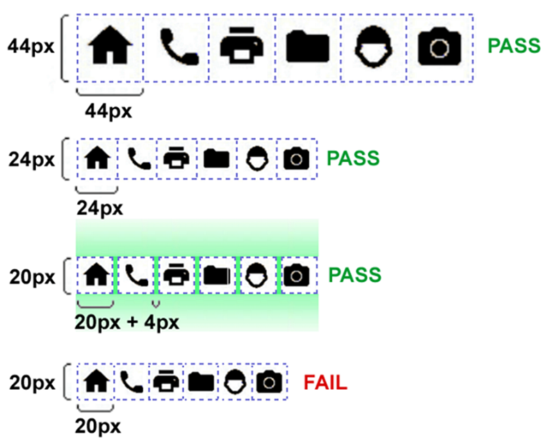
The purpose of this success criteria is to ensure targets can easily be activated without accidentally activating another target by mistake. This criteria states that targets should have an area of at least 24 by 24 CSS pixels. The example below in figure 6 shows the importance of using sufficient sizing and spacing between targets.
WCAG 3.2.7 Visible controls(this will open in a new window)
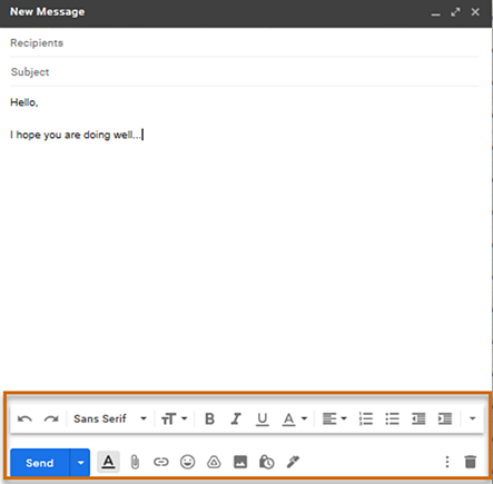
User interface components (controls) should be found easily by users. Often controls can be hidden and require the user to hover around the page for the controls to be displayed. When controls are hidden, this creates difficulties for some users to discover the controls to complete a task. Therefore, it is important that controls are persistently visible for users. Below, in figure 7 is an example of a toolbar that meets this criterion. When composing an email, the toolbar remains persistently visible. You do not need to move your pointer for the toolbar to appear.
C) New Level AAA WCAG 2.2 Success Criteria
WCAG 2.4.12 Focus Appearance(Enhanced)(this will open in a new window)
This is the enhanced AAA success criteria for Focus Appearance which defines a higher level of visibility for the focus indicator. It includes a greater contrasting area ratio of at least 4.5:1 between the colors in the focused and unfocused states. A greater minimum area is required which is at least double the area of a 1 CSS pixel perimeter of the unfocused component. It also ensures that no part of the focus indicator is hidden by content.
Summary
The latest WCAG guidelines are helpful in removing barriers and making access possible to a wider audience. We recommend that you consider keeping up to date with the WCAG 2.2 Working Draft with the aim of moving towards WCAG 2.2 when it is released. This may include setting up processes and training your team with the new requirements so your organisation can continue to meet the needs of your users.
If you would like to find out more about how our accessibility services can help you set up a strategy to meet the revised accessibility guidelines when they are released, please get in touch.
You might also be interested in...
The Speed Camera Problem: Why Continuous Accessibility Monitoring Beats the Annual Audit
24 April 2026Most organisations treat digital accessibility like a fixed speed camera - everyone slows down for the audit, then immediately speeds up again.
Read the article: The Speed Camera Problem: Why Continuous Accessibility Monitoring Beats the Annual AuditApplying the Three Lenses Model: How to Integrate MR, CX and UX Research
21 April 2026Knowing the three lenses is one thing — here's how to actually use them together without restructuring your entire research function.
Read the article: Applying the Three Lenses Model: How to Integrate MR, CX and UX ResearchThe Three Lenses Model: How MR, CX and UX Work Better Together
16 April 2026Most organisations run market research, track CX, and test with users — but they rarely connect the dots. Here's a model that does.
Read the article: The Three Lenses Model: How MR, CX and UX Work Better Together