Accessibility Review of Online Retailers Part 1: Boots
18 January 2017 - Natalie Simpson
For our Accessibility Review of Online Retailers blog series we are starting with the popular UK company Boots(this will open in a new window).
Boots operates over 2,500 stores across the UK ranging from local pharmacies to large health and beauty stores.
In terms of physical accessibility in the shops, they were the first high street retailer to work with DisabledGo(this will open in a new window) which provides detailed and independent information for disabled people when accessing their local area.
Boots has a section on its ‘Company Information(this will open in a new window)’ page dedicated to accessibility. Here, it states ‘we have been actively addressing accessibility since 2001 – one of the first companies to do so in the UK’.
Customer Journey Review
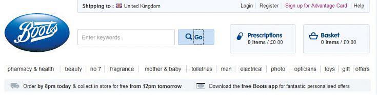
Homepage
On the homepage, a ‘skip to main content’ link gives users the option to bypass the lengthy navigation menu and go straight to the product information. This is implemented throughout the site and is a positive start.
Moving on, we start tabbing through and can see that there is default visible focus only. Sighted keyboard users can see where they are on the page, but time could be spent making this clearer. Implementing a custom focus is recommended and would mean consistency across all browsers.
Moving through the top section of the page, the tab order jumps between the main navigation menu and other links. Tab order should follow the same sequence as the information is visually represented.
The search field does not have an associated label which means that all a screen reader user will hear is ‘edit blank’ when it receives focus. The search function is a quick way for users to locate products. As no context is given here, it would be difficult for a non-sighted user to know what is required in this field.
On a more positive note, all images, icons and logos have appropriate alt tags which enables non-sighted users the same access to this content. There is an issue with the carousel of images here, but we will cover this on the next page as it is a theme across the site.
Browse
Brand search results page
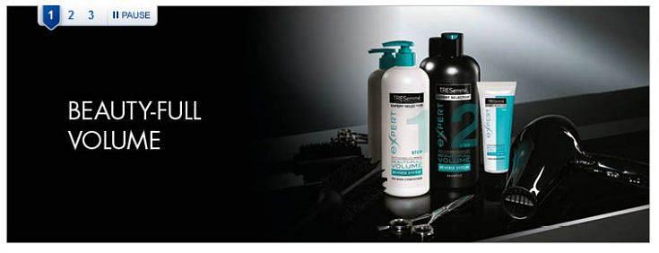
The first thing we notice on this page is the use of breadcrumbs which a great way of letting the user know where they currently are in context of the wider site. Users can narrow their search by navigating through the ‘product range’ or’ product type’ by tabbing through the product grouping images which all have appropriate alternative text.
However, the interaction is not as good as it could be when we navigate to the image carousel. Visually, users can click on the buttons to view one of three images and pause the carousel. However, for non-sighted users when tabbing through, the screen reader only reads out ‘1 link’, ‘2 link’ and so on, giving no context as to where these links might lead. For keyboard users, the pause button does not receive focus at all meaning the carousel can’t be stopped.
Selection
Product search results page
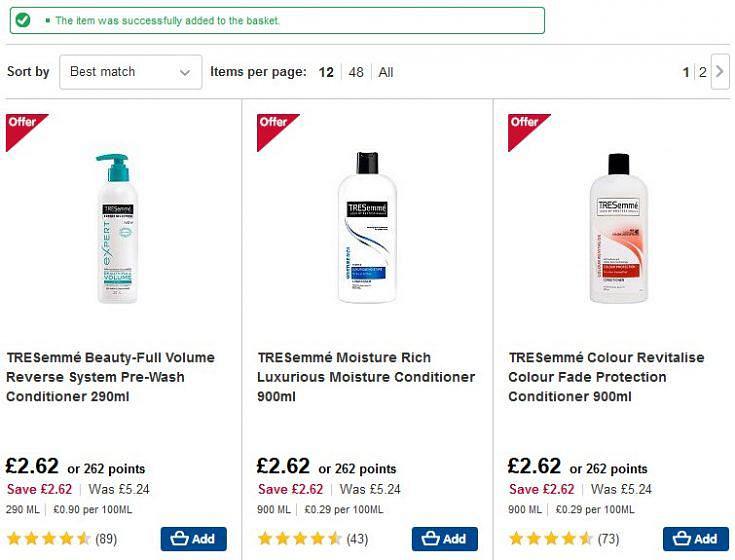
Generally, we felt that the level of accessibility on this page was good and that users have access to all information including appropriate use of alt tags on images where relevant.
When we add an item to our basket, a message appears on screen letting us know that this action has been completed. We are really impressed when this also gets read out to the screen reader.
Review your Basket
Overall findings on this page were positive. Product details are presented in a table with all rows and columns correctly associated making it easy for non-sighted users to determine if they have the correct product in their basket.
Before moving to the checkout, a visually hidden link is read out to screen reader users only. This allows users to sign in or register on a new page rather than via a modal window. This is another great example of the effort Boots has made to make the site more accessible.
The only issues on this page were missing labels on both the ‘Advantage Point’ and ‘Promotional Code’ form fields. These need to be rectified as form accessibility is a major obstacle to online inclusion.
Payment
Delivery address
So far, our experience on the Boots site has been mostly positive with easy navigation and good access to product information. We would expect this to continue all the way through to the checkout process, however, this is where we come across a few issues.
On the ‘Delivery address’ page, there are two options for users to choose from, to collect in store or have the product delivered.
The ‘collect in store’ option has a set of form fields with a fieldset but no legend. Adding a legend is required to give screen reader users more context as to what input is needed. The form fields do have labels but are not correctly associated with the corresponding fields so currently, ‘edit has auto complete’ is all that is read out. This is not sufficient for blind users to act upon.
Delivery options
Moving onto the delivery options page, users can choose when the product is delivered along with the corresponding cost. Here, the radio buttons do receive focus but a series of ‘blanks’ is all that is read out.
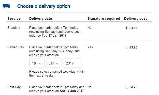
Moving through the section in browse mode, content does receive focus. However, visually users can select their preferred delivery method by clicking on a radio button, but programmatically this is not the case. For example, all a non-sighted user hears is ‘clickable £3.50’ giving no indication as to what option has been selected. At this stage, some users may be stopped in their tracks or require help. It would certainly not be easy or quick to make their preferred delivery choice or add in further delivery instructions.
Payment
Unfortunately, the interaction for screen reader users does not get much better moving onto the payment page. There are labels required on form fields and fieldset and legends should be implemented on radio button and drop down menu groupings. Currently when tabbing through, a user will hear a set of ‘edit blank’ and ‘combo box collapsed’ and it is not easy to know what input is required here. Error messages are good visually, but not read out which is another barrier for non-sighted users.
Summary
It is obvious that Boots have put a huge effort into implementing a lot of accessible features on the site. There were some areas that we were really impressed with. For example, the link for screen reader users to proceed to the checkout via a new page rather than a pop up. Additionally, when a product gets added to the basket, the message is dynamically read out to the screen reader.
Unfortunately, the site fell down in other significant areas such as when users were required to input payment details or choose a delivery option. We felt that many screen reader users at this stage would either be stopped in their tracks or it would take them a great deal longer to complete the task.
Score: 3/5
Up Next
Come back tomorrow to read our next review – Mothercare
You might also be interested in...
European Accessibility Act Now in Force: What Your Business Must Do
28 June 2025The European Accessibility Act is now in force, requiring organisations to ensure digital and physical products meet new accessibility standards across the EU. This major milestone will make physical and digital services more inclusive across the EU - find out your obligations.
Read the article: European Accessibility Act Now in Force: What Your Business Must DoYour EAA Compliance Roadmap
21 April 2025Unlock a more inclusive digital experience with the European Accessibility Act. Discover how to ensure compliance and enhance user engagement for the 101 million EU citizens with disabilities.
Read the article: Your EAA Compliance RoadmapThe Cognitive and Learning Disabilities Accessibility Task Force (COGA)
19 March 2025Discover how the Cognitive and Learning Disabilities Accessibility Task Force (COGA) is revolutionising web accessibility for neurodiverse users, bridging gaps in existing guidelines to create a more inclusive digital world.
Read the article: The Cognitive and Learning Disabilities Accessibility Task Force (COGA)