Airline web accessibility – Part 7: Singapore Airlines
14 July 2016 - Ed Chandler

Singapore Airlines

Route searched: San Francisco (SFO) to Singapore (SIN)
We had a quick look at the Singapore Airlines website a few months ago and they had a note referencing we’re trialling a beta site. Given that effort, now that the deadline has passed and armed with knowledge of this airline’s good customer-centric reputation, we had high hopes for this website.
General Experience
The first thing we notice about Singapore Airlines is the lack of visible “skip to” links and visible focus. The homepage lacks even the default visible focus ordinarily supplied by the browser, meaning that it has been intentionally disabled. This gives us great cause for concern. Straight away it tells us that sighted keyboard users haven’t been fully considered and that WCAG checkpoints related to this user group have fallen by the wayside.
From that point forward we shifted to the screen reader in order to carry on testing. Having shifted to NVDA we tried to interact with the global navigation but could not find a keyboard equivalent of the hover over mouse effect. This means that keyboard users (sighted or not) cannot use the homepage menu. As mentioned previously, this doesn’t mean a fail against the DOT requirements (in terms of the core functions) as they never specifically mentioned the top level navigation, but it is another indication of how far Singapore Airlines have to go to make the site accessible.
Booking Experience
Moving to the search flight widget, we found that the “from” and “to” form fields worked quite well. The radio buttons (book flights/redeem flights and return/one-way) would benefit from fieldset and legends to provide greater context.
We see the same problems with the datepicker that we observed in our reviews of Latam. The calendar datepicker (JQuery UI) uses non-standard keyboard controls in that the user needs to hit control first to be able move around the calendar. The implementation of this calendar means that the dates are not announced correctly so that a blind screen reader user would not be able to use the datepicker as it is. Fortunately, the form fields allow for free form filling and manage the separators for the user. Norwegian Air which we looked at earlier would benefit from taking a look at Singapore’s implementation regarding date entry and management.
Moving to the dropdown menus things go downhill again as these form fields do not have programmatic labels associated correctly. Screen reader users only hear “edit blank” for each dropdown menu, and cannot determine what the numbers they are selecting pertain to. Looking at the code, it is really disappointing as the problem is occurring because the “for” and” id” attributes do not match (the “for” attribute which should be contained within the <input> is not there). As one of the most basic web accessibility corrections, this failure highlights a clear lack of accessibility implementation.
Irritatingly, one thing the screen reader does announce properly is the contents of the carousel. Every time the image changes. This advertising information is a big distraction to screen reader users who are trying (and likely failing) to select their flights.
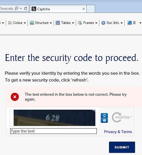
Moving on from the homepage we encounter… a captcha screen. There is no apparent reason for including this security feature at this stage – and unfortunately, Singapore Airlines have not implemented an accessible captcha, meaning that should a blind person be faced by this screen he or she would need to give up or ask for sighted assistance to carry on. The only thing we can think of is that Singapore Airlines have an aggressive security implementation on their site as it didn’t occur on our very first searches but happened soon after and every time after that.
On the search results page, we see that the global navigation is still present meaning that Singapore Airlines really should have made this accessible from the keyboard. We come across a link labelled as link – which is not very informative. Without a visible focus, we don’t know what it is and we couldn’t get any more information by turning CSS off. So in a last ditch effort, we clicked the link to find it was the printer icon.
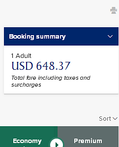
The booking summary link shows the currently selected flights. When activated, more information is shown visually but not announced, so blind screen reader users would not know that anything has happened. ARIA live is definitely needed here. Another issue is that this booking summary stays visible on the page as the user moves down the page. Mouse users can easily click on it to get a summary but keyboard users would have to tab back up to get at this menu. Again this would be a fail as functionality exists for mouse users which do not exist for keyboard users. We also found that the sort link does not receive keyboard focus at the appropriate time in the reading order, which would be another fail. In a small part of the site, we have found significant problems.
Progressing on to the flight options our experience does not improve. Whilst the radio button states the cost of the fare it does not state any information related to:
- Seat availability
- Fare class (saver/flexi)
- Any flight details (e.g. departure/arrival airports and times, duration, flight number, etc.)
This means that screen reader users cannot determine the difference between costs within flights (e.g. is it a saver/flexi or premium economy ticket), the different flight options (e.g., flight SQ15 going through Seoul or flight SQ1 going through Hong Kong). We also found that the down chevron linking to more information about “flight SQ1” was not in the tab order, meaning keyboard users could not use it.
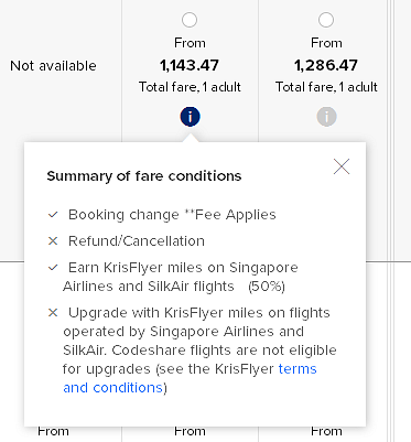
The “i” icons bring up a modal window containing a “summary of fare conditions” related to that fare class. Screen readers only announce this icon as “link” and do not announce the contents of the window at all. Keyboard and screen reader users cannot distinguish the different fare conditions related to each fare class, making it very difficult to use the page.
At this point, we felt that it was not worth continuing as we had spotted so many issues which would fail a WCAG 2.0 Level AA audit. Many disabled users would not find this an accessible experience.
Although we have conducted all tests on the same platforms (Firefox 47.01 and NVDA 2016.2.1) we felt that we just needed to check things with JAWS with Internet Explorer – just to be sure – but the experience was very similar unfortunately.
Summary
We had high hopes for this airline but unfortunately we feel very let down by the lack of accessibility features in the site. Things like “skip to” links, visible focus and programmatically associated form fields and meaningful links are the basics of web accessibility and Singapore Airlines don’t seem to have done these correctly on the pages we viewed. We wouldn’t want to say that there is a total lack of accessibility consideration but it is clear that not much has been done. Given that the deadline has now passed, this is really worrying and a significant shame as it means disabled people are locked out of their site.
We’d definitely recommend that Singapore Airline’s consult with accessibility experts either in their home country or aboard at their earliest opportunity.
Score: 1/5
We’ll be wrapping up all our mini audits in a final post on the airline web accessibility tomorrow.
In the meantime, check out our previous mini audits on:
You might also be interested in...
European Accessibility Act Now in Force: What Your Business Must Do
28 June 2025The European Accessibility Act is now in force, requiring organisations to ensure digital and physical products meet new accessibility standards across the EU. This major milestone will make physical and digital services more inclusive across the EU - find out your obligations.
Read the article: European Accessibility Act Now in Force: What Your Business Must DoYour EAA Compliance Roadmap
21 April 2025Unlock a more inclusive digital experience with the European Accessibility Act. Discover how to ensure compliance and enhance user engagement for the 101 million EU citizens with disabilities.
Read the article: Your EAA Compliance RoadmapThe Cognitive and Learning Disabilities Accessibility Task Force (COGA)
19 March 2025Discover how the Cognitive and Learning Disabilities Accessibility Task Force (COGA) is revolutionising web accessibility for neurodiverse users, bridging gaps in existing guidelines to create a more inclusive digital world.
Read the article: The Cognitive and Learning Disabilities Accessibility Task Force (COGA)