Airline Web Accessibility – Part 4: Ethiopian Airlines
11 July 2016 - Ed Chandler

Ethiopian Airlines

With our first two airline reviews done, it’s time to turn to Africa and Ethiopian Airlines.
Route searched: Washington (IAD) to Addis Ababa (ADD)
General Experience
Its clear that Ethiopian Airlines have been busy implementing accessibility features on the site. ARIA landmarks are used on the homepage, fieldsets have meaningful legends and most form fields have been labelled correctly.
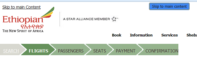
It is good practice to provide “skip to main content” links to allow keyboard users to avoid navigating through menus every time they land on a new page, but like Delta, Ethiopian overused this functionality. The homepage had several skip to links, and during the booking process we even came across an additional “skip to main content” link which looked somewhat out of place. We would recommend getting rid of the one with the blue background for this reason.
Within the main menu Ethiopian have implemented features to enable keyboard users to interact with the main menu, including instructions to screenreader users; however, in practice these did not work which was a little disappointing.

Generally there is a a good visible focus however this does fall down in places which can be a little frustrating.
Booking experience
The “search for flight” forms have been implemented well. The calendar is accessible from the keyboard, however we encountered a little problem in that the screenreader didn’t announce the dates when using the left and right arrow.
On the search results page, the fare selection radio buttons are associated with the flight details in terms of the fare type and price but not associated with the departure and arrival time (neither is the flight number). As there is only one flight to choose from, this is not a massive problem but does mean that the screenreader user has to interegate the information in more detail to understand the flight properly.
After selecting the outbound flight, screenreader users need to navigate by headings or use the down arrow to perceive that information further down the page relates to the return flight. Having already come across links related to baggage the fact that these are seen again without understanding the wider context may confuse some users.
When selecting flights, sighted users can see their selections build up using the summary section on the right hand side. Updates aren’t announced, and keyboard users have to navigate past the “continue” button to get to this section – which includes the price. The same happens after selecting both flights, but this time it is the total cost which is not announced to users.
The seat map is a little confusing as the users do not get told that they will only be able to select seats that are available. In addition, the rows and columns get in the way of understanding the column labels (e.g. A-L) and row labels (e.g. 11-15). A short introduction and description would have helped.
Going through the remaining parts of the booking flow, we found that most things work as expected, but throughout the process, there are a number of places where the greater context (which is visible on screen) is not communicated to screen reader users. Examples we found:
- In the flight summary section, the “view details” links are not meaningful enough as they are not programmatically associated with specific flights.
- The age ranges for passenger drop downs (e.g., adults: 12+ years old) are not announced.
- A link labelled “Click here” link rather than describing where it would take users (in this case the mileage level you will earn).
- “Learn more” links associated with the TSA Secure Flight Programme are not programmatically associated with that content.
Summary
We can see that considerable effort has gone into the accessibility of the site and there are a lot of good features being implemented. However, based on this review the site would fail an audit. The team could use further support and advice to get them over the line and deliver the DOT requirements.
Final score: 3/5
Check out our other mini reviews on:
You might also be interested in...
The Deadlines Moved. The Standard Didn't.
24 August 2026Two accessibility deadlines moved in opposite directions this year. The EAA turned one in June and enforcement is now visibly ramping up across EU member states, while the US extended its ADA Title II deadline for state and local governments to April 2027 or 2028, depending on size. Neither is a reason to relax: both frameworks converge on WCAG 2.1 AA as the baseline, and this piece sets out what the extra runway is actually for.
Read the article: The Deadlines Moved. The Standard Didn't.Forbes Just Ranked Accessibility's Best. The Rest of the Web Got Worse
10 August 2026Forbes' 2026 Accessibility 200 (published 19 May, 200 honourees, 23 countries) leans heavily on AI powered personalisation this year - from a tactile sign-language robotic hand to Amazon's AI shopping assistant. But 2026 also produced the first WCAG compliance regression in six years and a record year for accessibility lawsuits, a reminder that recognition for innovation and compliance are answering two different questions.
Read the article: Forbes Just Ranked Accessibility's Best. The Rest of the Web Got WorseDesigning the Journey to Change
5 August 2026The ScotRail app problems are a reminder that a digital launch is only part of the story. This article explores why smooth transitions, realistic testing and accessible design are essential when people rely on a service under pressure.
Read the article: Designing the Journey to Change