Accessibility Review of Online Retailers Part 6: Not on The High Street
26 January 2017 - Marie Moyles

For today’s mini accessibility audit, we are focusing on the online retailer notonthehighstreet.com(this will open in a new window). This site focuses on products which are out of the ordinary and a little bit unique in comparison to what we expect to find on the high street. There is no visible reference to accessibility on the site, indicating that making the site accessible to disabled users has yet to be considered so my expectations are not too high.
Customer Journey Review
Today’s task: To find a truly unique wedding gift for my friends upcoming nuptials.
Home Page
Starting on the homepage and navigating with the keyboard by tabbing through the page, we immediately spot an accessibility issue, there are a lack of “skip to” links present throughout the site. This is a fail under WCAG 2.0 Level A and therefore a disappointing introduction to the site. “Skip to” links would help disabled keyboard users to avoid unnecessary navigational elements and help them move through the site quickly.
Continuing, there does not seem to be a logical order for navigating the site as the focus jumps first to the shopping basket on the far right, then back again to the sign in/register section which precedes it. This is exacerbated by the fact that these elements do not receive visible focus so the user is doubtful of where they are on the page:

Sadly, the search box cannot be accessed by the keyboard so this functionality is not available to disabled users. However, the mega menu is accessible meaning that disabled users can browse through the site to find products.
Browsing through the site
Category Page
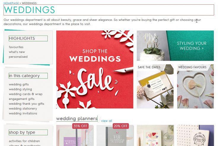
The page I am redirected to has been clearly titled ensuring disabled users can tell which page they are on. Notonthehighstreet have followed standard convention of putting the page description first, then the site name (weddings | notonthehighstreet.com):

Headings have also been used in the correct order, helping screen reader users navigate around the page and to the various sections quickly.

It’s a joy to move around the page as the filter is accessible from the keyboard and its options are spoken by the screen reader. However, there is a small snag with the price range slider not being accessible via the keyboard. Such functionality can be made more accessible by incorporating ARIA roles(this will open in a new window)such as the slider role and accompanying attributes such as aria-valuemin, aria-valuemax, aria-valuenow etc.
Selection process
Product Page
The product page has a number of issues that affect the accessibility of the site. Firstly, there are elements on the page that do not receive visible focus which can be confusing for sighted keyboard users as there is no visual clue highlighting where users are on the page. This was particularly problematic when navigating through the gallery of images for an individual item.
Secondly, images have identical alternative text (all images should have unique descriptions).
To add to this, the social media links have not been titled so are conveyed to screen reader users as simply “link, link, link, link”.
Focus is not given to a tab panel containing a wealth of information regarding product details, customer reviews, delivery and returns. It is not possible to interact with this information via the keyboard and the information does not get announced by the screen reader.
The pricing of the product causes confusion when announced by the screen reader as both the original and sale prices are announced without distinguishing what the current price is. This is a recurring find across this blog series (Link to Joules review here?).
Shopping Cart
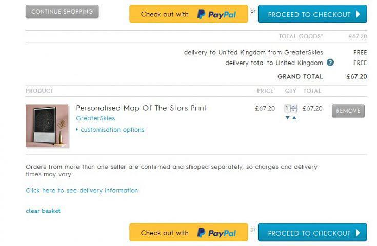
The shopping cart is not accessible via the keyboard as it is not a focusable element. A disabled user’s journey may end here if they are relying on the keyboard and screen reader alone. Carrying on the review, as if help had been received, we proceeded to the shopping basket and notice the repetition of buttons signalling “Proceed to the Checkout” and “Check out with PayPal”. It is not announced by the screen reader that using PayPal is an option here. The button for the PayPal option is not accessible and the “proceed to checkout” button is hard to locate due to the minimal visible focus it receives.

Payment process:
Completing the purchase is very clear and easy to navigate as the forms are labelled correctly. But the placeholder’s text colour fails to comply with WCAG 2.0’s requirement of a colour contrast ratio of 4.5:1 for normal text and 3:1 for large text. Error handling is an issue for those using screen readers as the errors are not announced but are available visually to the user. Additional error information regarding creating a password is not announced:

The form for delivery information is well labelled and associated so it is easy to complete for both keyboard and screen reader users. Inputting the user’s postcode dynamically updates the page with a “find address” dropdown but this not announced and there are changes on the page regarding form validation that need to be announced also:

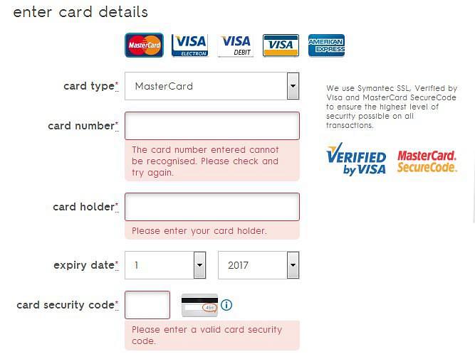
The same issues regarding error messages crop up again on the card submission page as they do not get announced to the screen reader:

Summary
Sadly, most pages on the notonthehighstreet.com site proved to be inaccessible. Notonthehighstreet are missing out on a large segment of their audience as in its current state a disabled user would be unable to complete a purchase without assistance.
Out of the criteria we are comparing the site against it did well with incorporating a proper heading structure and ensuring that forms are adequately labelled and associated correctly. Considerable consideration needs to be given to including skip navigation links, providing effective descriptions of images when suitable and incorporating logical navigation. Undertaking these actions would begin to get this site closer to a Level AA WCAG 2.0 compliance and expose its fantastically unique offerings to a much wider market.
Score: 1/5
Up Next
Come back tomorrow to read the round up of our accessibility reviews.
Previous Posts:
Accessibility Review of Online Retailers Part 1: Boots
Accessibility Review of Online Retailers Part 2: Mothercare
Accessibility Review of Online Retailers Part 3: House of Fraser
You might also be interested in...
Your EAA Compliance Roadmap
21 April 2025Unlock a more inclusive digital experience with the European Accessibility Act. Discover how to ensure compliance and enhance user engagement for the 101 million EU citizens with disabilities.
Read the article: Your EAA Compliance RoadmapThe Cognitive and Learning Disabilities Accessibility Task Force (COGA)
19 March 2025Discover how the Cognitive and Learning Disabilities Accessibility Task Force (COGA) is revolutionising web accessibility for neurodiverse users, bridging gaps in existing guidelines to create a more inclusive digital world.
Read the article: The Cognitive and Learning Disabilities Accessibility Task Force (COGA)Consumer Duty Compliance: Measuring Outcomes That Matter
4 March 2025Explore how financial services can move beyond traditional satisfaction metrics to master outcome measurement for Consumer Duty compliance. Learn about Key Experience Indicators (KEIs) and strategic approaches with User Vision's expertise.
Read the article: Consumer Duty Compliance: Measuring Outcomes That Matter