Debenhams – User Experience Review
1 April 2015 - Alan Blackwood

This article was published in March 2015 edition of Internet Retailing Magazine.(this will open in a new window)
Debenhams is one of the UK High Street’s retail big hitters alongside notable rivals such as Marks & Spencer and John Lewis. More than many of these direct rivals, Debenhams appears to operate in the Land of the Perpetual Special OfferTM
How effectively does its website promote this slightly differentiated brand proposition? And how well does the overall shopping experience measure up?
Riding the carousel
In common with the direct rivals mentioned (and countless other retail websites) the Debenhams homepage is dominated by a ‘carousel’ containing a series of promotion-related images.
As this feature takes up such a large proportion of Homepage real estate, its ease of operation is directly relevant to the bounce rate and the important first impression given to new site visitors.
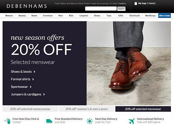
Debenhams have chosen a slightly less conventional route regarding the format and operation of the carousel controls.
Rather than the more familiar series of icons (dots or lozenges) used to indicate where the current image lies in the sequence, the Debenhams version relies on the user making the connection between the carousel items and the series of three elongated buttons directly below.
On balance the Debenhams approach gives just as much control to the user and more information about the available options.
As ever on the web though, users will spend the majority of their time on websites other than yours, becoming accustomed to conventions that are adhered to across those websites.
Sticking more closely to established conventions here would make the carousel’s operation more immediately obvious.
Moving through the site
The familiar ‘mega-dropdown’-style menu navigation is used effectively. However, certain menus (like ‘Men’ shown here) include somewhat unhelpfully titled categories such as ‘Clothing’ which contains a borderline obese 21 items.
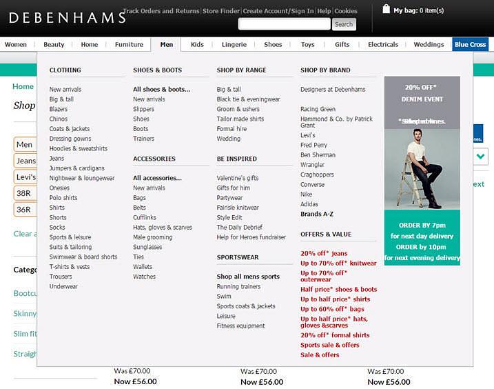
A higher number of less ambiguously titled sub-categories, each containing fewer items, would make the options here easier to scan.
Also included here are deliberately distracting red ‘offer’ text links. “You’re here for the offers” Debenhams seems to assume, even if you’re not.
Narrowing your options
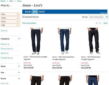
Once on a category page, faceted filtering options are well implemented with large, prominent buttons showing the currently selected options and clearly indicating how to remove each individually.
A text link placed just below allows you to quickly remove all currently selected options.
Viewing items
On product pages for clothing, low or no stock levels are indicated next to the size option using a text label.
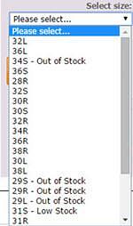
Although no doubt effective in persuading many potential customers to complete the sale during the current visit, this information is unfortunately somewhat hidden as it relies on them first clicking on the drop-down to select their size.
A static graphical indication of low stock for that item across a variety of sizes might increase the level of compulsion here.
As a side note, there appears to be no clear organising principle to the order of sizes for some items, potentially leading to lost conversions as customers overlook their required size.
Large, easily navigated imagery with an intuitive ‘Zoom’ feature and a very prominent ‘Add to Bag’ call to action minimise potential barriers to the conversion process on the product page.
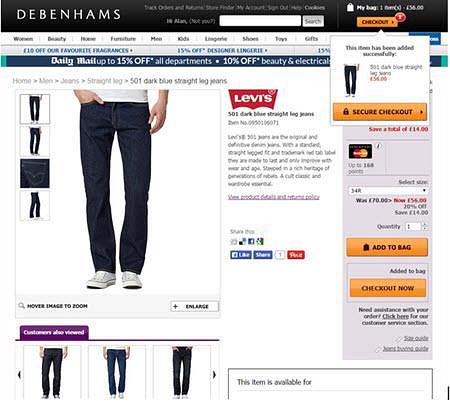
Completing the purchase
Items added to your bag are clearly signposted with an overlay appearing briefly with item details. Prominent ‘Checkout’ calls to action also appear in the page body and in the banner area as soon as you add an item, encouraging completion of the process.
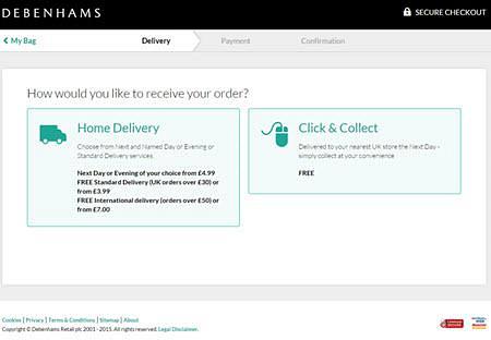
Checkout is painless with clear signposting of delivery options as well as control over item quantities and a breakdown of total costs.
Security is also emphasised with padlock icons on the ‘Go to checkout’ buttons here.
Although there is a progress indicator at the top of the page throughout the checkout process, its formatting and location mean that it could be taken to be part of the global navigation rather than specific to the checkout journey.
Not-so-inclusive design
There are no ‘skip to content’ links for screen-reader or sighted keyboard-only users meaning they have to navigate through many links to get to the main content. Many images also lack alternative text.
Some form elements have no form label or title attribute. These form inputs are therefore not understandable or explicit to a screen-reader user.
Summary
Debenhams’ is a good example of an efficient e-commerce site. While it does very little wrong, it also lacks significant innovation in any area.
This may appear to be a criticism but in fact is very likely to be what most visitors to the site need and expect. While it also lacks some of the striking imagery and other visual design elements present on the John Lewis and M&S websites, if you’re motivated by discount offers and want a quick, painless user experience it’s likely that you will find both here.
You might also be interested in...
User Vision placed on Government DOS 5 Framework
9 March 2021User Vision is proud to have been awarded a place on the latest UK government-mandated agreement for Digital Outcomes and Specialists (DOS 5) Framework.
Read the article: User Vision placed on Government DOS 5 FrameworkCreating Valuable Personas
27 January 2021Personas are a powerful way of communicating user needs to design teams. In this article, Mark Haley describes some best practice for making them useful, usable and engaging.
Read the article: Creating Valuable PersonasWhat are UX errors of omission and commission?
26 January 2021Explore how these often small and subtle errors can create big blindspots for your users.
Read the article: What are UX errors of omission and commission?