Topshop – User Experience Review 2015
16 February 2015 - Gayle Whittaker

The Top Shop homepage is all about the festive season from what to wear to the Christmas party to what to buy as gifts.
.jpg)
The free delivery offer on orders over £50 is clearly shown in the top banner and an animated lorry cleverly draws attention to a link where user can find the final order dates for Christmas.

This proves that the retailer can be trusted to get your purchase to you in time for Christmas.
In addition to the Christmas feature the homepage contains carousels for the latest season’s trends. These are nicely and simply presented on topics such as what’s new, what’s on offer, and the best knitted jumpers.
The user controls these carousels to browse at their discretion without the distractions of lots animating at the same time.
Navigation
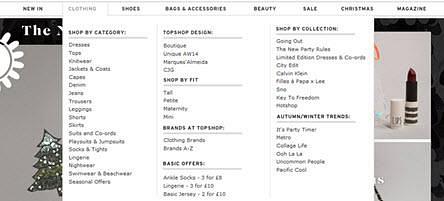
The primary navigation is a part-width mega menu which works well categorising and ordering the products effectively into sections then logical sub-sections. The sub-sections headings are clearly defined in bold and capitalised that makes it easy for shoppers to find what they’re looking for.
The navigation is within a persistent header that does not move or hide when the user scrolls. This allows the user to quickly navigate to other sections , view what’s in their bag and what the cost is.
Unfortunately the navigation does not highlight where you are which would help to convey a sense of place in the site.
Product listings page
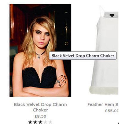
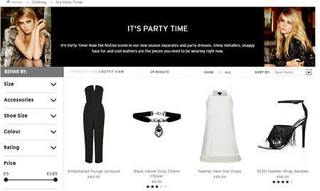
The product listings page makes good use of whitespace to display each product with a short descriptive title, cost and star rating.
The images are large and the roll-over product display on a live model is a nice feature but in some cases this view gives more emphasis on the model than the actual item which can be lost in the image.
A faceted navigation is implemented in an accordion menu that provides multiple filters for product search. This is a simple feature that does not overwhelm the user.
Product page
The product pages allow users to zoom into images. There are a good number of persuasion techniques at play such as customer’s reviews, number of Facebook likes, and an indicator showing how much stock is left.
A prominent clear all to action of ‘add to bag’ helps.
After adding products to the bag, the user can see a clear tick icon and message that their item has been added but they remain on the product page. This gives them the option to carry on shopping or to go to checkout. The My Bag feature in the header highlights the number of items in ‘my bag’ and the total cost – a clear visual indicator and feature that users are familiar with and generally expect.
Basket
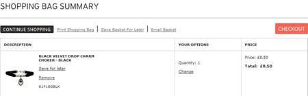
The shopping bag summary is a good example of a clear and simple basket design. Nothing fussy, nothing distracting, it drives the customer straight to checkout securely whilst providing information on payment options, delivery options and states whether you qualify for free delivery with minimal fuss.
There are nice features to print, save and email your shopping bag allowing users to maintain their list to complete at another time or share it with friends.
Checkout
The only requirements to register as a new customer is an email and password which means speed and efficiency is the focus, rather than data capture. The checkout is an efficient four step process – sign in, delivery, payment and confirmation. Each page is displayed intuitively visually grouping elements together and using active language to proceed at each step in clear call to actions.
Accessibility has been implemented in some areas such as skip to navigation links but further areas such as providing a visible focus indicator for users using the keyboard to navigate and allowing the mega menu to operate when not using the mouse would be a great benefit.
Conclusion
The Top Shop website is an effective e-commerce site that is compelling and functional. The site communicates a strong brand image that expresses the personality of their target users, which guides them effortlessly through the site from browsing to purchasing.
You might also be interested in...
Consumer Duty Compliance: Measuring Outcomes That Matter
4 March 2025Explore how financial services can move beyond traditional satisfaction metrics to master outcome measurement for Consumer Duty compliance. Learn about Key Experience Indicators (KEIs) and strategic approaches with User Vision's expertise.
Read the article: Consumer Duty Compliance: Measuring Outcomes That MatterWelcome to User Vision: Shaping Incredible Experiences
29 January 2025Discover User Vision: Your partner in human-centred design. We shape incredible digital experiences through expert UX research, accessibility consulting, and service design. Learn how our insight-driven approach can transform your digital offerings.
Read the article: Welcome to User Vision: Shaping Incredible ExperiencesUser Vision Secures Place on G-Cloud 14 Framework ... again!
8 November 2024User Vision secures coveted spot on G-Cloud 14 Framework yet again, offering innovative UX research tools and cloud support services to enhance digital experiences in the UK public sector.
Read the article: User Vision Secures Place on G-Cloud 14 Framework ... again!