Engaging with users – mobile diary studies
26 November 2014 - Ed Chandler

We gather user insights through a smorgasbord of techniques from one on one usability testing through to co-creation workshops.
One of the techniques we use to specifically understand user behaviour in the natural environment (ethnographic research) is mobile diary studies.
There are a variety of mobile diary study apps available, which enable participants to write, take a video or capture photos of their everyday experiences in real time.
The key here is that we get raw, “in the moment” experiences.
For WUD 2014 we decided to run a mobile diary study with our attendees to get them engaged prior to joining us on the day.
Here is what happened and my thoughts on the apps currently on offer.
Choice of tools
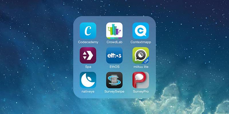
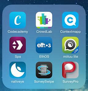
Nativeye, Contextmapp, Ethos, Miituu, Dscout and Journey HQ are a few of the examples currently on offer.

From a user/participant perspective the apps all operate slightly differently and have differing amounts of interaction between the researcher and participants and across participants.
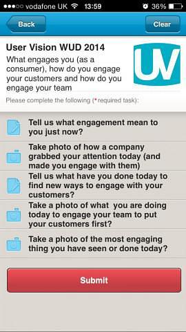
At one end of the scale we have Nativeye and Contextmapp which provide users with set “tasks” (answering a question in a predefined way – e.g. take a picture).
At the other end of the scale is Ethos and JourneyHQ. Here the “context” (the tasks set) are only shown to the user if they go looking for it in the app, where the main aim of the user is to take a picture, video or write a note (without too much emphasis on what to record).
When prescribing the feedback method, the participant does not have a choice regarding how they complete the task, they have to do it the way the researcher prescribed.
On the other hand, the problem of not providing sufficient context means that the participant may not always submit relevant and useful insights, meaning you have to wade through irrelevant data.

One area in which Contextmapp excels over the others is longitudinal studies that have distinct phases. This is because it can be used to clearly differentiate discrete parts of a customer journey into segments.

Thus you can release a fresh set of stimulus that directly relates to the test participants as they are in a particular phase of their journey.
This provides greater flexibility and of course means you get deeper and richer insight.
From looking at a variety of these apps, I feel that all of them have a little room for improvement.
For example the way the user uses the app to make a post or get to the instructions can often be confusing, making it difficult for the user to understand what they have to do.
Furthermore some of the apps even invite the participants to other studies (that are not related to yours), adding complexity and diluting the focus of your study.
In terms of the administration side, all the providers come at this from different angles, but essentially they all have the key parts of: set up the study, invite people, analyse/review results.
As you can see, you need to choose the tool that best fits your requirements so getting the research question and understanding what information you want out is very important.

For our WUD mobile diary study we chose Nativeye as this allowed us to to get them thinking what engagement means and how companies engage with customers.
We chose Nativeye as it was a best fit for our requirements both from the perspective of the user involvement and administration side.
Results from our diary study
The results were quite mixed with only a low number of respondents however, the reason for doing it was to show mobile diary studies in action rather than just the results.
The great thing was that it intrigued our attendees sufficiently as we had a steady stream of people coming to find out more throughout the afternoon.
In addition some really useful things were highlighted, which can contribute to making the apps better including:
- Compatibility across devices (Windows Phone users were excluded – including myself)
- Some received the invite but could not join the study
- Some didn’t want to answer in the way we had prescribed (e.g. they wanted to submit a photo rather than inputting their answer in text).
Who did what and why?
Understanding why an individual has behaved or done something in a particular way is key to providing a solution that will meet their needs.
Getting the “what they did” information is important and is very natural information to get from a diary study, but without getting the “why they did it” we do not get the key insights to making real change.
To find out the why, we need to probe a little further and this means being able to interact with the participant and ask them questions.
Nativeye allows for this interaction which is great. For a real study we may arrange a focus group or one on one session with the most active participants to clarify their experiences further.
To finish off, these tools are great for obtaining in the moment, rich experiences, but they need to be used in the correct way in order to elicit meaningful (and actionable) insights.
With a few tweaks to many of the apps, they would be even more powerful than they are now!
You might also be interested in...
Bridging Business Analysis and User Experience: Achieve Outstanding Digital Results
24 November 2025Discover how aligning Business Analysis and User Experience transforms digital projects - boosting efficiency, user satisfaction, and ROI for organisations seeking exceptional results in today’s competitive market.
Read the article: Bridging Business Analysis and User Experience: Achieve Outstanding Digital ResultsUsing the Kano Model to Drive Product Success
14 October 2025The Kano Model helps product teams understand what drives customer satisfaction. Features are grouped as Mandatory, Satisfier, Delighter, Indifferent, or Rejectors - each affecting the user experience in different ways. By balancing these feature types, teams can make smarter decisions, avoid clutter, and build products that truly delight users.
Read the article: Using the Kano Model to Drive Product SuccessMastering UX Benchmarking: Your Secret Weapon for Digital Competitive Advantage
1 August 2024Discover how UX benchmarking can revolutionise your digital strategy. Learn to compare your site's user experience against past performance and competitors, identifying key opportunities to prioritise UX resources and gain a significant competitive edge in the digital marketplace.
Read the article: Mastering UX Benchmarking: Your Secret Weapon for Digital Competitive Advantage